


Many cosmetic surgery center websites make two fatal mistakes—they sound like medical textbooks and look too “clean” to build trust.
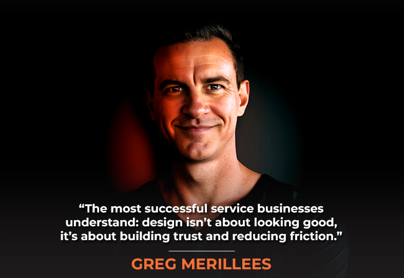
Today, we have Greg Merrilees back with us. He’s the founder of Studio1 Design, who has been creating conversion-focused websites for over a decade. His team specializes in designs that prioritize results over aesthetics. Our collaboration on the cosmetic surgery center Quintessa—one of the many projects Greg and I have worked on together—perfectly illustrates why clarity beats cleverness.
In our discussion, we break down Quintessa’s complete transformation from clinical copy and sparse design to compelling StoryBrand messaging with strategic conversion elements. This premium cosmetic surgery center, with five Wisconsin locations, doubled its organic traffic and keyword rankings in just over a year by shifting from doctor-speak to patient-speak while abandoning the minimalist design trap. We explore how messaging like “At Quintessa, we believe beauty is personal and so is your journey” replaced sterile procedure descriptions, and why social proof above the fold outperforms clean white space.
This episode shows you exactly how the right SEO and design team can transform a site from a digital brochure to a revenue engine in just months. So, without any further ado, on with the show!
In This Episode
- [05:32] – The shocking truth about cosmetic surgery websites: why cookie-cutter designs with generic stock photos make every practice look identical and forgettable.
- [08:31] – The “remarkability test” revealed: how Quintessa transformed from just another forgettable website into a memorable, league-leading online presence.
- [10:21] – The great copy debate: balancing SEO-friendly content with mobile conversion optimization when extensive text becomes a liability.
- [13:02] – How burying testimonials and valuable content in dropdown menus sabotages both user discovery and search authority.
- [15:25] – Why demanding too much personal information upfront kills lead generation and the art of progressive profiling.
- [19:08]- The hero’s journey technique: Greg’s signature timeline approach that transforms boring about pages into emotional connection magnets.
- [25:19] – Service organization mastery: the categorization strategy that prevents visitor overwhelm while dramatically boosting user experience.
- [29:36] – StoryBrand’s three-step process plan: crafting simple, compelling explanations that eliminate buyer hesitation and confusion.
- [34:48] – The AI creativity warning: why over-reliance on artificial intelligence strips away the human spark that makes brands relatable.
- [37:50] – Rage clicking revealed: understanding user behavior patterns and why visitors frantically tap images they expect to be interactive.
- [46:18] – Related content that actually relates: plugin strategies for displaying truly relevant blog suggestions instead of random recommendations.
- [51:35] – Media page authority building: why every business needs a dedicated press section to attract journalists, producers, and boost credibility.
- [59:49] – 404 page gold mine: transforming broken link frustration into conversion opportunities with strategic error page design.
- [63:04] – The design-SEO connection: how stunning visuals improve dwell time and user engagement signals that Google rewards with higher rankings.
- [66:37] – The Apple trap unveiled: Greg’s closing thoughts on why minimalist “clean” design works for tech giants but destroys everyone else’s conversions.
Greg, welcome back to the show.
Thank you for having me. Stephan, it’s always a pleasure to be here. And yeah, I’m wearing my uniform black T-shirt.
Yes. Feel like Mark Zuckerberg.
So much easier to pick one choice out of the cupboard. Black t-shirt.
Yes, yes. You know that lowers cognitive load, and then you can bring even more brain power to these, uh, case study episodes.
Exactly.
All right, all right. Let’s discuss the specific challenges the target market faces and what Quintessa aimed to achieve by partnering with both of our companies.
Yeah, absolutely. And look from memory like they spent a lot on advertising initially, and their previous website, which I’m just going to bring up now, if you’re watching on YouTube, you’ll be able to see what it used to look like. This is on the Wayback Machine because they weren’t generating enough leads from their ad spend, despite spending a fortune on ads. So this is what their homepage used to look like.
And so, some of the problems they mentioned during our onboarding call were that the ad spend wasn’t working. The quality of leads wasn’t there either. And look, this is a beautiful, clean-looking website, and it’s just. Classic case of if you try to be too clean and be like Apple, like most people want to be, and if you don’t have the authority level of Apple, then you’re leaving money on the table because there’s not enough clarity and a point of difference as to why they should choose you over your competitors.
Don’t try to be like Apple. Clean and minimal only works when you have their level of brand authority. Most businesses need clarity, not cleverness. Share on XThere’s no social proof above the fold, either, so I don’t see that pre-selected celebrities got services from them. They’ve been featured in various media outlets. None of that is present here. I have to dig for it.
Exactly. There’s a lack of clarity about their exact work, and they’re using stock imagery. And that was another significant issue, and we’ll also show you what their competitors do. Now, in fairness, this is on the Wayback Machine, so it does have some images missing, so it didn’t look as bad as it’s showing here. However, this was the structure of their web page, and that was pretty much it right then. Upon closer inspection, they had a pop-up that appeared all the time.
No matter which page you are on, it always pops up multiple times. Every time you visit a new page, this exit pop-up will pop up. It wasn’t even an exit pop; I think it popped up just five seconds after landing on a page. So that’s just very annoying for people. So if you do have a pop-up, make sure you don’t annoy your visitors and have a pop-up on every page. We generally have one rule, which is to make sure it pops up once per day per visitor.
If you have time, please switch to exit-intent.
Yeah, I agree, absolutely cool. All right. So, this is what they had. We also review their competitors. Okay, so we’ll just have a quick look at the competitors they sent us at the time. So this is one. I’m not going to call out their brand name, but yeah, once again, it’s kind of a lot of stock imagery, not much different from their old website, in a way.
And then I mean, they have a real photo of their team up here, which I think is great, but it’s obviously very busy and has a lot of text over it. It’s kind of pointless. But yeah, this is another competitor. This is just way too busy. They have a video background, which kills conversions, and then they have this pop-up here, which I didn’t even realize was a pop-up. When you look at it, it doesn’t feel like it’s a pop-up; it just feels like a part of a busy design. So, anyway, it’s not as busy, but it’s still ugly, and it’s just stock imagery, right? Oh, this is just their Instagram feed, but yeah, stock imagery all throughout this as well.
So if we think about how to position our client differently from the competitors, we just need to address all of those issues that we see from the competitors. So, one thing it needs is a better copy. Two, it requires fewer stock images, and three, it needs to have a beautiful, high-class feel. Because obviously, we’re talking here about doing surgical and non-surgical solutions for cosmetic improvements on people, right? And it might not just be for vanity. It might be for scarring, it could be for a range of issues and different body parts.
So, it’s certainly a very relevant problem for many people, and they’re willing to pay a significant amount for a solution. So that’s probably why they went with this clean look initially. However, it lacked clarity and failed to attract the right people. Because if you think about any business out there, any service business, especially if you do business with people, and when you just say stock is like, “Well, who am I dealing with? And why should I choose you over your competitors?” And there’s none of that when you first land on the page. So what were your thoughts, Stephan?
Button copy converts better when written in the first person. ‘Start my journey’ outperforms ‘Start your journey’.
Yeah, so remarkability is critical. Is this worthy of remark? And it wasn’t. It was too similar to pretty much every cookie-cutter cosmetic and plastic surgery website out there. They’re very undifferentiated from each other. They all share the same hallmarks in both the information presented and its presentation. It just didn’t stand out. It wasn’t memorable. It wasn’t remarkable, but I believe the redesign makes it remarkable now. It does stand out. It does differentiate them and put them in a whole other league. So yeah, great job on the redesign.
Thank you. Well, let’s flip to that now. We’ll just sort of talk through the key differences. So, we wanted to feature real people, just like their competitors did, but we ended up creating a much better design. But if you look at the color palette, the font choice, the font pairing, the social proof, the credibility logos, as seen on the Morning Blend, ABC, Vogue, Cosmopolitan, and the impact metrics here, 25 years of experience and all these other, you know, impact metrics.
Five-star reviews on Google. Yeah, that’s good stuff.
Exactly. It’s good stuff, yeah. And by the way, this is just the design. If we show you the live web page, it’s a bit different because they’ve updated their photos and added a little too much copy, I believe. Leave above the fold. That’s why I’ve just shown you our design. This is what it used to look like. We were just talking a few months ago, but yeah, they’ve added more copies and changed a photo. And I guess that’s a problem most service businesses face: when you have a team and put their photo on, if people leave, you have to change the photo. And that’s probably what’s happened here, going down from four people to three.
So let’s talk a bit about the copy above the fold there. From an SEO standpoint, having more copy is typically beneficial, especially when it’s prominently positioned, as Google gives it more credit. If it’s way down near the footer, then Google gives it less credit. But there’s a downside, and from a design and a usability perspective, especially on mobile. What was that downside?
Yeah, exactly. So I get why you want to put a lot of copy on the page, because you’ve got a lot to say, right? And you want to do what Stephan said; it appealed to Google, and even AI search can pick up a lot of copy. But the problem is that people like two things. It’s a lot of cognitive load. So people may not want to at this point. They just care about what’s in it for them. Why should I trust you? Right? So you’ve got a benefit-driven headline.
A little bit of copy would have been enough, but they’ve added more. Now, when you view this on a mobile device as well, if the copy doesn’t change, it stays as is. It occupies the entire first screen on the mobile device. So that’s a big problem, because it won’t look beautiful. And, a lot of the time, people will discover you first on mobile before they go to your desktop view of your website. So yeah, you want to make sure that the mobile experience looks amazing.

Yeah, especially when we’re talking about an industry like cosmetic surgery, he wanted to look beautiful, because that’s a reflection of the beauty of the brand and the outcome of working with them.
Yeah, and it’s pushed all the trust and credibility below the fold as well. You can see here on a wider mobile device, but generally speaking, it’s going to be this first one, which is, you know, like an iPhone 14, which is quite popular.
And there are no visual elements there. Yeah, that’s a problem. It’s just text. That’s a problem.
Exactly. So yeah, that’s not good for us. And even just the way this has ended up on mobile, you can’t see those logos. So I think we need to have a chat with them, Stephan, because when they’ve changed images, they’ve probably messed up what we intended there. So let’s just scroll through the homepage. We’ll talk about the top nav as well. We’ve tidied that up a bit from what they had.
And I do believe there are two things missing: the reviews and testimonials. As Stephan said, they have 505 star reviews on Google; that’s amazing. We want to create a dedicated page for social proof, making it easier for people to access, since it’s currently hidden on the about page. I think Stephan agrees that it should be viewed in the top nav. And then the other thing Stephan is missing from the top nav is what?
Yeah, so the blog, which I wouldn’t call blog, because for a high end brand like Quintessa, I would say articles or resources or insights would be more kind of high end sounding, but you need that authority status and say, “we write great authoritative content pieces and go have a look at our Learning Center,” or whatever they end up calling it.
But hiding it under about is not intuitive. No one’s going to think, “Gosh, I wonder if they have an article section or a blog section, perhaps that’s under about.” It’s never placed under “about,” so that’s something I wouldn’t leave hidden. It’s in the footer, but that’s a very secondary place to look. Most people overlook the footer’s clickable links, which can help them explore the site further.
If your call-to-action just dumps people on a generic contact page, you lose the ability to track performance.
Yeah, exactly. Couldn’t agree more. A lot of little tips here as well. You see this little arrow in the bottom corner. That’s just a quick, easy way for people to get to the top of the page. Many website designers overlook this, which is annoying since it forces you to manually scroll to the top of the page. But yeah, all right. And the other thing I wanted to mention was their call to action. There are a couple of problems with that. So, one of them says, “Start your journey.” And it’s been proven that the majority of the time, button copy is effective. If you use “my” in button copy, it converts better than “your,” because it’s the first person clicking that button. So they want to start my journey, you know?
So, they’re thinking those words that call to action. They’re actually kind of repeating that in their head. Even if they’re not saying it out loud, they’re thinking it. So, “start my journey or get my free thing” is much more aligned with the action they’re going to take than “get your free thing.“
Exactly, and if you press that, it just takes people to the generic contact page. This obviously might take a while, because it’s on the Wayback Machine. But yeah, just takes people to a general contact page. And so that’s a problem, because you have no idea where that person came from. You’re unsure what to fix or track.
And by the way, if your paid traffic just directs people from the call to action to the contact page, you won’t know how it’s performing. Generally speaking, you want to direct people to a dedicated page and track their origin.
What do you think of all these required fields? That’s a lot of required fields.
It is. Yeah, I mean, and it’s quite ugly the way it’s all laid out. I’m not sure if you need to ask for the date of birth when people first reach out, but they have a first name, last name, date of birth, email, phone, and location. Then, I’m looking for the service drop-down and a whole bunch of comments.
The only required information is the location you’re interested in and your comments. Everything else is a required field, and that makes it quite a hoop for the visitor to jump through to contact the company. That’s a problem, and we did raise that with the client. And then they reduced the number of required fields. They still needed some required information, but they reduced it and added more comfort elements and features to the page based on my advice and yours.
So that was good, yeah, exactly. So, we’ll just go to that now. So, here we had first name, last name, date of birth, email, and phone number I’m looking for.
Oh, so they put those back in as required fields.
If someone lands on your site and it feels like a template or like AI wrote it, they’ll bounce. People crave authenticity and connection. Share on XSo I think they added to it again. Stephan, exactly. Yeah.
So they’re all required now again, but you’ll notice there are more trust-building and comfort elements on this page. So it feels like I’m communicating with people, not just submitting a form into the ether.
Exactly. We have a map with all the locations on the page, and you can find them underneath as well.
And that’s a really classy look, by the way. I really like how you use the duotone version of the Google Map and embed it in a way that makes it look less widgety. It feels elegant and integrated into the design. Nice job.
Thank you. Yeah, just yeah. It feels more on brand. Absolutely. Yeah. Cool. So let’s go through the homepage. These little impact metrics do animate when you first land on the page, and that’s because we do want to draw a bit of attention to them. After all, it’s very important for building trust.
And then, obviously, we want to segment people into the right procedure based on their intent. And then we have more, obviously, sections on the page that talk about challenges. We’ve got some before and after. There’s a bit of a gallery in there as well. We’ve got some real stories, testimonials, and links to all the reviews, which are good for copy and help build trust in the brand. Okay?
We’ve got an overview of three different areas —face, body, and wellness —that they’ll click through to. They’ve added a new section here, which I think states that Quintessa is the proud sponsor of Natalie Boyd in the Petite USA pageant 2025, which is probably really good for them.
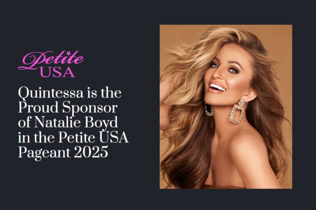
But I wonder, personally, we didn’t design this section. What we had instead was a section featuring them on The Morning Blend TV show, which I considered a more effective authority-boosting piece than what they’ve turned it into. Now, for me, this is more about what’s in it. Will consumers connect with this? I believe they will, compared to having this. Quintessa is sponsoring a petite pageant, which doesn’t feel on brand either. So anyway, that’s just our little bit.
It kind of clashes with the color scheme and the classy style of the rest of the page.
Yeah. So, you know, that’s a client choice, and that’s fine.
I believe it’s there just temporarily. It’s just part of a sponsorship period, and then they’ll take it off. But yeah, the social proof element that you showed on The Morning Blend Show that’s more compelling, I think.
And then, yeah, there’s just more authority boost in sections on the page. And Why Choose Us? And yeah, it’s good to put more content on the homepage rather than less, like they used to have and like their competitors have, because people need convincing, especially for this; they need a reason to choose you. Why should I choose you? And all this stuff just screams authority. But also, it’s not just that we are good. It’s about what’s in it for them, and messages like you deserve to feel confident and beautiful. We’ve really highlighted that it just animates going across to the page there.
Yeah. My team and I worked on the copy, helped with the brand script, and contributed to the overall story, brand methodology, and everything else. So, an example of the old messaging style was a lot of technical procedure descriptions. It sounded like medical textbooks, where. Our new messaging was at Quintessa, we believe beauty is personal, and so is your journey. That’s why we blend cutting-edge aesthetic treatments with heartfelt, individualized care. It’s not stuffed with keywords, so it just feels like it’s an SEO copy and not meant for human consumption. It builds comfort, confidence, and rapport, and helps move them down the buyer journey, rather than feeling overly clinical or technical.
Exactly. And so it’s a benefit of, yeah. What’s in it for them? Authority boosting is good for search engines as well. Yeah. So that’s the homepage and the top navigation as well. As we mentioned, we tidied that up a bit, but then they made a few minor adjustments, including the about page, which has changed since it used to look like that. So, this is their about page before we redesigned it, and it’s just got to be about the owner. And then I think, not sure if it’s a partner or just another surgeon, but that was it for the about page. And in this case, you’re dealing with people, so you want to put a lot more effort into the about page.
Timelines on about pages humanize your brand. They show the journey in a non-boring way and help people connect.
Especially when you’re dealing with five locations, you have doctors in each location. It’s not sufficient to just show your top two doctors.
Yeah, yes, exactly. So, we put the lead team at the top, along with all the awesome copy your team did. Stephan, I think, you know, it’s fantastic. It’s not just to meet the team. It’s like, board-certified plastic services, blah, blah, blah. And then the next part of it, transforming lives at quintessence, our exceptional team. And then we have all of their exceptional team, and it’s everybody. There are like 40 or 50 people on this page, so, yeah, I think that’s just showing that there’s a full team, not just two experts. I think that’s cool. But then we do have an individual bio page as well. This is what the individual bio page used to look like. There’s not a lot of content on there for trust building and so on.
And this is from the owner, Dr. Campbell, so it doesn’t have the kind of trademarks of a really good about page in the old version, like a timeline with milestones and a hero’s journey and all that. Just a lot of text that’s just kind of a wall of text for people to kind of mire through, and they’re probably not going to read it. They’re just going to quickly scan it on the old version.
Exactly, yeah, so the new version is just a way better design, visually. Additionally, we have other sections throughout this that discuss his expertise, awards, and accreditations. I’ve got a nice video of him here, along with his journey. He’s the business owner, so we’re just sharing his journey, including what led him to build this business and the milestones that helped him achieve it, to help everybody. Yeah, that’s the about page now and then. Obviously, for everybody else, we just do a standard about page, which has all of their credentials and things like that, a little bit of personal connection, family photos, et cetera. But we don’t need to do the full timeline, but it starts off looking very at the top of the page.
Right, because with the owner, or the face for the brand, having that timeline with the milestones, the hero’s journey. When we talked about Yosha Law Firm, we talked about the tribute wall and the founder, who’s now pretty much retired of that firm, really honoring him and putting up something that makes people feel warm and fuzzy about the firm, even if that person is no longer involved day to day, it just really makes you feel like you want to work with those people, and that’s something that you’ve been doing for a long time now, probably at least eight years. I think the timelines on the about pages.
It’s been quite a while. And yeah, I absolutely recommend it to everybody, because it does humanize your brand, and people can see in a non-boring way, the journey that you’ve taken to get to where you are now, and they really connect with that. So it’s very important.
Yeah, and you’re more likely to get links, deep links, directly to that about page, which means you, as the business owner, founder, CEO, and face of the brand, are more visible. When people search for your name in Google, you’re more likely to have that page show up at the top rather than maybe your LinkedIn page or something, because it’s so much more meaty and content-rich.
Absolutely. Yeah, good point. Okay, and then this is their services page, which used to look like this before. It’s a bit messy and not very well organized. So, that pops up again. We segmented it into two areas: surgical and this page. So, we put all the surgical information on one page because having everything on one page can be a bit confusing. And overwhelming. We’ve split it into a surgical index page, complete with nice tabs that let you view one category at a time. You can also click through to individual services. But it’s just better organized; instead of being all on one page, it’s more like a big mess.
You’re not just competing for attention—you’re competing for trust. Your design and messaging must earn it instantly. Share on XWell, it’s overwhelming, too. That’s a lot of choices to admire and wade through, especially with all this imagery. It’s consistently set up in a grid with the same dimensions and style, and so forth. Now, it’s much easier to find the kind of treatment or surgery you’re looking for.
Yeah, exactly. So it has a very nice visual. And yeah, I guess they did not have a visual at all. Just had two stock images for the categories. But yeah, good point. Okay, so then we go into the individual service page.
And by the way, with those two previous visuals that were displayed. They were not just stock; they did not convey that one was surgical and the other was non-surgical. Yeah, there was a label underneath, but they didn’t look different from each other. The non-surgical didn’t look any more surgical or non-surgical than the surgical one. They just looked like random stock photos.
They do. Yeah, good point. Yeah, that’s why. Just made it more descriptive. Now, they didn’t provide us with actual photos, and I think that’s fair enough, because it’s the patient’s privacy. So we did use stock, but they’re very descriptive. It shows exactly what you get.

They have procedures in place or being assessed, and the patient is either being given a medical glove or receiving an injection. It feels like, “Okay, I understand what’s being done here.” This one’s relating to the face. This one’s related to the eyelids, and this one’s the chin, or whatever. Okay, I get it, and I don’t have to read all the text to quickly jump to the section that’s probably related to the chin.
Exactly, yeah, because people are quite visual. And yeah, pictures tell 1000 words. So this was their individual service page. So in this case, it’s for a brow lift. When we design websites, we typically design each one individually. If you have a range of services, we design one of those services, and then once it’s approved, it serves as a template for the rest of the services.
The reason we do that is so that there’s consistency throughout the page. Because when people are browsing through every page and they’re deciding which service is right for them, we just want all of the elements to be in the same place for that sort of less cognitive load reason, and they get to understand the pattern of the page for each of the services. So yeah, it’s pretty important to keep things consistent, rather than making each page completely custom.
Be careful with white text on dark backgrounds—it won’t pass compliance tests, and it’s hard to read, especially outdoors.
But yeah, so basically, it’s what the page used to look like. It’s not terrible. It’s got some really good information on it. And so yeah, some of this is quite important for the patient. So we did end up keeping a lot of this information, but we just redesigned it with a nicer look and feel. I think they’ve added more copy to the section above the fold, specifically in section two, Stephan, because it didn’t look off balance, and pushed the call to action below the fold like it has now. But anyway, pretend there’s not so much copy, and the call to action is up here.
But yeah, definitely, because we wouldn’t have designed it to push that far down. But yeah. Anyway, look, I don’t know. If the client’s watching this, I suggest we create two separate copies: one above and one below. This way, we can keep the call to action and impact metrics above the fold.
Yeah, it looks off balance with the image on the right-hand side, having so much text, and it’s not lined up, so the headline is way up at the top. There’s no image balancing on the right-hand side; the image shows up like a third of the way down the page once you get into the paragraph copy.
Yeah, exactly, exactly. Hopefully, the client can fix that up, but basically, this is similar content to what they had previously. The client provides all the imagery for each of the services. We essentially just create the template, but it has a much better look and feel. We use the same content they had before and add extra bits like social proof, FAQs, locations, and a call to action throughout. Yeah. Stephan, I think you can talk to those FAQs.
Yeah, yeah. We’re big fans of including FAQs, or frequently asked questions, at the bottom of our service pages. So, if someone lands on a service page from a Google search, they’re not only met with compelling content that addresses their objections, but they’re also presented with comprehensive FAQs. Additionally, the content is substantial enough to satisfy not just Google but also other search engines. Other LLMs, such as ChatGPT, provide great chunks of content that can be excerpted and used in their outputs, including Gemini, Google’s AI Mode, and ChatGPT itself.
Of course, there’s Claude, there’s Grok, there’s Manus and Deepseek, and there’s a lot of them out there. So we want to feed those LLMs with good passages, good chunks of text that directly and succinctly answer questions. So that’s why that’s there. But scroll up a bit. You passed a section that I want to highlight, which is really cool. Keep going up a bit. It’s the steps. It is a three-step process.
So what is this? This idea actually comes from Donald Miller and the StoryBrand structure, Building a StoryBrand. It’s the process, plan, three steps, never fewer than three. Could be four, could be five, certainly no more than five. That feels overwhelming, but this simple process provides a laid-out plan on how to get started. Here’s how to achieve the desired result, making it super simple and straightforward to work with any organization, such as Quintessa.
So step one is to prepare for the brow list. Step two is the post-surgery recovery, and step three is the post-operative results. These are the steps for the patient, the prospect, not what Quintessa is going to do behind the scenes. You can do it in different ways.
When I worked with BorderBuddy, we came up with the process plan. It was a simple three-step process to onboard the client. It wasn’t the entire process of shipping the item across the country’s border. There was more involved, but the simple three-step process for BorderBuddy was designed to get your shipment handed off to Border Buddies, who would then handle the rest. Make all the headaches and paperwork go away.

Love that. Additionally, you’ll notice a dark background behind these three steps. However, the text itself is set against a white background with black text, which is done for readability. But just be careful, a lot of websites that have white text on a dark background are very hard to read. It won’t pass the compliance tests, and you have to be compliant these days for people with disabilities, so it’s just something to be aware of.
But it’s also harder to read, especially outdoors on a sunny day. Trying to read white text on a dark background is almost impossible, so be wary of that. You can use white text on dark backgrounds, but if it’s excessive, consider switching to a light background. Also, ensure you have high contrast and a decent font size, especially for people over 40. So that’s the individual page. They also had a gallery page, which I think, yeah, maybe it’s from the Wayback Machine.
Yeah, it’s not formatted quite right because I think some of the CSS didn’t load, but it was definitely an upgrade of the photo gallery to get the redesign. That’s amazing. I love how you guys achieved it with a really classy look and feel; everything is very consistent between the different before and after. It was much more usable and I think compelling.
Absolutely. I also think there’s a lot of information here, but it’s segmented from the surgeon’s perspective. And then you can dive deeper into that surgeon’s individual procedure, if you like, from, you know, facelift, eyelift, etc. So, yeah, it’s a good way to show everything exactly right, rather than just displaying it all at once.
If someone is interested in a particular surgeon, location, and procedure on this website, let’s show them the individual’s before and after results, as that’s what they’re looking for. It’s like, you will see diversity in terms of age and ethnicity as well.
So it’s clever to show that, rather than just showing all the same age, be, yeah, and all the same sort of problems. So yeah, it’s very clever the way this is all done. So, a lot of thought has gone into it from the client, as well as a smart, logical layout. Yeah, all right. So as you can see, there’s a lot of thought that goes into a website. Sure, you can get a website built with AI these days in just five minutes, but will they invest the same level of thought and attention into it? And what happens to a 1000-page website, Stephan, if you replace that with an AI website? Don’t get me wrong, they’re coming a long way. Yeah.
People click on images more than text links. Heat maps show rage clicking when images aren’t clickable.
The quality and all the nuance get lost. When you rely on AI, you lose that human spark and that human touch, that relatability. It becomes more generic, more vague, just flat when you’re overly reliant on AI. Of course, you can use it for brainstorming, for headlines, for checking the copy, for grammar errors and so forth.
However, if you draft your pages, make quick tweaks, and then publish them, you lose the soul of your business. People can’t connect with that, and as a result, they won’t connect with you either. So be wary, be mindful about your usage of AI. It’s a powerful tool, but it’s more than just a replacement for your copy team or marketing department; it is a tool, an augmentation, a force multiplier for your marketing team.
Couldn’t agree more. And if you think about how many people put their thought power into creating this website, from their team to your team, to our team, there’s probably like 30 people that had input to make what it is, so yeah, it takes a team to do an amazing website.
Takes A Village for that quote, over there in Australia.
It takes a village, yep, and speaking of, it takes a village. We’re now going to look at their location pages. So they have five locations, and this is the one before. So, this is what their page used to look like; it had images and text down the left-hand side. There are a couple of images missing because it’s on the Wayback Machine. It doesn’t produce everything, but so that’s what it used to look like. Had nothing else on the page. The point is, this is what it looks like now. I should just scroll to the top.
It has five convenient locations across Wisconsin, along with an image, text, address, phone number, and a clickable link. Then, another thing most people get wrong is that, as you’ll notice, when I hover over the image, it changes to look clickable, and it actually is. And you’ll find that many people don’t have clickable images. Now, if you look at heat maps, when you do conversion optimization or user testing, you’ll see that people often click on images. They click on images more than text links. So, really, you’ll know because you’ll see on heat maps that people are rage clicking.
Yeah. Could you explain what a rage click is for our listeners who aren’t familiar with the term?
Sure. When you do conversion optimization, you look at heat maps and user testing. You’ll see who clicks images, and these clicks show up as little dots all over the heat maps. So, it means that people are literally clicking. Usually, they tap repeatedly because they think the first click didn’t work, so they want to click again and again. And yeah, it’s called rage clicking, where they click more than once. The beauty of looking at heat maps is that they tell you what should be clickable, and since they’re always images, they should always be clickable.
Speaking of heat maps, there are multiple software tools you can use to analyze a web page or website. This helps you see where people are clicking, how they interact with the page, and identify areas where a lot of clicks are happening, such as an image that’s all red. What sort of software do you recommend? There are many choices out there for heat mapping analysis, for either user experience improvement or for conversion optimization. What do you use?
AI can build a site in five minutes, but it loses nuance and the human spark.
Yeah, look, these days we use Microsoft Clarity because it is free, right? And it has heat maps. It has videos of people using your website. It also has AI built into it, so it provides a brief summary of each page. It’s really helpful. But apart from that, there’s Hotjar, there’s Crazy Egg, there’s a whole bunch for them. But yeah, I would say they’re all good because each one is unique in its own way.
But yeah, for us these days, Microsoft clarity does 80% of the paid tools. It’s free, yeah, and you used to use Hotjar, we did indeed, yeah, and I love it. We still have it on various client websites because it allows you to do user polls, surveys, and other things specific to each page. It also has a bunch of other little features that are well worth it if you’re serious about conversion optimization. But yeah, Microsoft clarity does 80% of all the other paid tools, so I think it’s cool.
But then there’s usertesting.com. It’s a service where you pay them for a range of users to provide feedback on your website. This is really cool because you can hear their thoughts directly. After all, they’ll actually talk through each page. You just give them a goal and they’ll see if they can achieve it. So yeah, usertesting.com is really good for conversion optimization as well.
Yeah, good stuff. All right.
Yeah, cool. All right, that’s what we call a location’s index page. Then, you click on the individual location, and this is what ours looks like. Now, let’s explain that in a minute. But first, if we go back to the original state, this is what it looked like before, and it’s got stock images. It has a bit of messy navigation, similar to their services page. It’s just, yeah, too confusing. Doesn’t show images. They have open hours, which is good. They have an interactive map, which isn’t displaying, but I think that’s a great feature. And they’ve got a little bit about us and the surgeons, etc.
So I think that’s, you know, not too bad as far as the type of content to put on there. Above the top of the page, we have some good copy and an SEO-friendly image of the place. Then, we list all their services. Still, in categories, it’s kind of like a mini version of their services page, but it’s really easy for people just to flip through the tabs and see the right treatment for them, because not all locations have the same treatment across every location. We have two sections: surgical and non-surgical.
And there are images now, they’re small images, instead of just having a huge list of text links to all the services relevant to that location.

Exactly. So, you might remember us talking about this on the Services page. This is just a mini version of the Services page, designed to make things easy. We also have open hours and an interactive map. And then a little bit of context about their location. And, you know, why choose us? And then social proof. The other page was missing social proof. And then just end with a call to action to start their journey.
And you have to have social proof on a page like this, because this could be the first page that a visitor comes to from a Google search, do some good SEO, and then the location page shows up, or a location plus service page, which we’ve talked about on previous case studies.
Yeah, very powerful, yeah. So, I would say, in general, put social proof on every single page. So just a few pages remaining to show you some before and after. And I do love the Wayback Machine, because we didn’t screenshot every page. And yeah, this is just really handy. This tool, which is web.archive.org, allows you to bring up any website in history.
Even from the 90s, on some sites, you could see what netconcepts.com looked like in 1997; it was pretty cutting edge for back in the day.
Amazing. I’ll check it out later. I haven’t seen that yet. All right, so this is their blog index page, which probably uses the same layout as the locations page and the same template. In contrast, ours is significantly more organized and visually appealing. Has a lot more on the page. And just a little tip we got from Stephan is that, instead of having a load more button like many blogs, you might have 1000 blogs or 10,0, whatever it is, and they just have a load more button. There’s no SEO value in that. Is there Stephan? And this is just talk through.
It is problematic because you’re hiding those other teaser bits about each blog post. And it doesn’t really count for SEO. Google discounts it because it doesn’t load by default and now by pagination. On page two, you’ll have all that displayed. On page three, you’ll find all the relevant information you want to include in your SEO.
Put social proof on every page—it’s often the first impression from Google search.
Love it, yeah? Great little tip. A small thing that gets big results. So yeah, we just scroll back up to the top, and now it’s showing that. We’re trying to categorize their blog posts to relate them back to their three main areas of service. So I think that’s smart.
And if you think about any business type, you may have multiple target markets or multiple areas of service. If you can tie your blog back to that, the beauty of it is that people will find a related blog post, and then, what do you know, you become the next logical choice for that service.
I really appreciate how it makes it easy for people to find what they’re looking for, rather than just having a big stream of blogs.
Yeah. Cool.
And then we have the Blog Post page. I’ll show you what that looked like before. Okay, so there’s not a lot of conversion on this page. Although there’s no sticky call to action, they have a sticky top nav, which is great. However, they lack a sidebar, a free offer, and social proof. There’s nothing, right? It’s just a wall of text with nothing on either side.
This is important because we have people coming in from Google searches directly to blog posts that have been optimized to rank. If that’s the first impression of the website, it’s not a great one. The social proof and irresistible offer are missing. Additionally, a key takeaway or summary of the article would be beneficial for LLMs. It’s also important to get your passages into ChatGPT and other tools to utilize as part of the output from those LLMs. Like this is important. You get to see those details.
Absolutely, and I find as well, like it’s so helpful for people, and that’s probably why blogs that are helpful for people have key takeaways, and, you know, just organizing it properly with little chunks of copy and big images and just breaking it up. Hence, it’s easier on the eye, more visually pleasing, and more engaging for people.
I think you’ll find it’s better for people, and that’s probably why LLMS and Google favor this type of blog layout. Yeah, it’s a little bit more user-friendly, yeah? So that’s pretty much it. And then we have a call to action. You may also like this option, as you want people to click through to another page. And we have some social proof. We then have the main call to action to start their journey, along with their locations. So yeah, it’s very strategic with this type of layout with this structure from top to bottom, because it works.
There are plugins that display related posts or other relevant articles at the bottom or elsewhere on the page, such as Yet Another Related Posts Plugin (YARP) for WordPress. There are a bunch of these out there, so you can get this functionality pretty sophisticated with a free plugin or a freemium plugin, and not just have it be the same exact three posts at the bottom of every single blog post, because sometimes those are very unrelated to each other, the topic that you were writing about, and then the supposedly related posts, if they’re not related, well, you’re not doing as good of a job as you could.
Spot on. Yeah. Okay, cool. And so yeah, with plugins like that, you can control what you see at the bottom of every individual post, if you want to go that granular, yeah, all right. And then another really good page to put on any website is a careers page. But this is what their careers page used to look like. That’s pretty much it, which is also a bit of a problem because it’s a careers page. The call to action on the careers page is to request a consult. So it doesn’t make a lot of sense.
So, on our careers page, we have real images of their team. We have been part of our qualified team, join a highly qualified team to make a difference in the world of medical esthetics, blah, blah, blah, blah, all the good stuff applied to join our team. And that will anchor the link down the page, and then they have just a little bit of their USP, transforming lives through beauty, our vision, a video there, as seen on their main sort of tagline, their values, their point of difference.
Big section on their mission, team photos everywhere. And then meet the lead team, some member testimonials as well from their team, which I think is pretty cool, and then their locations, and then a call to action at the end of the page that has a form for them to fill out to apply to join the team.
So that form is not a pop-up. If you click on the top to apply to join the team, that button takes you down to this section of the page where the form is, rather than having a pop-up. So why would you not do a pop-up or a modal box and anchor link down to the form at the bottom?
Great question. So the reason we do that is because we want people to know that, Oh, they’ve just skipped all this valuable information. If they don’t see all this stuff and they just press apply, they’re missing out on the core values. And you know what’s unique about this business to join. And so we want to show them, by pressing this button anchor linking down the page, that, “Oh, whoops, like I missed a whole lot of valuable stuff.” So they just may not know that all this stuff is below the fold. We know it’s there, but they may not. So we’re just going to make sure they see it. That’s the reason for doing that.
A well-designed Careers page doesn’t just attract talent; it convinces prospects you have the best people.
The beauty of a careers page is designed properly with the values and the mission. And you know, Why Choose Us and photos of the team? It does two things. It’ll track better members to your team. Still, also, if prospects that are thinking of hiring your services see this careers page, it’s like a double benefit, because they think, “Oh, wow. These guys put a lot of effort into attracting the best people to join their team,” so they realize that there’s going to be good people that work there. So yeah, it’s just another reason for them to choose your service. So it’s pretty clever.
And then, yeah, just a couple of pages that we always put on a website, which would be the patient reviews page. We talked before about the fact that it should be in the top nav, not hidden in a drop-down. And once again, it’s categorized for the type of services that it offers, if you want to find reviews about that particular service. I think that’s pretty clever. And then the press and media. This is a page that Stephan always recommends.
So, back to the reviews page for a second. It’s important not to just link off to reviews on Trustpilot or your Google business profile. Instead, pull the best testimonials and reviews from sources like Yelp and feature them on your website. One, you keep them on your site. Two, you editorially curate and decide which ones you’re going to feature and where and how, so that you’re putting your best foot forward.
You’re not changing the wording or anything. You’re not doing anything unethical. You’re making it easy for people to stay on your site and get that social proof by rating. And if they want, they can, of course, go to your Google business profile from there to verify that indeed those were the words written.
But you have the star rating, you have the person’s handle or username and their location, if they’ve supplied it, et cetera. So all that information is there in one place. Then you’ve categorized it according to the same categorization scheme —face, body, and wellness — that the blog, services, and everything else are organized by; that’s really smart.
Yeah, thanks for unpacking that. Yeah, I tend to just skip over these things, but these things are a game-changer when you really go to that level of detail. And yeah, thanks for pointing that out, Stephan. So this is a press and media page. I just want to frame it as this is a page that Stephan recommends, right? And I often overlook this, but it’s so important from the point of view of when a prospect comes to your website, if they go to this press and media page, they see that you’ve had TV appearances or article mentions on other authority websites, podcast appearances, wherever you’ve been in the media.
Essentially, they go to one page and they automatically think, “Oh, wow, this is an authority look at all the TV shows they’ve been on,” et cetera. So yeah, it’s often overlooked even by our team. So, I just wanted to point out that, yeah, this is really a Stephan idea, and it works wonders, not only just for finding clients, but even for finding opportunities with partners in your industry. It can be a great page for boosting your authority.
Paid traffic converts better when sent to a lead magnet. It’s cheaper and lowers cost per lead.
And TV producers, if you want to get on TV, they’re going to look for your press page or your media page to make sure that you’ve been on TV before. They don’t want you to be totally green as a newbie, and you’re going to freeze on live camera on live television. Yeah, right. Okay, awesome. Really small. Then, a TV station in Podunk, Iowa or something, and only five people will be watching it. So the journalists will be checking out the Press page. The folks who are going to consider you for podcasts they’re going to check out this page. This is a really important page, and don’t bury it. Feature it. Make it easy to find in the top nav.
Also, there are those logos as seen repeatedly at the top of this page, because we use them throughout the site as social proof. On all those other pages, they’re clickable, leading to this page, not off the site, to Vogue magazine or whatever, but to the press page. Once you’re on the Press page, those logos are not clickable. They don’t go anywhere because you’re the destination. We want to keep you on.
Suppose you do want to verify that Quintessa was indeed mentioned in Vogue magazine. In that case, you can click inside the article, the mention section on that article, and the mention will take you to the Vogue article. But we don’t want to make the logos clickable at the top of this Press page. So that’s the only place where they’re not clickable. Everywhere else you should send them. They should not generate rage clicks. They should send the user to the press page.
To the press page, exactly, not off to the external website at that point. Yeah, nice one, but, yeah, very powerful page, often overlooked. I just wanted to mention as well, we do have a lead magnet on this website, and it is an exit pop, and it’s popped up here. And I just want to mention that we didn’t design it with so many forms, and I would only recommend first name and email at most for a lead magnet, most of the time. Okay, look, they’re probably doing this to qualify people by asking for phone numbers, date of birth, as well as last names, not really necessary for a lead magnet. Yeah, that’s my thoughts. What are your thoughts on that Stephan?
I agree. If you need that additional information, then ask for it on a second screen. Yeah. So, if you get just the first bits of information, that puts them on your email list. Having their first name allows you to greet them properly in your email, which will encourage them to open and read it. Of course, the email address is the only required field, and you can leave off all the other fields that ask for additional information on a second screen. And then, if they don’t provide that, you still have them, but if they do, you have this additional information as well, allowing you to further target them.
That’s right, yeah. We often do that. By the way, if we think back to their schedule, we often use a two-step form when asking so many questions, which is why we do the same. Ask for a first name and email. If they abandon, don’t fill out the rest of the questions later; you can just auto follow up with them if you have good email marketing software.
So I’m really not a fan of asking for a date of birth on a lead magnet opt-in. I think it’s pretty intrusive, so I wouldn’t recommend it, but that’s what they have there. Yeah, now you do something really clever with the Privacy Policy Link. You always want to have a privacy policy link and mention that you abide by that privacy policy anytime you have a form or a pop-up with an invitation to fill out a form. So what do you do differently there that some folks get wrong?
So obviously, you need a privacy policy on your website as an individual page. That’s a must, right? Apart from that, when you do ask for people’s information, they want to know what they’re opting in for, so we put a privacy policy link under every opt in form, but when pressed, instead of taking them off to privacy policy page where they’ll probably never come back or even see the lead magnet again, we just have that Privacy Policy Link generate a pop up on top of the pop up so you can read the actual privacy policy right there. Then you close it, and you’re still on the pop-up where you can opt in. So, it’s just a better conversion tactic to take that approach instead of sending them off to a privacy policy page.
Yep, really smart.
Yeah, cool. We also designed an actual lead magnet opt-in page. This is just the design, but I’m not sure where the actual page is on their website, so this is a placeholder for now. We’ve done one for a comprehensive guide to surgical beauty transformations and another for non-surgical transformations.
So, why would you have a pop-up and a landing page for a particular lead magnet?
Great question. Because if you’re sending paid traffic to the website, they’re not going to see that lead magnet. Maybe. Right. So, this is a really good strategy if you have a good funnel off the back of this, and we do, or we did when we set it up. It’s a great opportunity to build trust in your brand. And then when they go to the thank you page, you have a face-to-camera video that talks through.
The point is, it talks through, you know, basically what they go to get out of the lead magnet, and just thanks them, and then just invites them to the next step, and it builds trust in their brand, and you just explain what they can expect if they do take the next step, which in this case would be to book an appointment. So it’s really powerful.
Gift cards plant the seed for a future purchase—even if they don’t cover the full amount.
If you send paid traffic to a lead magnet, it’s cheaper than sending them to a homepage or a services page, and you’ll find your cost per lead is lower. But then, generally speaking, people ask for their first name and email. And if you do that, you can build trust in your brand, even if they don’t take the next step. You can do this by having a nurture campaign, an email nurture campaign, which is super powerful because it’s a long game. Then they have a couple of other pages for people who aren’t quite ready, or if they have a friend, they can send them a gift card. And I think that’s great for this type of service. Can just purchase the gift card. So I think that’s really cool.
So, why would you have a gift card for, say, a plastic surgeon? Because, you know, that might be a $10,000 procedure, yeah? But in this case, they also have other things besides that. So you want to talk about.
Yeah? Well, they do. They have products. They offer various aftercare options, but I’m not sure what they entail. Maybe they have a range of before-care and preventative measures, along with various other things. But yeah, I assume they have a lot of lower ticket items. But I think also, if you think about, even if it is an expensive service by just having this on their page, and if somebody does think, “oh, wow, I might even buy a gift card for someone like I care about”, and it may not be the full amount of their service might be $100 but at least it’s planted a seed of them potentially purchasing this service later on. So I think it’s a pretty smart idea, whichever way you look.
And they do have wellness services like IV therapy and different kinds of injections and stuff. So this is useful for that kind of service. I also agree with you that if someone gives a gift towards a procedure, such as $100 or $ 500, it’s more likely that the recipient will cover the entire cost.
Yeah, exactly. So I think it’s a smart idea. It was their idea. We just redesigned the page, another clever page. Their idea is that it is an expensive service to get cosmetic surgery. They offer a concierge service on this page, which flies people across the country, and that’s what it’s all about. So they’re just getting people to essentially apply for that. And yeah, I think it’s smart. Yeah, this is one way to get people from wherever they are in the country, in the US.
Yeah, because they have people coming from all over for their services, thanks to their reputation for being well-known and well-respected.
Yes, exactly, yeah. Lastly, this is a page that we put a lot of effort into, believe it or not, it’s called a 404 page. Now if in anybody’s website will likely have dead links or pages that used to exist but no longer do. And so when that happens, essentially, it sends them to what’s called a 404 page, right? So, for a 404 page, we design it with something relevant to the brand, like a nice, big 404 image.
A 404 page is often overlooked, but it’s really powerful because it saves people from frustration when they end up on a broken page.
Sometimes we get cheeky with this. It just depends on the designer’s mood on the day. But then underneath, we just have a little What are you searching for? We just have a search box, and we get them back on track, essentially. Then underneath that, we have a link to all of their services. So it’s a really helpful 404 page. We have social proof, and then the footer as well. So generally, the structure we put on a 404 page is. Sometimes we’ll even put a lead magnet at the bottom of this page. It’s an overlooked page, but it’s really powerful because it saves people from frustration when they end up on a broken 404 page.
Yeah, and it’s not your fault. A lot of times that people end up on a page like that, a webmaster linking to your site might make a typo when they wanted to link to a particular page and ends up on a 404 and that could be an ugly default 404 error page, or it could be a really elegant and conversion optimized 404 like this one.
Yeah, totally. And yeah. So that’s the review. Now, Stephan, do you wanna have a look at the results?
Yeah, we’ve put together a case study write-up for my site, stephanspencer.com, and the agency website, netconcepts.com. We can pull up that draft and see some results. And then, let’s also pull up Semrush. Maybe start with Semrush, because that’s publicly available data. If you have a Semrush account, you can see the organic traffic. So check this out.
Look at that organic traffic trend. So we don’t claim credit for the years in the past, like 2018, 19, 20, etc. But in the 2024 time frame, there was a really nice uptick, and that was us. So we did some really good work there. And if you scroll down to the organic keywords graph, you’ll also see an uptick in the right graph that pretty much mirrors the organic traffic trend.
As you can see, ranking for more keywords results in more traffic. So, you want to measure and track whether you’re ranking in the top three positions, especially with SERP features like the ones you mentioned, such as AI overviews, image one boxes, and people also ask boxes, among others. And then if you’re elsewhere on page one, positions four to 10, etc, you can tick all these boxes to see how many keywords you have in those various places, all the way up to the first 100 positions.
Wow. That’s the power of investing in SEO, even today with AI.
It’s not just SEO; you also have this issue, which is why I bring you in, and there are so many engagements because not enough conversion optimization is happening on the site. It’s not representative of the quality of the brand we’re working with, and this will help us get more user engagement signals that Google pays attention to, like dwell time.
If people immediately bail from the site, Google tracks the immediate click-in and then click-out. This is because if someone clicks on another search listing, the time difference between clicking on your listing and then clicking on another listing is tracked. That dwell time is very highly correlated to user satisfaction, so if people do not immediately bail and then click on another listing that looks really good to Google and the algorithm and makes you rank higher, and so your beautiful, amazing conversion, optimized website design work then improves the dwell time and other signals that help with SEO.
Love it. That’s why we work together so well, you know, to get clients great results. But yeah, love it. But yeah. Also, with AI, we find a lot in AI. We ask everyone on every form, How did you first discover us? And a lot of people are selecting AI ChatGPT, you know? So, this works for Yeah, Google, and AI LLMs. Very cool. Stephan.
So this is a good format for your case studies. You, the listener, if you have the problem, or, like, the background kind of situation analysis, and then you have the solution, and then finally, the results. That’s the standard format for a case study, and those are so much more compelling and informative than just a testimonial quote. Looking at the results section of this case study, you’ll see that in February 2024, when we began work, they were ranking for 6131 keywords. This number rose to over 8000 within just a little over a year, and organic traffic doubled. The number of top 10 keywords doubled. So these sorts of stats are worth measuring, because, as supposedly, Peter Drucker said. Still, it was a misattributed quote: “What gets measured gets managed.” If you don’t measure it, who knows what you’re doing, what’s moving the needle, and what’s not?
Exactly? Yeah, we’re both very results-focused, and then there’s the day when our reputation online is at stake. So, yeah, this is what we live for – getting clients great results. That is why we’re sharing this case study with you, to show you it’s definitely worth the effort. And yeah, you too can get great results like this if you invest in your website.
Some people say they want a clean design, but no—you don’t want clean, you want results.
We managed to get them to rank very highly for it as an example of breast augmentation in Wisconsin. But if the site that the person ends up on from that high ranking listing is poorly optimized from a conversion standpoint, it doesn’t look high end and elegant to match the ethos and the values and experience of your brand, then there’s this mismatch, there’s user dissatisfaction, and then they bail, and then your due all time. It is terrible. So yeah, you got to address both sides of the equation: SEO, conversion, usability, and classy design.
Yeah, cool. All right, ready for some key takeaways?
Yeah, yeah, let’s do that.
All right, I’m just gonna say like, don’t be like Apple. Don’t try to be like Apple, because you don’t have the brand authority that they do. So simplicity doesn’t work that well. So you need to have clarity over trying to be too clever. Okay, so short, little bits of copy, it just won’t cut it. These days, when you’re trying to compete with your competitors. People come to your site and their site, trying to compare the two. So, you need to let them know what’s in it for them and what makes you unique. Okay, so that’s number one.
So, just to piggyback on that, some people like to use the term “clean,” like I want a clean design, and that’s just another euphemism for sparse or simplistic. And, as you said, Apple can get away with that, but you can’t. It’s not going to bode well for your rankings in Google. It won’t provide the clarity and compelling value proposition for first-time visitors, so avoid doing that. Avoid cleaning that doesn’t benefit the user. And I hear that term so much like, well, we just want a clean design. No, you don’t. You want results
Exactly. And don’t get us wrong, like, we’re all about beautiful design, but you’ve got to get the balance right so it’s, yeah, clean about, you know, a little bit dirty.
It’s full of valuable content, presented in a very organized way, akin to a buyer Journey, rather than a mishmash. Everything is well-orchestrated and done strategically. And that’s what you do.
It is strategic, exactly, yeah. But some people just view copy as messy and dirty, because it’s just, yeah, so much to read. And yeah, they just want clean and clear space and all that. But yeah, it doesn’t work as well as getting the balance right in a strategic design, which’s beautiful. And the other key takeaway is that if you do have a high-ticket item, your brand must match that price point. You don’t want people to think that you’re not as good as you actually are. So, yeah, just make sure the design represents
Right. So like, a garish pink or something would be a bad fit for a design like this,

Yeah? Make sure it appeals to your target market, which is why it’s important. Stephan, so yeah, we understand a lot of their clientele are female, but not everybody is female. So what we’re really trying to do is position them as a trusted authority that can obviously deal with males and females. Yeah, cool. So that, yeah, to me, they’re the main takeaways, and have some sort of strategy to warm up leads, especially on an expensive service, to warm them up if they’re not ready to take action yet, have a lead magnet, have an exit pop, and potentially send paid traffic to a lead magnet as well, to warm them up if they’re not quite ready for this service.
All right. Well, thank you so much, Greg, for yet another successful and awesome case study. If you haven’t listened to the other case studies in the series, please do listen to them. Each one contains numerous gold nuggets, all of which are relevant to your business, not just the industry we are case studying. And each one is different. So let’s give the locations. For our listeners interested in your book or work with your company, your agency offers some great free resources. In addition to the book, you’ve got a bunch of great guides and downloadable PDFs on your site as well. So yeah, where do they go?
Thank you. So, if you visit the nextlevelwebsitedesign.com, you’ll find a button offering free resources for the book. One thing I’m really excited about is a free resource that’s an interactive AI author. It uploads my entire book and then uses parameters to review your website. You can ask it anything about the five key areas of my book, and ask it to review your website, review the design, and review the copy. And yeah, it can help guide you with creating a high-converting website. So it’s pretty cool.
That is awesome. So how did you create that? What kind of AI tool did you use for that?
A custom ChatGPT. And yeah, in the paid account, it’s really good. We create a lot of custom GPTs for various roles in our business. But yeah, this one in particular, we’ve just been finessing. So yeah, like I said, it has the whole book, but then we have a whole bunch of parameters around it as well to help people get the most out of it. So it’s pretty cool. Yeah. So yeah, check out nextlevelwebsite.com for free resources.
But you also have your agency site, studio1design.com, which is the number one.
Thank you. Yeah, studio1design.com. Yeah, check it out of the folio as well, because that’s what people want to check out first. And then thank you for a good fit. Then, by all means, reach out. But yeah, reach out to netconcepts.com, as well, Stephan team, and yeah, have a look at the awesome work that they do.
Thank you. All right. Well, another great case study. Thank you, Greg, for coming back on the show, and I think we’re going to do one more, and that might be the end of the series. So thanks again, pleasure. Thank you, and thank you, listener. We’ll catch you in the next episode. I’m your host. Stephan Spencer, signing off.
Important Links
Connect with Quintessa
Connect with Studio1 Design
Connect with Netconcepts
Apps/Tools
Book
Businesses/Organizations
Film/TV Show
People
Previous Marketing Speak Episodes
YouTube Videos
Your Checklist of Actions to Take
- Avoid the “Apple trap” by prioritizing clarity over cleverness in my design. Don’t try to be like Apple with minimal, sparse designs unless I have their level of brand authority. Instead, focus on providing clear value propositions and comprehensive information that helps visitors understand why they should choose me over competitors.
- Make all images clickable to prevent user frustration and rage clicking. Use heat mapping tools like Microsoft Clarity (free) or Hotjar to identify where users are clicking, then ensure those elements actually respond.
- Replace generic “your” language with personal “my” language in call-to-action buttons. Change button copy from “Start Your Journey” to “Start My Journey” because visitors mentally think in first person when taking action, which significantly improves conversion rates.
- Implement strategic pagination instead of “load more” buttons for better SEO. Break up long lists of blog posts or content into separate pages rather than hiding content behind load buttons, as Google gives more SEO value to content that’s visible by default.
- Create dedicated landing pages for lead magnets in addition to exit popups. Build specific pages for my free offers to send paid traffic to, as this typically results in a lower cost-per-lead than sending traffic to homepages or service pages.
- Design my 404 error pages as conversion opportunities with search functionality and service links. Include my brand imagery, a search box asking “What are you searching for?”, links to all services, social proof, and even consider adding a lead magnet at the bottom.
- Use anchor links instead of popups for career page applications to showcase company values. When someone clicks the “Apply to Join Our Team,” link them down to the form section so they see all the mission, values, and team photos first. This attracts better candidates and impresses prospects.
- Categorize testimonials and reviews by service type rather than displaying them randomly. Organize my social proof by the same categories as my services (like face, body, wellness) so prospects can easily find relevant testimonials for their specific interests.
- Create privacy policy popups that appear over lead magnet forms instead of linking away. When users click my privacy policy link on opt-in forms, show the policy in an overlay popup so they can read it and close it without losing the original form, maintaining better conversion rates.
- Visit nextlevelwebsitedesign.com to discover Greg Merrilees’ custom ChatGPT, which has his entire book uploaded and can review his website’s design and copy. For agency services, check out studio1design.com to see their portfolio and determine if they’re a good fit for my high-converting website needs.

About the Host
STEPHAN SPENCER
Since coming into his own power and having a life-changing spiritual awakening, Stephan is on a mission. He is devoted to curiosity, reason, wonder, and most importantly, a connection with God and the unseen world. He has one agenda: revealing light in everything he does. A self-proclaimed geek who went on to pioneer the world of SEO and make a name for himself in the top echelons of marketing circles, Stephan’s journey has taken him from one of career ambition to soul searching and spiritual awakening.
Stephan has created and sold businesses, gone on spiritual quests, and explored the world with Tony Robbins as a part of Tony’s “Platinum Partnership.” He went through a radical personal transformation – from an introverted outlier to a leader in business and personal development.

About the Guest
GREG MERRILEES
Greg Merrilees is the founder of Studio1 Design. He’s passionate about really good-looking website design that gets results!


Leave a Reply