


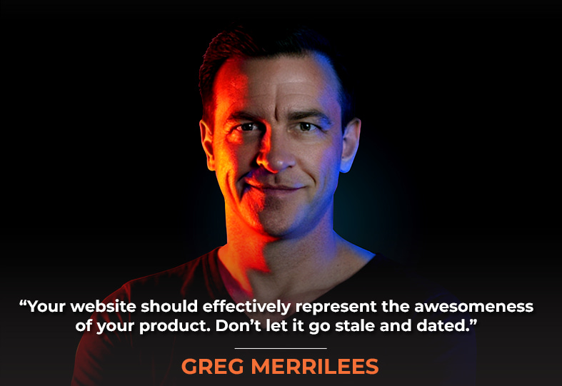
Successful e-commerce websites need a lot more than just look pretty —they need to be built with SEO and conversion in mind from the ground up. Greg Merrilees, my guest on today’s show, is the founder of Studio1 Design, a conversion-focused web design agency that has been crafting high-performing websites for over a decade. His team specializes in creating designs that prioritize results over aesthetics, helping businesses transform their online presence into powerful revenue generators.
In our discussion, we break down the complete website redesign & optimization journey of our joint client, The Tuttle Twins, which is attuttletwins.com. Together, Greg and I examine how their website evolved from a basic homepage featuring the founder’s children to a much more sophisticated online experience that supports their impressive 6 million book sales. We break down the critical elements that make e-commerce sites perform, including strategic use of social proof, impact metrics, and the power of identifying a common enemy to galvanize your audience. Greg shares some advanced Shopify features like side carts for upselling and bundle strategies that dramatically increase average order value. He also explains the importance of removing conversion-killing elements from checkout pages.
We discuss practical tactics for building communities around brands, the psychology behind consistent call-to-action colors, and why having multiple products enables powerful bundling opportunities that single-product businesses miss entirely. And so much more!
This episode takes a close-up look at the specific design, layout, and content decisions, as well as the strategic thinking behind a successful e-commerce website transformation, giving you actionable advice to improve your own website’s performance. So, without any further ado, on with the show!
In This Episode
- [05:10] – Greg Merrilees introduces the Tuttle Twins, an educational children’s book series that has reached 6 million copies sold.
- [09:52] – Greg walks through the outdated website design and explains how it failed to capture the brand’s growth and credibility.
- [12:27] – Greg highlights the new website features, including strategic social proof, impact metrics, and a bold section featuring negative press from CNN to build intrigue and authority.
- [25:04] – Greg showcases Shopify’s side cart upsell functionality and how it effectively boosts average order value.
- [30:24] – Greg compares the legacy checkout experience to the updated flow, pointing out key enhancements in user experience and conversion strategy.
- [33:53] – Greg and Stephan dive into community-building strategies, spotlighting the Tuttle Twins as a successful case study.
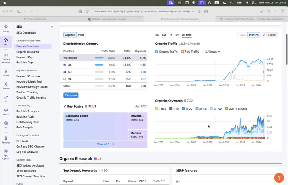
- [42:11] – Stephan demonstrates how SEMrush reveals strong organic traffic and keyword growth trends for the Tuttle Twins website.
- [47:25] – Greg offers practical website optimization advice, including staying visually current, leveraging testimonials, and integrating sidebars to improve conversions.
- [48:20] – Stephan underscores the value of bundling—even on informational sites—as a tactic for increasing user engagement and opt-ins.
Greg, it’s great to have you back.
The Tuttle Twins are amazing books for kids that inspire entrepreneurship, greater freedom, and a deeper understanding of history.
Yeah, it’s great to be back. Stephan and I’ve seen you do teardowns on stage live, which is hilarious, and hopefully, this won’t be like a full teardown because the products are incredible. The website didn’t really do justice to how awesome Connor‘s products are.
Teardown, maybe, isn’t the right word. It’s more of a behind-the-scenes deconstruction of what the process was, of a redesign that really took the site to the next level, but also combined with SEO that we incorporated from the get-go before even Studio1 was involved; we were doing SEO audits, tech audit, content audit, link audit, keyword strategy, all that sort of stuff. Develop a link-building plan and execute it, acquiring links from high-authority, high-trust websites over several months, which yields significantly better results.
If you look at SEMrush and the organic traffic and organic keyword numbers, it’s all up to the right, so it’s working for them. But let’s start with a little background, Greg, on the Tuttle Twins and what you saw as the opportunity for them to improve and uplevel their website, marketing, and conversion optimization.
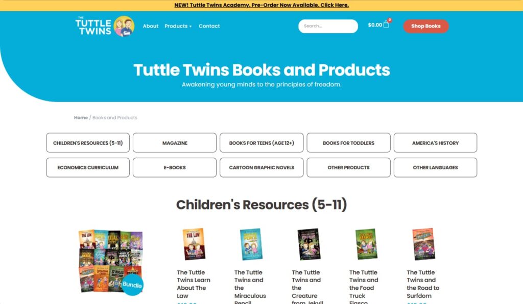
Yeah absolutely. All right. So, if you’re on a podcast, go to YouTube and check out this episode because it’s quite visual. This is their website before we redesigned it. According to the Wayback Machine, which we introduced last week as a resource to explore websites throughout history at wayback.archive.org, they had this design for a few years. But so this was it, right? So The Tuttle Twins is an incredible series of books for children, essentially, but it’s really for parents to buy for their children.
And they’re very educational, and they have a lot of books; I’ll just show you that they have a whole range, probably more than this now, right? But they’re good stories, and, yeah, they’re really well received, and they’ve sold, like, 6 million copies of these books, so they’re a big deal, right? But their website didn’t reflect that. And these were the author, or, you know, the creator of this business, Connor, his children, who are now probably 10 years older than that, and they just sort of ran with this for a while because I was so super cute, but it didn’t really sort of explain the core message.
The beauty of having multiple products is that it enables powerful bundling opportunities that single-product businesses often miss entirely. Share on XAnd then, when I was speaking to Connor. This is Connor with his family. I was speaking to Connor on the first call that we had with him. And, obviously, your business, Stephan, Netconcepts, did all the SEO. And maybe just talk a little bit about that quickly, because I’m thinking, I’m not sure what you did on the previous live version before we got to it. Did you do much SEO on this version?
Yeah. So we really did a lot of the strategy and the auditing, analysis and competitive research and all that sort of stuff. Then, they implemented a lot of the features over time, with some not being implemented until later, after the new website was launched. So I don’t know exactly what was implemented when, but one of the things that appealed to Connor about our working together on the execution side was that we could do link building without really any hands-on efforts on their part, so there’s nothing for them to really do, review, approve, or anything.

We just could be on autopilot. We handle all of it, whereas they’re very particular about the copy and about everything on their website, they’re very particular about so it would require their involvement to get stuff live, even if it’s just more in terms of meta descriptions and stuff that’s behind the scenes, even that they would want to have involvement in. So they were super busy, and they wanted stuff that was just on autopilot, and that’s why we shifted to just focusing on link building after all the initial keyword research and auditing and all that was done.
Got it, okay? Good to know. All right, and so, yeah, there weren’t that many pages at this point. They didn’t have a marketing funnel. They didn’t even have a lead magnet. So it was really just the books. And then, you know, they had an upsell through the checkout sequence. And was this initially built on WordPress, Stephan? Yeah. Okay, cool. When they approached us, they had initially considered using WordPress but ultimately decided to build it on Shopify.
They initially planned to use WooCommerce with WordPress for the E-commerce part of it but then switched to using Shopify. That was a decision they made later after Studio1 designed the site.
Yes, exactly. To clarify, we designed the website, but we didn’t build it. They organized the build themselves, and it is on Shopify. And yeah, it’s the best platform for products. And, yes, there are numerous things you can do with Shopify.

And then, just to interject here, something else that I think was kind of unusual about this engagement was Connor is good at web design development, and he’s built websites before. He could have taken on this project on his own, but he simply wasn’t time-rich enough to do so himself, so he wanted to rely on the trusted referral source that I provided, recommending Studio1, and then he engaged with you. So that was, I think, pretty unusual because most people don’t know all the ins and outs of the design and development side of things. They don’t know how the sausage is made. But Connor does, yeah.
Yeah, got it, yeah. Absolutely. He loves design and wants it done quickly. He still uses us for design today for various brands. We’ve designed a lot of things for him, but yeah, so look, the problem with the previous website was that it did okay in terms of conversions, but mainly when he ran a big promotion. Okay, so he has a common enemy, which is CNN, right?
So, let’s explain that for our listeners who didn’t listen to our previous case study, Episode 503, about Ware Landscaping, local services, and business. They may not be familiar with the whole brand, script, story, framework, or any of that. And they don’t know what you’re talking about about a shared enemy. Another way to frame it is as a common enemy, common villain, or shared villain that everyone agrees they dislike, right?
So government bureaucracy, I don’t think anyone says, No, actually, I kind of like government bureaucracy. You know, it doesn’t have to be a company or a person; it could be a system, it could be a methodology, or whatever. You could hate the idea of getting up super early to do your journaling and whatever that could be, just something you don’t like that other people like to do, but everyone rallies around like, “Hey, I don’t like that.” So, it’s a very powerful way to galvanize and build unity within your audience. Like, “Yeah, I feel that way too,” right? So, with that said, Greg, go ahead and elaborate more on CNN.

Yeah, and just on that. So it could be anything, just with Studio1, right? We design websites that are high-converting. We have an enemy, and that’s designers who just love all the fancy things, like parallax, animations, and moving elements, as well as video backgrounds. All that stuff kills conversions, which is essentially the opposite of what we design. So our enemy is designers who think that stuff’s really cool.
So, when we push back on that for a second, our enemy, the common villain, is the designers who create all the eye candy without considering its effect on conversion. Or is it the designs themselves that are not made with care and attention to conversion? Are you galvanizing your audience to really dislike the web designers? Or is it really the designs that people should dislike?
Again. So let me clarify, and we’ll get back on track to why this is important to this case study. But basically, for me, right? I like conversions. I want our clients to convert better. That’s essentially why we design websites; we love designing websites that look good, but you’ve got to get that balance right. The end goal is to deliver a better result for the client.
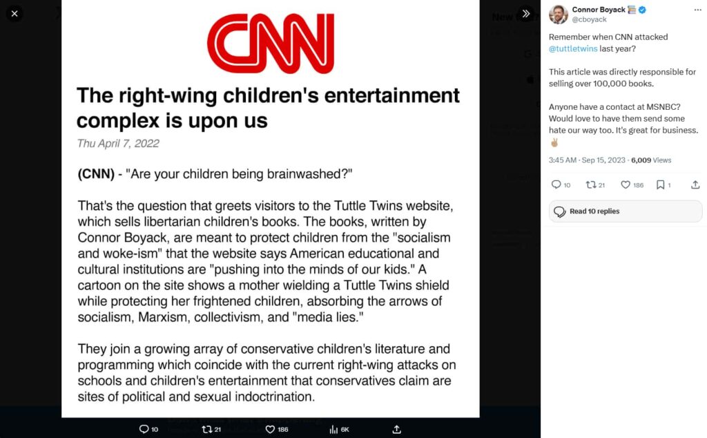
Now, whether it’s a designer or the actual design that those designers output, they’re not conversion-focused. So the real enemy is a non-conversion-focused design, one that focuses on being visually appealing rather than converting; that’s the enemy. So, back to this case study. So CNN doesn’t like the Tuttle Twins for whatever reason. They’re saying the right-wing children’s entertainment complex is upon us, blah, blah, blah, and they’re just having a whinge about the Tuttle Twins.
However, the Tuttle Twins also have fans who will do the opposite, and they will promote the Tuttle Twins. When they see some negative press about the Tuttle Twins, and then, off the back of this, people start saying nice things about the Tuttle Twins, they get a ton of sales, right? So this works really well for them. So, when he came to us, and thanks to Stephan saying, ‘Go to Studio1 for the redesign,’ he told us the story about the CNN posts. And every time they post negative things, I get lots of sales. So he said, “I want to do the opposite of social proof. I want to have, like, the anti-social proof on the page and really point that out, that CNN is our enemy, essentially.” So we’ll show you the redesign shortly. And yeah, there is a section for that, and it works really well. So that’s the thing.
So, where do you see it? On the old site? The mention of CNN.
It’s not on there.
But they did have the social proof of three and a half million books sold, and now they’re at 6 million. So they’re doing something, right? That’s a big increase.

Exactly, right? Yeah. So, when we redesigned it, yeah, I think it had 4 million sales at the start, which was three years ago. Two years ago, there were about two or three, and now they’re at 6 million. So, yeah, they’re doing something right. And I might just flip to the design and show you that section while we’re discussing it. Attacked by CNN, blah, blah, blah. And so I just love the fact that he wanted to point that out, and so that’s what we did in the design for him. Those are great.
It remains there several years later, which is why it’s still on the live site.
Yes, exactly. To clarify, this is the design we created three years ago. It’s exactly the same today, other than the color palette and maybe some copy tweaks. So this is our design, blah, blah, blah. And obviously, we designed every page of the entire website.
However, I’m going to switch to the actual live website right now, and it’s the same, except for the image and the different main blue color; the rest of the design remains the same throughout. So, I just wanted to point that out.
It’s because we did so a few years ago, and clients sometimes have updates to their brand style guides, which include changes to colors and other elements. But I still think this is a great design overall. Maybe this banner is too busy, but it’s probably just a temporary thing because it’s a summer reading sale.
There’s a big market beyond their core audience: parents who want their kids to learn real-world principles not taught in school.
Just a temporal sale. However, this is a significantly different look from their previous one, which is somewhat homemade. And this, I think, was not as effective by any stretch, building their credibility and winning people over who had just heard something about them but weren’t sure whether it was right-wing, and they’re not right-wing. They’re more kind of center line. And then they’re like, “well, actually, this isn’t too bad. Maybe I will try one of their books or buy a bundle.”
But the whole point here is there’s a large audience of people who aren’t just their exact core audience, ideal client avatars of homeschoolers, conservatives, libertarians, etc. There are just regular parents who want to teach their kids principles that are not taught in schools very well and are not taught generally in other books, things like the free market and entrepreneurism and how laws are made by the Federal Reserve and the money printing system like there are some really fascinating things that you’re not going to learn in school. Most books for kids are not going to teach you, but the Tuttle Twins will.
Yeah, that’s incredible content.
Yeah. And I read these books to my kid, to my youngest, who’s five, and he loves them.
Fantastic. Wow, very cool. So, yeah, 4505-star reviews, maybe even more. So that’s incredible.
Yeah, so that’s in the impact metrics. So that’s a really important piece that is common pretty much across all your designs is you want impact metrics as well as logo bars of either as seen on logos or affiliations, endorsements, clients that have big names, that sort of stuff really helps build the positioning and credibility before the user even start scrolling.
Spot on, and that’s what we’re trying to do above the fold. So it does look busy. It’s probably busier now because I have this banner, but yeah, and I think the banner does get your attention, so it’s doing its job.
We’re talking about the summer reading sales. So, if our listeners are only listening and not watching the video, they can certainly derive a lot of value from listening to this episode. However, they’ll get even more if they hop onto YouTube and watch the recording with the video.
Our enemy is a non-conversion-focused design—a design that prioritizes aesthetics over conversion. Share on XTotally yeah, and you’re right. Above the fold, we want to convey all that authority and back it up with social proof to demonstrate that these guys have a decent product and that people love it. So that’s even without scrolling. And then the copy is also extremely important. It’s all benefit-driven: empower your family with engaging stories that inspire freedom, entrepreneurship, and more. So, it’s a distinct point of difference from all the other books out there. And yeah, I just think it’s amazing what these guys are doing.
Then, they have a small section underneath the top banner, which includes their principles, a brief history, and current events. You can then simply link to relevant content. There’s a call to action that’s relevant to each one of those little junction boxes. And then they introduce the books after that. And there’s little buttons that you can press to go to, you know, various categories and things like that.
And they didn’t have any of those in the prior design, right?
Yeah. They had a version of it, but it just wasn’t as good. Additionally, there are three call-to-action here, but that’s because the target markets for the different offers are very different: books for toddlers, books for kids, and books for teens. So it’s kind of the quickest way to segment, and I think it’s fine, in this case, to have three calls to action. I wouldn’t normally recommend that, but it’s for a very good purpose.
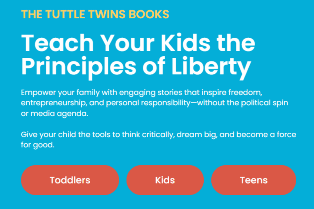
Yeah, because as a customer of the Tuttle Twins, I’m not interested in toddler books. The teen books are not anywhere near relevant, either. My son’s five, so that’s going to be years and years away. So I just want you to show me the kid’s books. That’s it. I don’t want to see all the other stuff that’s perfect, exactly.
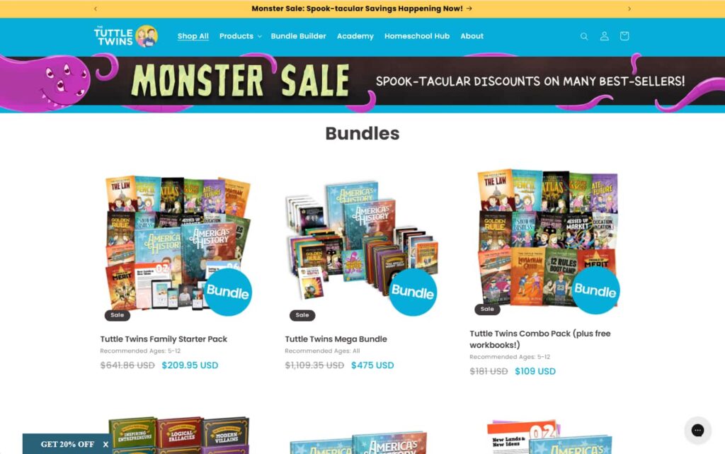
Now, we also know from speaking to Connor that their bundles work really pretty well. Okay, so we’ll get to the bundles in a minute. But further down the homepage, they do have, like, a bundle pack, and you get all the free bonuses. So we’re just going to click on that, and then we go to the actual bundle pack page. And so on this page, you know, they’re bundling it together.
This shows the price, the sale, and how much you save as well. It was $200 and is now $139, so you say, you know, $60 or so. And I think that it’s important to show what it was and what it is now, so people can see how much they save at the same price when you buy all 14 children’s books. To reiterate, they’re getting top value here, plus each of our PDF activity workbooks for free, which is another $70 value on top of that. This is all presented above the fold in the main call-to-action area.
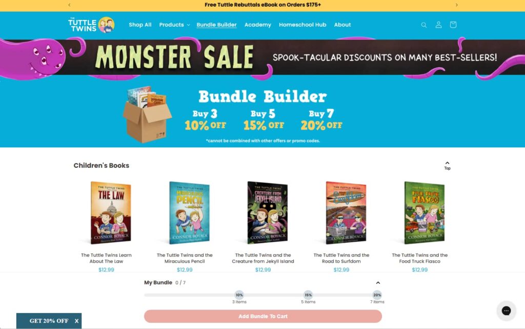
They also have a few small details: a 100% secure payment logo, a Satisfaction Guarantee logo, and a money-back guarantee logo. So, it just helps reduce the risk of all these things around the very close to the actual Add to Cart button. So that’s important.
Your team designed those icons. They’re not like stock icons, such as those for MasterCard, Visa, and American Express, which the same person designs.
Yeah, that’s exactly right, yeah, for sure, and yeah, actually, we’ll get to the actual check in a minute. However, essentially, yes, and also on this page. So a lot of product pages, like, if you got a majority of E-commerce websites, if they have, I don’t know, say, 50 products or more, and a lot of E-commerce have 1000s of SKUs.
Bundles don’t just increase order value, they simplify the decision for the customer and showcase value instantly.
They don’t put much effort into their actual product page, which is a problem for both SEO and conversions. The main reason is that you don’t want people to have to stick around the entire website to figure out if they can trust this brand, right? So, they might find this through SEO, search engines, AI, or other means. And then you just want them to be able to have all the information they need on this individual page.
So you’re talking about the value that they get from the bundle packs. And then, they go into each of the individual books and talk about what that book is all about and what the value is to the reader. So, it just goes into a lot more detail. And then they’ve got, like, another section on resources to build a bright future. And they go into as a parent, you know, you empower your children and all these sort of things.
And then they also reiterate their principles, you know, their history and all these things to reinforce the brand. You know, like, Who’s behind a brand and what they stand for? And then obviously, we’ve got, you know, you may also like it. They’ve made it this far down the pace or almost to the bottom. Well, then they can add other things to the cart, or they could view other products, etc. Then, at the very bottom, I would reiterate that it’s a money-back guarantee, unconditional, 100% refundable within 30 days.
Another thing too I want to mention is that Connor gave a presentation at Genius Network. That’s how I met Connor’s through Genius Network. Joe Polish was his mastermind, and he presented, kind of like, an inside baseball on how to build a successful authorship business that isn’t just making a little bit of money off of authoring your books. Still, your main thing is your consulting business, your agency, or whatever it is. It’s just kind of a big business card.
Now, he makes a lot of money from the Tuttle Twins’ books, and one of the secrets to success he shared was the importance of bundles having many books; if you just write one book, you are completely missing out. Suppose you write 10 books or even just a few books. So, there’s a series and a bundle that you can offer; you’re in a much better position.
One of the things I really liked that you did, Greg, and not just for the Tuttle Twins, but actually on multiple sites, including your own, is that you took the bundle concept for freebies and applied it in a really cool way. So, do you want to show real quick? I know we’re going off-topic for just a second here, but if you go to Studio1 and go to the Free Resources button on the top right.
This is your idea. Stephan,
Well, we’re all standing on the shoulders of giants. So we also have to give credit to Connor for this whole idea of bundles selling a lot more than individual books because when somebody can see that, here are five or six different ebooks that they can get for free from studio1design.com if they just click that button at the top, then they get the whole pack for free. They download all five together, which is really convenient and a no-brainer. Once you see it, it’s like the blinding flash of the obvious. It’s like beforehand, though, I don’t see anybody doing this, really, not very many.
There you go. Yeah, you gave us that idea from your book website. So yeah, but cool. So yeah, that’s right. And bundles do work really well for conversions, whether it’s a lead magnet or whether it’s for a product range. So yeah, it’s a great tip, Stephan. Additionally, I like that this includes not only the books but also the bundle of books; we’ll focus on the photos. I have a carousel of photos.
A well-designed product page should stand alone—build trust, show value, and close the sale without needing extra clicks.
Obviously, they don’t rotate through until you press it because we don’t want things to fly around like that until you actually make it move yourself. However, in the other three photos of the carousel, children are interacting with the books, which I think is really smart. That’s, you know, essentially just showing the end user enjoying these books, which is the goal, essentially. So, yeah, I really like that. But okay, so now we’ll just go through unless you want to add anything else on the product pages. Stephan just wanna go through the sort of checkout that they have.
Yeah, go further.
Yeah. Cool. With Shopify, when you press ‘Add to Cart,’ you can have a really cool feature called a side cart. And this is a great opportunity. Various plugins for Shopify do this. It’s a great opportunity for an upsell. So you’ve already got something in your cart, and then they have you may also like. And you add all these extra things, but you try and make sure, if possible, depending on what they’ve got in the cart. If you can add extra items to the cart, then they’ll save money by doing so. That’s essentially what the goal is here.
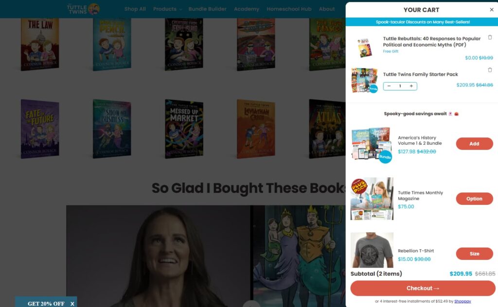
You can add these extra items with just one click, and it automatically adds them to the cart, which is really convenient. But yeah, put a few in there. You know. Why not offer them? I’ve just added four or three to the original purchase. And now it just keeps displaying other ones. So, you can simply keep adding them if you’d like.
These plugins are particularly powerful for increasing your average order value. And so I just want to point out this is on Shopify. This is the way it is. You can get back to the original cart, right? So, this is the actual shopping cart. Now, we didn’t design it to look like this, and this is probably just a lesson for people who do have E-commerce; if you don’t use a sidecar, or even if you do, and you still have this actual cart on a page, then there’s a lot of things that in this page are an issue, right?
However, most people won’t go here, so they probably aren’t concerned about it. I just want to discuss those issues, if that’s okay. Stephan.
A great ecommerce website doesn’t just sell, it builds a community around a brand. Share on XYeah, go for it.
Yeah. Cool. So, with your cart page, generally speaking, the only thing you want them to do is check out and go to the checkout page. That means removing all distractions and leakage points from this cart page and adding elements that will increase conversion.
So, at the top of the page, you just want to reinforce your brand. That’s fine. You may need a little, you know, cart icon, but you don’t need any of the top nav items at all, and you don’t need a search. And you definitely want to reiterate that in your banner because they’re in the cart already, so you don’t need to do any promotions whatsoever. So that’s above the fold, right? And then they continued shopping a little, which is fine. It doesn’t stand out much. That’s fine. But you can literally increase your conversions by putting a button to go to the checkout above your list of products. And Amazon does this, and that’s where we got the idea —to have a little button above the list of products and also below.
Now, when you scroll below the list of products in the cart, you have just one single call to action, essentially. So, they have a checkout call-to-action button, and then they’ve three different payment options underneath. And I don’t believe you need that on this page. Just have one. And then, once you go to the payment, that’s when you can have the different options.
And by the way, generally speaking, three different payment options convert the best for E-commerce. So you know, whether that’s Amazon Pay or Apple Pay or Google Pay or Paypal or Shop Pay. Generally, three works the best. Okay? It’s because of things like Google Pay and Amazon, and, yeah, they’re really quick because it’s usually just one click and you’ve made a purchase. So you’d have to enter all your personal details again, all right.

And then they have a money-back guarantee underneath, which is really smart. However, to me, what’s missing is also some social proof. And just reiterating, what is their USP, and, you know, is it a money back? Sorry? Is it free shipping and all the other things we mentioned on the previous page?? So we’ll just show you what we had. And mind you, if you remember, what we said earlier was that we were building, so not building. We were designing this, thinking it would be built on WordPress with WooCommerce. I think they just call it woo now.
However, before the sidebar idea, we were trying to have users add products to their cart, and then we had a little slider bar. It was not really a slide, but rather a small indicator that shows if you add more to your cart, you’ve got $25 in your cart right now. If you go to $75, you’re going to get free shipping. If you go to $100, you know something else, and this was just the design. However, the point is that we’re trying to show that if they just add more to the cart, they can get free shipping. Then, you have a call to action to add more to the cart, and you can also add various other items to the cart.

It’s essentially a progress meter for reaching shipping.
Yeah, exactly. And kind of gamifies. It looks like it’s gamified, yeah. So then, it goes to the cart after that point. And this was the cart that. This is the way we designed that cart, essentially. So, at the top of the page, you’ll notice there’s nothing in there other than the actual total. You have a Proceed to Checkout call to action button above the items, and that’s kind of it. And then underneath frequently bought together. This was our upsell version before the sidecar idea, okay?
And then, yes, we reinforced the payment icons, the 30-day money-back guarantee, and some social proof underneath that, and that’s it. The footer, as well, has nothing in there other than the legal stuff, the terms and conditions and the privacy policy, and when pressed, they would open in a pop-up on this page to keep people on the page, and they don’t leak off to an individual privacy page, et cetera.
Is that coded on the live site?
Well, let’s have a look. I doubt it because this is a site-wide foot.
It’s the site-wide footer, with all the social chiclets and everything, too.
Yeah. So the answer is no. In fact, I think that might be a problem with that, but yeah, let’s check the terms. Yeah, no. So, there you go. I’ve gone to the terms page, and yeah, I’ve lost my cart. That’s a problem. Yeah. Cool. All right. So they’re the type of things we fix. Or, you know, if we build it, we would be aware of these things. We make sure little things like that don’t happen.
Social proof should be reinforced at every stage, from checkout to the about page, to reduce doubt and build trust.
However, the beauty of the Shopify checkout is that I’ll just go to the cart now and check out. All Shopify checkouts that look identical to this layout. If you’re watching on YouTube, you can see this on the screen right now. You have a banner at the top for your branding. You can change this to an entire image, and we recommend putting in, like, some social proof up here as well, just to reinforce a little bit of killer testimony or some impact metrics to show you know how many books you’ve sold, so people don’t feel alone. And then, essentially, yeah, you just have this on one side for the payment information, which is pre-loaded, so maybe blur that out, but on the other side.
It’s just a summary of all the things that I’ve added to my cart. Wouldn’t they love it if I purchased that right now? Cool, but all Shopify checkouts look identical to this. There are opportunities to put upsells on the left-hand side, but yeah, generally speaking, that’s it. However, you might also find really clever plugins, such as Ezra Firestone‘s OneClickUpsell. So, even after you pay, it’ll have a pop-up that asks you if you would like to add this to your cart now. Then, it’ll simply deduct the amount from your card. It kind of delays the purchase after you press ‘pay.’ Now, it’s pretty smart, and it really does help increase the average order value. So check that out: one Click Upsell by Ezra Firestone, Smart Marketer.
Cool. So yeah, that’s there. That’s what I would show you from an E-commerce perspective. You know, there are various ways to filter products on an e-commerce website. If you have a lot of products, filtering options are probably limited, as these sites typically don’t have a wide range of products, so there’s not a lot of filtering available. However, generally, with E-commerce, I find that having a sidebar down the left with various filters is the best way to help people find things quickly. Alternatively, you can have a product wizard that guides you through a series of questions to filter out the final product based on your criteria. So, anyway, I just thought I’d mention that, Stephan; I also wanted to mention their about page and their podcast and blog post page, compared to what they used to have.
That’s going to be great. What a difference.
Cool, awesome. And by the way, this is their role. I took screenshots from the very old site before we redesigned it. And yeah, this was their cart back then, and this was their upsell little pop-up. And, yes, they then had WooCommerce for the actual checkout.
Lead magnets should invite people into your community, not just offer a discount.
What a difference.
So, all right, and this was their about page. I can’t scroll. Oh no, yeah, I can’t scroll because there’s nothing else. It’s just a screenshot above the fold. But that was it, essentially, right? So, if you watched our last episode, where we reviewed the landscaping website, we showed you the timeline. And, like I said, we do this on a lot of clients’ websites because it’s just so impactful. So I’ll just show you.
So this is their about page. That banner, the promotion banner, is site-wide, so it’s, yeah, kind of at the top of every page, but yeah, so on their about page, they reiterate their USP and what’s unique about them. They segment to get people to their books, but underneath that, they have a social proof video and then a bit about their mission, which I think is extremely important.
And by the way, they build a massive community around their brand. I mean, there are so many customers, and they have podcasts that show you the podcast page. They built more than just books like; it’s a whole community around your brand. I believe that the essence of a really good e-commerce business is to build a community around your brand. So if you have a lead magnet, for instance, most people have, like, pop up, buy, get 10% off, or instead of that, you could ask people to join your community and get a discount, or whatever else you want to offer them, but yeah, position it around building a community as opposed to getting a discount.
Yeah, and communities can take different forms. They could be a community, a Facebook group, or Encircle or Skool, with lots of different options. And also just, you know, having them post comments and reviews and things like that on your website is a bit of community as well.
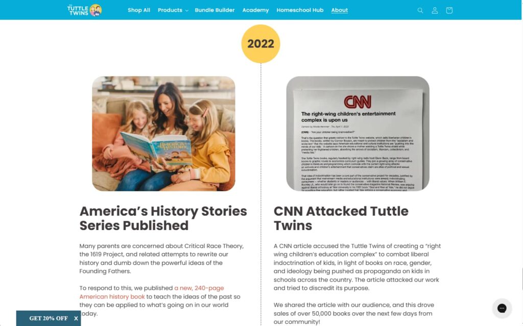
Yeah, I couldn’t agree more. Absolutely. So yeah, then they have just a little bit from the owners, which I think is really cool. And then, they go into the timeline journey that led them to this point. So, yeah, they started the Tuttle Twins in 2014, and there have been various milestones since that point that have helped position them as the trusted authority and knowledgeable experts in this space. So it’s pretty cool. And he talks about the enemy again, attacked by the socialist magazine. I love that. He just calls out his enemy all the time.
That wasn’t CNN; that was current affairs.
That was different. Yeah, exactly.

However, they were also funded by Shark Tank. I think if you go up to the milestone around 2018 or so, 2019
Yeah.
That’s amazing.
Think Tank, Shark Tank. That’s pretty cool.
Think Tank, Shark Tank, okay, so that’s different from the Shark Tank TV show, but still, I mean.
I think it is, I think it is, yeah, it’s still, it’s a great milestone. Pretty cool. Exactly. And then, yeah, in 2020, 1 million books will be sold. 2025, they’re at 6 million. It’s incredible. So yeah, that’s the result of having a community around your brand, doing a lot of marketing, obviously, and having a website that converts, yeah.
Building a community around your e-commerce brand is the secret sauce. This isn’t just a store; it’s a movement.
This is more than just a tribe or a community. This is a movement.
It really is, yeah. I mean, it’s part of The Libertas Network. And if you go to The Libertas Network website, yeah, they’ve got a whole range of brands for different segments of the market, but it’s all around a general mission that they have, which is pretty cool. If you’re interested, go check it out. Yeah, so that was the About page.
I think having a little message at the bottom of the page, one dad wrote this, it’s really heartfelt. One mom wrote this; it’s really heartfelt. So yeah, check out this about page if you get a chance and read all the details because it’s pretty cool. And he also mentioned the CNN attack again, which I love. That’s the About page. And then Stephan, you do a lot of work with content pages. So I just wanted to point out, you know, they even have a podcast, you know, for The Tuttle Twins Podcast, which I think is pretty cool. They should probably have individual podcast post images for each episode rather than just the logo.
Yeah. So, each episode could have its own episode art instead of just reusing the same podcast cover every time. That’ll add some variety.
Exactly, and seven designs in general. What we’re looking at now is their previous website for their blog posts, essentially the layout, which had no design, and it just feels so boring. So, I mean, if you take a look at any of Stephan’s podcast websites, let’s say, and Get Yourself Optimized. The level of detail in that is incredible. The level of effort, the multimedia, and everything that you do there is super helpful. But so we went just from that to this, essentially, which, like I was saying before, they didn’t have any lead magnets, so now they’ve got a range of lead magnets. And all the lead magnets, you know, would lead to a thank you page that has an offer on there. But yeah, so it’s just a little bit more of a marketing, a little bit of social proof on there as well. It’s pretty basic.
But it looks so much better.
Looks so much better than it was, totally. Yeah. And it would rank better as well, and they got breadcrumbs and all those things that help. So, yeah, I think, look, that’s everything I really want to share, as far as I mean, when we, you know, we first started, we do our usual process, have a call with a client, our brand director didn’t do a full mood board this time but gave design direction to the design team, and then we do our magic from there and send to the client, and obviously work with the copywriter to write all the amazing copy, which is super important for a website.
A consistent call-to-action color trains the brain. People instinctively know what to click next.
You know the old adage, the devil’s in the details. And there are so many details, so many details, for example if you go down to the footer where the social chiclets are. The YouTube chiclet leads to the YouTube channel for the Tuttle Twins, but it doesn’t have a question mark at the end of the URL. ?sub_confirmation=1 which automatically directs the person to the subscription pop-up on YouTube, stating that you’re confirming you’re going to be a subscriber. So you’ll get more people saying, “Oh, yeah, I’ll do that,” because it’s as if they had clicked the subscribe button inside of YouTube.
Now, it didn’t automatically subscribe to them. It just took them to the confirmation prompt on YouTube. Still, you will get a lot more subscribers just doing something as simple as that if you’ve got a website with a fair amount of traffic, so there are so many details, and especially if you’re not going to use, let’s say, my team and Studio1 for the coding portion, which is a past client for Netconcepts. So, we aren’t actively working with Connor at the moment. Still, you know, these sorts of things can be missed or undone accidentally by somebody who doesn’t know what they don’t know, like an internal web developer person or a VA or a new web design contractor that you’re bringing on board. So yeah, these details are important.
They are, indeed; it’s a good point, like mentioning it just for the sake of it. However, the call to action color stands in stark contrast to everything else. Additionally, a consistent call-to-action color is used throughout the entire website. And I find that’s a big mistake. I often see websites where they’ll have multiple different call to action colors on various pages. It just doesn’t work as well because when somebody clicks a call to action on a website, that trains their brain into looking for that next same color call to action button with a similar style, so, yeah, it’s just a little thing that is a psychological trigger to make sure everything’s consistent, from call to action button colors to the color palette on every page, to the font used, just to everything, to reiterate, building trust in the brand and making it easy for people to convert essentially.
If you’re serious about SEO, tools like Semrush and Ahrefs are essential. What gets measured gets managed.
Yep, yeah, awesome. So it’s something I want to show on my screen. Okay, so this is Semrush. Ahrefs is another tool that, or toolset, is similarly awesome. I’m just pulling up the domain overview for Tuttletwins.com, and specifically, I want to point out the organic traffic trend and the organic keywords trend graphs, which look pretty healthy and trending upward. That’s what we want to achieve: an upward and to-the-right graph showing the amount of traffic you’re getting and the number of keywords you’re ranking for.
Now you can untick these different check boxes under, let’s say, organic keywords to say, Well, I just want to see the top 10, or I don’t want to see positions 11 through 20 or anything past that. I just want the top 10, or I want to see the SERP features over time and see how that’s been growing. And so, you know, there’s a lot of ways that you can kind of dial in to get more specific data, you know, actionable metrics, because, let’s say you’re not moving the needle with SERP features, which are search engine results page features, such as the mentions and people also ask boxes and image results and things like that. What are the SERP features, and do you want to make some improvements? Well, what gets measured gets managed.
So if you start measuring that with a tool like Semrush, and you start making changes and improvements to hopefully move the needle in that regard, and then you see things that are working and not working based on the results that you’re getting in tools like Semrush, then that will give you the insight to make further changes and undo the things that didn’t work or kind of went sideways. So this is, this is an essential tool, like, if you’re going to if you’re serious about SEO and getting organic traffic, then you need to be using a tool like Semrush or Ahrefs either one, you’d be in good shape using.
What were some of the key things you did to boost that traffic by so much?
So when we conduct a comprehensive audit, we’re actually auditing. These are three audits. In one, we conducted three separate audits: the content audit, the technical audit, and the link audit. And when you look at things like content issues with regards to headings and subheadings, meta descriptions, the usage of keywords in the page, thin content, and duplicate content.

There are a lot of content issues that are discovered when we do this deep dive analysis, and then that stuff gets fixed, and some things you just won’t know unless you use an expert. For example, maybe on the technical side, you have a 404 error page that looks like all pretty custom error pages, but it doesn’t return a 404 status code in the HTTP header. It returns a 200 status, which is similar to any other web page.
And so now Google bot can get confused and think that your website has no edges to it. It’s an unlimited, limitless website where nothing is an error; everything is a web page. That’s a minor configuration setting that most people wouldn’t even think to check. We’ve found major websites that had this problem, websites that mistakenly had misconfigured their HTTP status code and error page.
So there’s a lot of stuff that needs to be looked at, hundreds and 100 1000s, really, of things across these three audits. Yes, getting that stuff prioritized and implemented is crucial. Not everything deserves to be implemented because it won’t move the needle enough, even though it’s supposedly a best practice. But if it’s not really going to have an impact, why are we doing it?
Yes, and you mentioned thin content pages before; what do you do with them? Do you base them up or delete them?
That depends on whether it’s something that can be improved. And it makes sense. This is all in the larger context of what we prioritize. What are the big needle movers? If we believe it to be a big needle mover, then it’s worth it. However, if it’s unlikely, for instance, it’s something that was a trend or a topic relevant 10 years ago but is certainly not today. Delete it, or at least not index it. So, take it out of Google’s big database so it’s not wasting your index budget and crawl budget.
Got it very cool. Stephan, all right, well, should we leave it there?
Yeah, so let’s just kind of wrap up by sharing some of the most actionable tips from this analysis of the Tuttle Twin’s new website versus the old one. What are some of the immediately actionable best tips that our listener or viewer got from this episode? Let’s reiterate them.
Yes, I mean, look, I would say that number one: if you have an awesome product, your website needs to represent that. Don’t let it look too old and dated. And obviously, you want to build a community around your brand if you’re going to need e-commerce products. Additionally, I suppose one of the key tips was that the sidebar is extremely beneficial and converts very well. So yeah, definitely put a sidebar on.
Your website is never truly finished. Keep stats fresh, update your palette, and fine-tune details as your brand evolves.
But generally speaking, the more social proof you get. Just keep adding that back to your website. You saw that they had 4,505-star reviews, and they increased from 4 million to 6 million since we designed the book. Like constantly update those types of figures as you grow and, yeah, just keep your website updated as well, so it’s always current. As you can see, we designed it, and then they updated the palette to align with their more modern brand style guide, making small adjustments like that. Just keep your website current and realize that your website’s never, ever finished.
And look for opportunities to bundle; even if you don’t sell anything, it’s an informational website. You can bundle free PDFs and guides and white papers and get more people opting in because they see a stack of value instead of just one thing at a time.
Great tip.
All right, so that’s a wrap. Thank you, Greg; again, let’s remind our listeners of your website.
Yes, visit my book website, nextlevelwebsitedesign.com, and you’ll find an opt-in for the free content there. Or check out my website. studio1design.com. What about you Stephan?
Oh wait a second, don’t you also have a personal brand website that you recently launched?
Awesome. And everyone has a personal brand because everyone who’s listening is alive. So it’s now time to nurture your own personal brand in the age of AI, where we want to still differentiate ourselves and hopefully stay relevant and employed or gainfully in business, so work on that personal brand, too. So gregmerrilees.com
And then on my side, my agency’s netconcepts.com and my personal brand site are stephanspencer.com. There’s a lot of SEO and digital marketing information on that site, too, so it’s kind of a pseudo-agency website as well. And then my podcasts, of course, marketingspeak.com and getyourselfoptimized.com, which are all studio-produced, and I’m really proud of them. Thank you so much.
Thank you, listener. Have a great week. Make it a great week. We’ll catch you in the next episode. My name is Stephan Spencer, your host. Signing off.
Important Links
Connect with Greg Merrilees
Connect with The Tuttle Twins
Apps/Tools
Book Bundles
Businesses/Organizations
People
Previous Marketing Speak Episode
Previous Get Yourself Optimized Episode
YouTube Videos
Your Checklist of Actions to Take
- Display my most impressive numbers (books sold, reviews, customers served) prominently in the header area before users scroll. I combine this with logo bars showing “as seen on” media mentions or client logos to immediately establish credibility and authority without requiring any user interaction.
- Find a shared villain that my audience rallies against, whether it’s a competitor, system, or methodology that frustrates my market.
- Create product bundles rather than selling individual items, as bundles consistently outperform single-product sales. I design bundle pages that display the individual price versus bundle savings, making the value proposition immediately obvious to customers.
- Implement Shopify’s side cart feature with plugins that allow customers to add complementary products without leaving their current page. I recommend showing “you may also like” items that can be added with one click, keeping customers in the buying flow while increasing their cart value.
- Strip away navigation menus, search bars, promotional banners, and any links that could lead customers away from completing their purchase. Design cart pages with only the essential elements: a product list, checkout buttons, and trust signals such as guarantees and security badges.
- Choose a single, contrasting color for all my CTA buttons across every page of my website. This trains users’ brains to recognize and look for that specific color when they’re ready to take action, creating a psychological trigger that improves conversion rates.
- Build a community around my brand, not just discounts. I create lead magnets that invite people to join my community while receiving value, which creates stronger brand loyalty than discount-focused relationships.
- Design each product page as if it’s the only page a customer will see, including full brand story, social proof, and value propositions. Everything they need to make a buying decision should be on that single page.
- Gamify the path to free shipping with progress indicators. Implement a visual progress bar showing customers how much more they need to spend to qualify for free shipping or other perks.
- Reach out to Greg Merrilees at studio1design.com for website design projects, or visit gregmerrilees.com for personal brand content. He also offers free resources, including multiple ebooks bundled together at studio1design.com/free.

About the Host
STEPHAN SPENCER
Since coming into his own power and having a life-changing spiritual awakening, Stephan is on a mission. He is devoted to curiosity, reason, wonder, and most importantly, a connection with God and the unseen world. He has one agenda: revealing light in everything he does. A self-proclaimed geek who went on to pioneer the world of SEO and make a name for himself in the top echelons of marketing circles, Stephan’s journey has taken him from one of career ambition to soul searching and spiritual awakening.
Stephan has created and sold businesses, gone on spiritual quests, and explored the world with Tony Robbins as a part of Tony’s “Platinum Partnership.” He went through a radical personal transformation – from an introverted outlier to a leader in business and personal development.

About the Guest
GREG MERRILEES
Greg Merrilees is the founder of Studio 1 Design. He’s passionate about really good-looking website design that gets results!


Leave a Reply