


Website redesigns can make or break a business’s online presence, especially when a decades-long reputation hangs in the balance. Greg Merrilees, founder and managing director of Studio1 Design, returns to join me in a compelling transformation story, the 5th in the series of case studies. His design agency partnered with my SEO agency, Netconcepts, to completely overhaul Firefly Legal’s web presence—a 27-year-old civil process serving firm that needed its digital presence to match its professional standing.
In our discussion, Greg and I break down the critical questionnaire process that will uncover a client’s true objectives and competitive positioning. Greg walks through the before-and-after transformation, revealing how generic stock photography and faceless branding were replaced with authentic team imagery and trust-building elements. We explore the strategic funnel design that guides visitors from initial curiosity to booked discovery calls, including the often-overlooked thank you page optimization.
We cover essential trust signals and exit-intent pop-up strategies that capture departing visitors. Greg demonstrates competitive analysis tools and explains how hosting choices impact performance. We examine the impressive results, including a 4x increase in quote requests and substantial organic traffic growth.
This value-packed episode reveals actionable strategies to transform your website into a conversion-focused sales machine that works around the clock, so without any further ado, on with the show!
In This Episode
- [03:02] – Greg Merrilees highlights why a modern, relevant website is essential to avoid looking outdated. Stephan adds that a credible, professional site is key to converting referrals into clients.
- [10:08] – Greg outlines the client questionnaire process designed to clarify objectives and pinpoint competitive advantages.
- [14:24] – They stress the power of showcasing real team photos to build trust and reinforce key metrics.
- [16:55] – Stephan breaks down the design and copy strategies behind the revamped website, boosting both usability and SEO.
- [20:27] – Together, Stephan and Greg underscore the importance of concise, benefit-focused copy tailored specifically to Firefly Legal.
- [23:49] – Greg unpacks the role of the ‘thank you’ page and the value of integrating third-party tools for a smoother user experience.
- [34:45] – The duo explores the careers page, emphasizing how it reflects company culture and perks to attract top-tier talent.
- [36:29] – They review the impressive results: increased quote requests and significant organic traffic growth from the redesign.
- [44:14] – Greg reflects on his biggest insights gained from developing the Firefly Legal case study.
Greg, welcome back to the show.
Thanks for having me back. Stephan, it’s awesome to be here. This is a good case study. I believe the listeners will derive a great deal of value from this. Suppose you have a service business, for sure. If you don’t have a service business, please share it with somebody who does if they want a better result from their website.
I think any business, whether it’s E commerce or just informational, just like an ad supported site, anybody who has a website would benefit from this episode, because there’s so many really cool tips and tools that we’re going to be talking about, and strategies, tactics, different kinds of techniques that apply to any website, not just a services website.
Let’s provide a bit more background on Firefly Legal, so they have a sense of where Firefly stands in the marketplace and how it differs from other types of professional services companies. And then we’ll delve into what the site looked like, how it functioned previously, and what the major issues were. Many common mistakes found on most websites are also present in the old version of Firefly Legal. And then we’ll go into what your process was to redesign them.
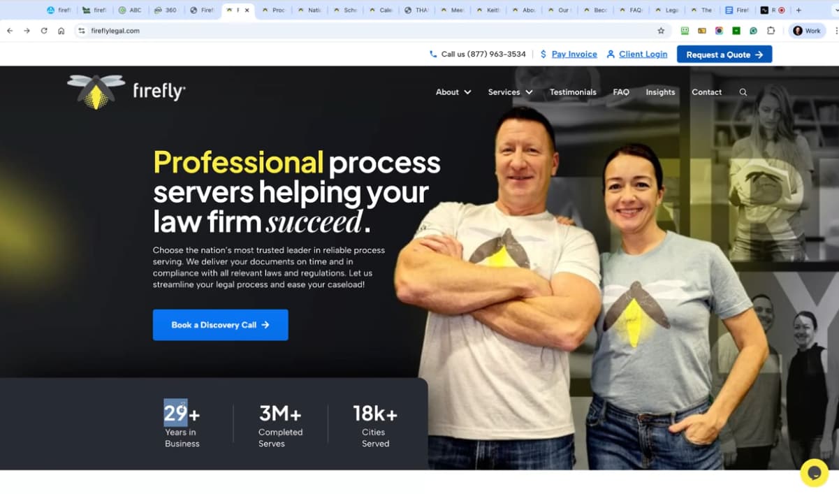
Even if your business has a long history, if your website looks dated, people will think you're outdated — or worse, out of business. Share on XSo Firefly Legal is a civil process serving firm, meaning that if you need skip tracing, court filing, document retrieval, mobile notary service, any of that sort of stuff, especially if you’re in the law industry, like a law firm, you’re going to need Firefly’s services. They’ve been in business since 1996. They have a strong industry reputation and not a lot of serious competition. So that’s good for them.
However, their old website was quite generic-looking and did not effectively differentiate them from their competitors. Did not make them look as professional and high-tier, high-level as the competition. So, the strategy was not in place to effectively convey that high-caliber reputation in a way that was clear when you visited the website. So that’s why, when I started talking with Keith, the CEO and founder, he needed a redo. He needed a new website, and I knew just the guy to introduce him to. That’s what I did in October 2022, and you guys came on board and started the redesign work in 2023. So, why don’t you talk about your process, what the big issues were? Why did they need a redo of their site?
Yeah, absolutely. This is a business with a rich history, and they likely have a substantial number of referrals, so they probably didn’t think their website needed much attention. But it obviously works against you if new prospects are coming to your website, and because they’re investing in SEO, there are a lot of new prospects finding your website all of a sudden. Therefore, the branding, the look and feel, can’t look dated. Although the business has a history, it still needs to appear relevant and fresh today. Otherwise, people might think you’re outdated, right? So that was the problem initially.

This is important for our listeners to understand that even if all of your business comes through referrals, some of those referrals will not actually call you, because they’ll go to your website and think, “Wow, these guys are not up to date.” Or “Are these guys even in business? Or are they legit?” Those wonderful referrals that would have come in were stopped in their tracks because they were unimpressed with your website. Therefore, it is essential to have a credible, professional, well-designed, well-maintained, and well-curated website.
Yeah, I couldn’t agree more. And you know, they do have history, but you wouldn’t know that by looking at this website. It doesn’t really talk to that quite easily. You have to dig deep to see that. “Oh, yeah, okay, they started in ’96,” but it’s kind of hidden, right? However, that’s just one of the aspects it lacks. With all the trust factors that we implement in the new version, we also consider the messaging, which emphasizes that these are people dealing with people, right? And if you look at this, it just feels like just a faceless brand. Yes, there are no people on this, and it’s a service-based website. And they help people. They need to build a lot of trust in their brand because they help people with legal documents.
And with civil process serving. So, yeah, a person shows up at somebody’s doorstep and gives them a document that they probably don’t want to receive, like being served in a lawsuit. So it’s not the lawyer who will be presenting that document to the other side. It’s Firefly legal.
Questions like, ‘What are your main goals and objectives for your new website?’ help clarify the client’s unique value and bring focus to what sets their business apart.
Yes, exactly. And so yeah, the first impression for people is quite lackluster. And so that’s the look and feel.
You mentioned trust signals briefly. We’ve discussed this in other episodes. However, if someone hasn’t listened to our other case study episodes, what are trust signals?
Yeah. So anything that, when somebody lands on your site, they get a really quick understanding of why they should trust you. Essentially, that’s the goal of the trust signals. But that could be anything from how long you’ve been in business, how many clients you serve, the clients that you’ve actually served as in the logos, or anything else depending on your industry, that’s going to help showcase your authority level, essentially, just as a really quick overview when you just visually look at it. We’ll show you what we did in the redesign shortly.
By the way, if you’re just listening, please go to YouTube, as we have a full video there where we share our screen and show the before and after. So then the messaging as well. It’s very much just, here’s what we do, from process serving to court filing, our personal attention, blah, blah, blah. It’s half decent, probably good for SEO, but there’s no real emotional connection in that. There’s no real point of difference from their competitors, so their copy lacks the personality needed to effectively showcase their unique selling point. So, yeah, the copy and the design. The SEO probably had some issues as well. Stephan.
We had several issues, but we began addressing them several months before your launch of the redesign. So, yeah, we were laying the foundation with new content, keyword research, and a technical audit to identify underlying foundational issues with the website’s structure.
Got it, yeah. And then there was no real strategy or a book, a call funnel. It was literally everything. I just went to the contact page, the ‘Get a Quote’ section, and the ‘Request a Quote’ section. Pretty much everything just went to the contact page. So. We’ve just built a little funnel for them that builds massive trust in the brand through video and various steps for conversions, which we can also unpack.
We’ll definitely want to unpack that so that our listener or viewer, if you’re not viewing this episode. Still, if you’re listening, you’re missing some key information, so you’ll want to watch the YouTube version of this episode, which includes a screen share, allowing you to see us go through the different pages of the site and learn from and apply this to your own site.
You want prospects to see themselves in the copy because that’s when it becomes powerful.
Therefore, our process involves a call with the client. We send them a questionnaire that includes a lot of questions about their existing business, their offer, their target market, what they like in a website, design, their funnels, lead magnets, and other relevant aspects of their business. Essentially, we aim to break down the larger picture. We then record the call, transcribe it, and run it through AI to formulate our plan for the designer. And then, we involve a copywriter. Then not from our team. We didn’t do this copy. But the point is, working with a copywriter who really understands the client and their business on a deep level is a game changer. Essentially, if you put the right copy on the page.
Can we review a sample set of some of the questions in your questionnaire? Because it’s so good, it really gets the client to think deeply about their website and what they’re trying to achieve and so forth. So you just kind of rattle off a few ideas, but I’ve got the questionnaire pulled up, and I love these questions. For example, describe your main goal and objectives for your new website. What’s currently working well on your existing website? What’s wrong with your existing website? Do you have a risk reversal strategy? Yeah, what are your competitors doing well? What could your competitors do better? How is your business different? Like this is great stuff. This really helps crystallize their unique point of difference, where they’re lacking what they’re trying to achieve with the new website. It really gets them to show up more intentionally.
Yes, and they’re the first two sections. Then we move on to the target market, discussing who their target audience is, including their age, gender, role, socioeconomic status, and any other defining characteristics that represent their target market. Then we go into the problem that they solve for their audience.
There may be multiple issues, but we want to focus primarily on the number one problem. You know, how do they benefit from your offer? What? You know, what their target audience’s heaven is like, and then what their hell is like? It’s usually the opposite of other questions, like, what motivates them to choose you? What implications do they have if they don’t purchase your offer? And what are some barriers stopping them from buying from you? All these things really help guide the copywriting to put that into the page, so that when other prospects come to the website, they can see themselves in that copy, you know, so it’s quite important. There are a bunch more questions as well.

It’s such an important initial part of the engagement, and it guides not just the copywriting, but also the design, layout, flow, funnels, and all the various steps in the buyer’s journey that are coded into the website. This is valuable. For example, if you’re using generic stock photography on the homepage and it doesn’t relate to the problems, situation, and environment of the ideal client avatar. That’s a mismatch.
It is, indeed. Yep, absolutely. And these days, with AI, we shouldn’t need to rely on stock AI to generate incredible images.
If you prompt, you can include their favorite books in the photo, such as a bookshelf behind them. It’s amazing why you wouldn’t use AI? I just can’t think of an answer. Simply select a stock photo from Pixabay or Unsplash. No, like, put their favorite stuff in the background on the desk and the bookshelf and the people that inspire them, hang those pictures of those people on the wall in a picture, and stuff like that. That’s now so customizable, thanks to AI.
The goal of trust signals is simple: when someone lands on your site, they should immediately know why they can trust you. Share on XYeah, we’re having so much fun with it. Even down to the branding, it will all be photography that we’ve created based on the target market, their problems, and the solution. We simply brand the photos within the color palette and the mood we want to evoke. Like, it’s really powerful. Yeah, it’s very exciting. What we’re doing these days is we designed the Firefly website a couple of years ago, and so we weren’t using AI back then. I’ll show you the after design in a minute.
However, it still didn’t matter, because we wanted to address the issues that were lacking, specifically the lack of personality and a lack of people behind the brand. Now, on my screen, I’m sharing what the after-design looks like on their homepage. I’ll just refresh so you can see this little bit of animation that catches your attention on these impact metrics, located at the bottom of the main hero banner above the fold on the homepage.
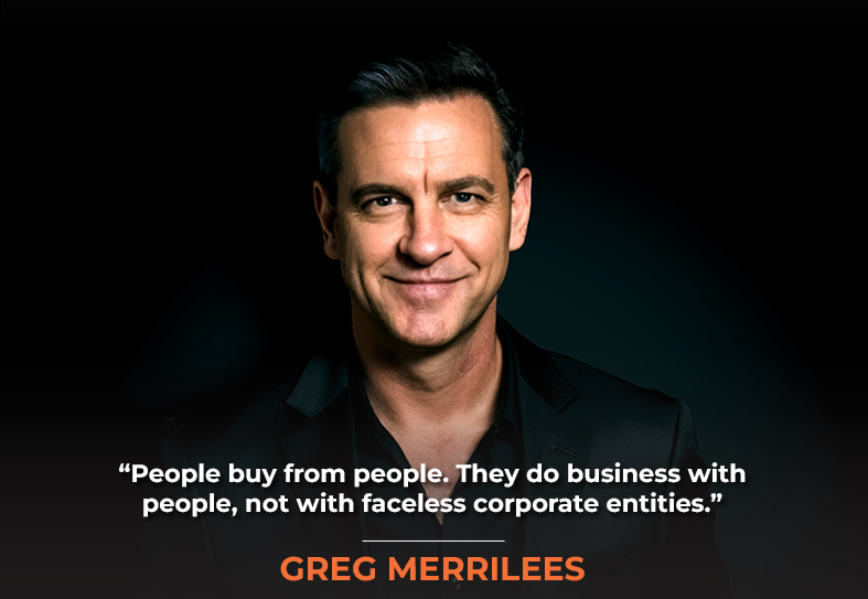
The reason we do a little animation on load is to capture your attention realistically without overpowering it. We wouldn’t recommend using image sliders, video backgrounds, animation, or other similar elements, as they can be too distracting. However, if it’s a little distracting and draws focus to the social proof, that’s a good thing. Yeah, so, but yeah, real photo of the people behind the brand, you know, and they look approachable. They’re wearing their brand in T-shirts, you know, but it’s just real. And look at this. I’m just going to quickly scroll. We’ll come back and unpack the various elements, but you’ll see that there are just a lot of real photos throughout the team at Firefly. So, yeah, it makes a huge difference when you show the people behind the brand, which helps build trust in the brand. The people behind the brand, essentially.
Because, as they say, people buy from people. They do business.
Yeah,
People, not with faceless corporate entities.
Exactly, exactly. We love their logo, just like the actual Firefly logo, so we utilize it. We also use the same color palette, but introduce a contrasting color for the main call to action in blue, which complements the palette. And it’s, yeah, it’s highly contrasted compared to the rest, so it gets your attention. That’s above the fold, obviously, in the top navigation. It’s probably similar to what they had.
Your website is your number one asset. Treat it like a silent sales machine that works for you 24/7. Share on XIf we just do a quick compare, we probably simplified a little bit by removing technology. I’m sure that’s probably just some advice from Stephan to say, ‘roll that into insights,’ or whatever the case was; it’s probably unnecessary. The primary goal of the top navigation is to simplify it and make it logical for users, so they understand exactly what they will find on that page.
From an SEO standpoint, the top navigation is crucially important because it reinforces the importance of key pages on your site to both search engines and users. So if you’re not putting a key page in your top nav, then the engines think, Wow, this isn’t that important of a page.
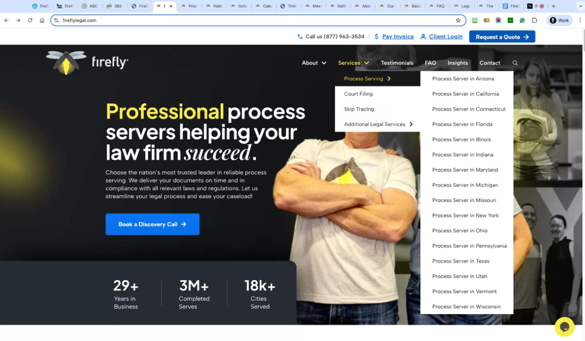
Yeah. And therefore, as well, like it needs to be user-friendly, people need to understand what it is. You know what’s in the top. Now, if you know what services will do, you know where locations will go, and what the FAQ and blog will cover, but where will technology go? It didn’t really make sense to have it there. It’s just confusing. That’s why we removed it, right? Yeah. And so then drop down. So services that have all their services, and this is where Stephan’s Ninja SEO team and Netconcepts come in, because they create individual landing pages for each of the services that have that service. It’s essentially a combination of a service and location page rolled into one.
Right. We discussed this in depth in a previous couple of case study episodes, specifically the Ware Landscaping case study, which covers local services, including landscaping, snow removal, and more. Additionally, in the Yosha Law case study, we discussed the combination of practice area and location as a kind of ninja tactic for obtaining the specialized location and keyword for the service you need. Car Accident Attorney Indianapolis, for example.
From an SEO standpoint, the top navigation is crucial because it highlights key pages for both search engines and users.
Yes, yes, we did indeed. So yeah, listen to those episodes or watch them on YouTube. And then, underneath the hero banner and the impact metrics, we have some of their clients, which are likely well-known law firms in their niche. I have no idea personally, but I’m sure they are.
We have some of those, such as bar associations and various organizations that lend credibility to Firefly. So if their clients or their partners or their trusted members of that association, or whatever, that’s what that trust bar of logos is for.
Excellent, and they could be a mixture of clients or associations. Listener, depends on your business model, but yeah, that’s a great place to put some logos there. Then we have a testimonial.
If you have certifications or awards, that’s a great place to display those logos.
Exactly. We then have a section for the services, which will link to the individual service pages. Underneath that, we have a brief description of their process. You know, knowledge, communication, and success are really quite simple, but I like the fact that they’ve got people in each of these steps to show that there are people who do each one of these steps. It’s not done with automation. It’s done with care, essentially, yeah, but all the copy. I haven’t mentioned the copy yet either. It’s quite simple, but it’s also beneficial for SEO. The goal is to reiterate what they do, how they do it differently, and what the benefits are to the customer.
I think that’s really important, and it’s good to have a copy throughout the page without it being overdone. I think that nowadays, people scan websites, stopping at headlines and content that catches their attention, as well as a lot of copy. Don’t get me wrong, good copywriting sometimes needs to be in-depth and detailed, but on the homepage, it’s really just an overview of the problems you solve and what makes you unique.
Good copywriting can be detailed, but your homepage should quickly show what you solve and what makes you unique.
Yeah, now in the age of AI and people using LLMs, we need to be concise and chunky and not just really overly verbose and not straight to the point, because that will hurt you in the LLMs, if people are using ChatGPT or Claude to get recommendations of who to work with process servers and different kinds of service providers, and maybe you kind of beat around the bush too much on your website. You thought you needed 3,000 words of copy because you read that somewhere for SEO purposes, but now it’s a different game. After all, people are going to ChatGPT, Claude, Gemini, and Grok and getting their answers there.
Yeah, that’s a really good point. So yeah, get to the point with your copy, humanize it, make sure it’s not like everybody else. Yeah. And what is unique about you? That’s really what you want to draw out on your website to let people know, essentially, why they should choose you over your competitors. Yeah, so, and that’s what all this copy is all about, right? So, it’s benefit-driven, and what makes us unique? Why Choose Us?
We also have some social proof. Then that’ll link to more testimonials, and just yes, other little bits of copy to reiterate why they’re different. Okay? We also have some blog posts, followed by a final call to action at the bottom, which is the site-wide call to action: to book a discovery call. And then we have a footer, but this was a big change. So, instead of just sending people to a contact page on the Discovery call-to-action, there’s no real trust in that. What we’re doing is sending them to a page dedicated to them, where they can book a discovery call. The page includes a brief description of what they can expect, a call to action, and a video that’s partially above the fold. Couldn’t put everything by the fold, and this is a really good video to explain why they should book a discovery call.
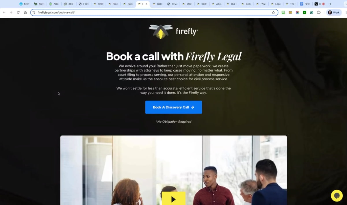
Then underneath we have more of those trusted logos and client testimonials. But you’ll notice there’s no top navigation. We just want them to do one thing on this call, and that’s to press the watch the video button and then press the call to action to book the call. And then we take them to a scheduling tool, which you can use, such as Calendly, and that’s embedded on the page. One mistake we often see others make is taking people to a third-party scheduling tool, as opposed to what we do here, which is to embed that third-party tool on a web page within your brand. So, yeah, it’s just that it can lose trust if you send them to a totally different URL, like calendly.com, forward slash, spot, whatever it is; you know what I mean. So we do this instead.
That happens for more than just scheduling a call. That happens when you know, fill out this form, take this quiz, or complete this questionnaire, and then they go to a Google form, a Typeform, or something that is not even branded. It has a generic, inexpensive look, regardless of the service provider you’re using for the form or otherwise. And now they have a bad taste in their mouth, like, Is this really a professional, legit company that, yeah, spent a decent amount of money building their website? Maybe not.
A thank-you page video that sets expectations and answers objections boosts call attendance and conversions.
Exactly, exactly, yeah. Now, by the way, we probably shouldn’t have had a top navigation on this page. That’s probably an oversight. Or maybe that’s been changed since we designed it accidentally. Who knows? However, we designed and built this a couple of years ago. Anything can happen since then. Now, what I should say is that we then take them to a thank-you page.
And this is another great tip for anybody out there who has a book a call funnel. If you do put videos in every part of the process, a, you build trust in who you are, but b, you will attract the right kind of people and repel the ones that aren’t a good fit, essentially, right?
However, on the thank-you page, there is a really important video where you reiterate, congratulate them, thank them for booking the call, and let them know what they can expect to get out of the call. However, this is also a golden opportunity to answer. Let’s say, if you have a sales team, if we are a salesperson, if you think about those little initial discovery calls, what are the questions you get from your prospects, about your service, about your offer, any objections that they have, anything that sort of worries them, you can answer those type of FAQs and objections in this five minute video.
Go to the thank-you page, and you’ll find that more people show up for the call. Not everybody shows up for a call, even though they’ve booked it, and they convert better because you’ve answered many of those questions. You don’t have to go through all those icky questions on the call. So, yeah, it’s pretty powerful if you do that on the thank-you page video.
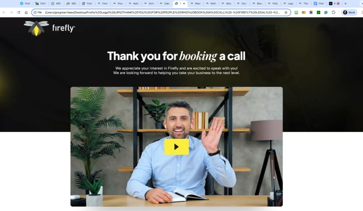
Additionally, when we discussed this on one of the previous episodes, Jon Schumacher‘s “Netflixing” strategy, one point he made was to overwhelm them with a lot of great video content that they can consume before the call. And do that on the thank you page. In preparation for the call, you might want to watch these videos. You don’t have to, but this will really help set you up for success and get the most out of our discovery call, or whatever you’re calling that strategy call. We’ll start strong right out of the gate, because you’ll be prepped for our call.
Exactly. Yeah, it’s a very, yeah, very good idea. Yes, we’ve done that with some client websites, and you generally place that content underneath the video on the thank-you page, yes.
So they could binge watch maybe an hour of content of years prior, and some people will, and then they’re pre-suaded, to use Dr Cialdini‘s terminology, they’re pre-suaded, then when they’re showing up on the call.

Exactly. Therefore, we must consider that not everyone will be ready to book a discovery call. And this is really for people who already know your brand, they’re familiar with what we call a warm lead. However, for those who are cold, they won’t be ready. They want to check out your services, location, or blog. However, they come into your website, they have a different pathway, and they’re not ready to book a discovery call.
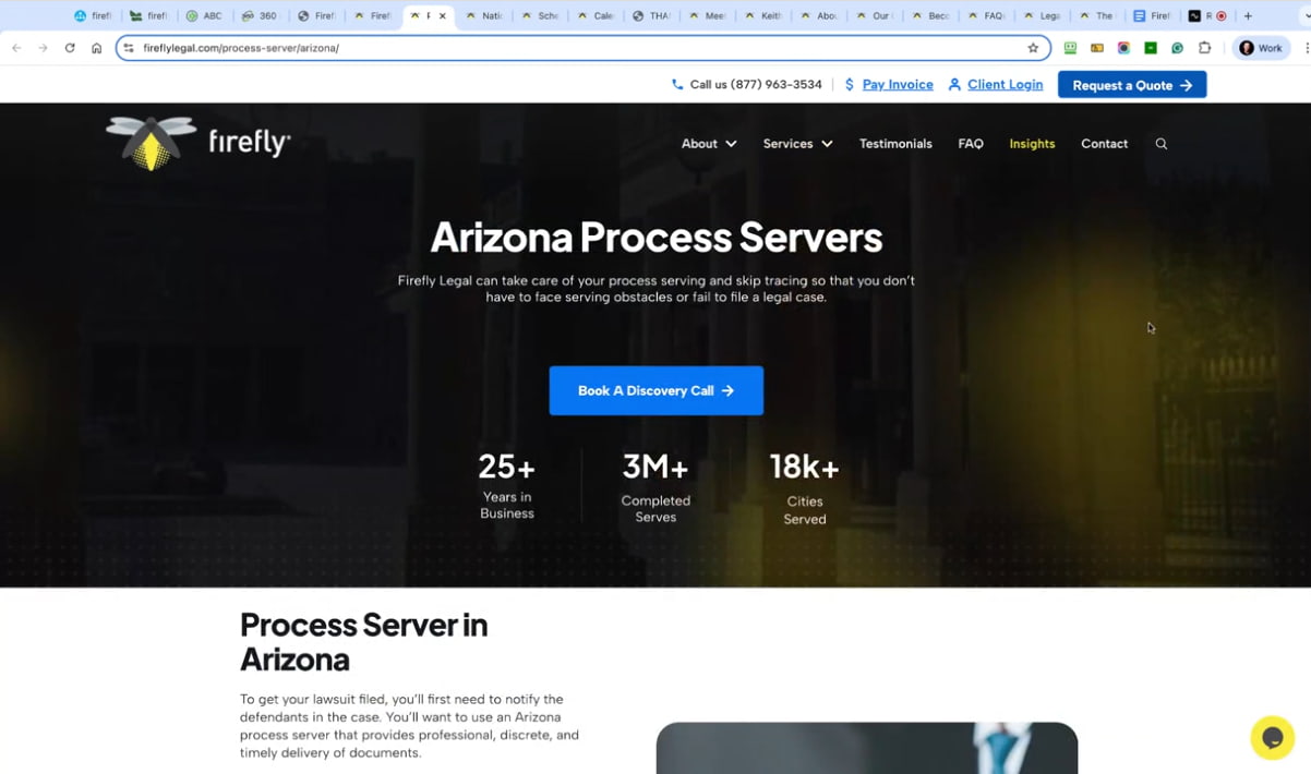
I’ve just got a page here. This is the Arizona location page for process servers. Therefore, on this page, we assume they haven’t visited any other page on the website.
So, you reiterate impact metrics, you have a lot of good copy that we’ll discuss, and obviously, search engines, but also the prospect, so they can understand how you’ve helped people in a similar area, for instance. And then, yes, it has a lot more information on this page, as this will help build trust in what they can deliver for you.
And then we reiterate some sections from the homepage, because we have to assume they haven’t visited the homepage, right? You’ll also see some repeated sections there. These pages are quite detailed and feature a lot of social proof, as well as a call to action at the bottom of the page, etc. As opposed to this standard, the old way of doing a service page was just literally to have to appeal to SEO, you know, to search engines or search everywhere AI as well, and it’s really quite boring visually, and that’s not enough trust-building elements on a page. So we go to the extra effort, and yeah, talk about what’s important to them, how you can help them, and what’s unique about the client that we’ve designed the website for. Essentially.
Yeah. Great stuff.
Cool. Yeah. So that’s the pathway for people who want to learn more about your offer. Additionally, you must consider whether they come in through a blog, in which case they may not be. I’ll just show you a blog, yeah, so just the blog here, the individual blog posts, and they may not be ready yet. They might just be looking for information, right?
So, what we did recommend is that there isn’t a lead magnet on this website, but we did recommend it; that was their choice. So even now, Stephan would probably go back to them and say, “Hey, probably put a lead magnet and generally on a blog,” these days we have, as you scroll, we have a sticky lead magnet, right? Because this is better for cold traffic. Before we talked about warm traffic, for cold traffic, they’re not ready to book a discovery call. They’re not a blog page, so it makes more sense to offer a lead magnet in exchange for their email address in return for some value. And Stephan, what could that value be?
Lead magnets aren’t about low-level freebies; they’re about capturing cold traffic and nurturing them into warm leads.
You had a great idea before, yeah, but before I share what that idea is, well, we’ll get to that in a minute. But what was Firefly’s justification or reasoning around not having a lead magnet, even though you recommended it? Do you remember?
I vaguely remember it was a couple of years ago, but I think it was because their target audience is essentially law firms and organizations. Still, they deal with high-level people, so they thought that maybe they don’t need to have a low-level PDF that their target market may not find valuable, compared to booking a discovery call. However, as I mentioned earlier, I think you need to cater to colder audiences who aren’t ready for a discovery call. What are your thoughts Stephan?,
What I recall is that their conversion rate is significantly higher when they get people on the phone, so they want to get as many people as possible on the phone. So that’s why they want the discovery call. And so they push that hard, and they don’t want to offer anything else, because perhaps it will deter someone from booking the discovery call if they give another option, such as downloading this thing or filling out this form. Whatever, and now they’re not on the phone, doing their amazing sales job, but the problem is that not everybody’s ready to get on the phone. They know they’re going to get sold, and maybe they don’t want to be sold because they need to be pre-suaded first before they’re willing to get on a call.
That’s why a lead magnet needs to be present on almost every website. It requires some sort of bait, such as an irresistible offer that everyone would accept. They would be silly not to that’s where the idea I’ll share now comes in of a new lead magnet, because times have changed since 2023 since we started this joint project with Firefly legal, they’re still a client of ours, so now we can go to them and say, “Hey, I know you didn’t want a lead magnet back when the site was redesigned in 2023, 2024 but things have advanced now.
In terms of AI, everybody’s talking about ChatGPT, everybody’s using ChatGPT and other LLMs. Why don’t we create a lead magnet about how you need to be on the cutting edge of these LLMs and just be using them in your law firm in order to not be left behind?” And that will kind of compel them, like that’s, there’s a pain point there. That’s gonna, I think, hit home for most people.

Yeah, I couldn’t agree more. And look, just on that topic of AI, they’ve got their latest blog post. This is how AI is transforming the legal services industry. If that’s a popular blog post, turn that into a lead magnet, you know? Why not? So, yeah, I think it’s probably a missed opportunity. I understand the argument for encouraging more people to book a call, but not everyone will be ready. That’s why a lead magnet is important. And I would say in this case, it could simply be an exit pop-up that people go to when they try to leave, triggered by hovering over the top pixel of the web page, and then, boom, you offer the opt-in for the free PDF in return for an email address. So if they don’t work for the website, at least test an exit pop-up.
Yeah. That’s different from a timed pop-up, which will appear for everyone at a certain time, let’s say 10 seconds after visiting the site. And if it’s misconfigured, then it keeps appearing every time they visit the homepage or any other page. I was experiencing the same issue with another website.
Sprinkle your story and community efforts across the site so visitors can know, like, and trust you without having to search for it.
Yesterday, I talked to the person who owns the website. This is a problem. So, anyway, that’s not best practice. Best practice would be to have an exit pop, and you wouldn’t put a call, request a quote, or any type of offer on an exit pop because they’re about to leave. You didn’t sell them. This is essentially a last-ditch effort. Hey, we got something irresistible before you go. Do you want this thing? All you need to give us is your email address, and you’ll get this valuable thing.
Exactly. And if you do get their email address, then take them to the thank-you page and offer the call. However, also keep them warm via an email nurture sequence. Now, another valuable page. They have a lot of options on their drop-down. They have a team. They offer compliance and organization, technology, and career opportunities.
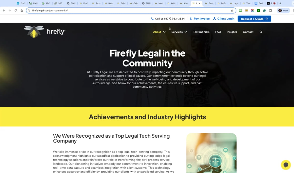
I wanted to highlight this page, which is their community page, because not many businesses make this gesture; instead, they give back to their community in various ways. And I just think it’s an awesome page, an awesome thing to display on your website. If you do give back to the community and get involved, here’s a Chicago Fire flight run that they participate in. And yeah, I would say it’s good to show that you give back, but it can also be a good trust builder, and people might choose you because of it.
Yeah, and wouldn’t you recommend that it be sprinkled throughout the site, not just on that one page? Because if they didn’t think to go to your ‘About’ drop-down and were curious enough to click on ‘Community Development’, If you are doing stuff like volunteering or donating or organizing fundraisers, doing something that is good in the world, highlight that don’t just bury it once in a page, in a section and a drop down, but sprinkle it throughout the site, just like you would sprinkle throughout the site that you want people to go visit your about page and read about the timeline of your evolution, of your business and you as a person, as the founder, so they can know like and trust you and root for you and feel good about you. But also do that with the community development stuff, including all the great donations, volunteering, and fundraising efforts you’re doing.
Yeah, true. Okay, and then just a careers page is a good page to have on any website. A, to attract, you know, top talent, but B, because other prospects see that you are trying. To attract top talent will be another reason for them to choose you. So, yeah, pretty powerful. On this careers page, we highly recommend it.
Even if you’re not currently hiring, right?
Yeah, exactly. We have one on our website, and it’s just always there. We do get people to supply all the time, but yeah, it’s just a good page for that. As I mentioned, it’s about building trust in your brand.
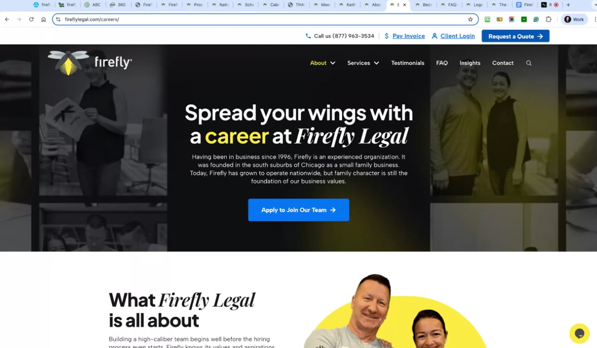
I love the personality that comes through in the Firefly brand on pages like this, our main goalparticularly in the careers section. It just makes them feel so much more real and fun and engaging and interesting, like the fun images of the staff and that section halfway down the page, and the wife join our team, like the guy there in the middle pointing to the next person with a big smile on his face, like everybody’s looking engaged and interested and happy and satisfied. That’s who I want to work with or for. And if I’m a prospect and I happen to visit this page to see if it’s a cool company, then I feel that vibe. I get that culture vibe from this page.
A careers page isn’t just for hiring; it’s a trust-building tool that shows your company is growing and worth joining.
Exactly. I love the benefit-driven headline that’s relevant to a firefly brand. Spread your wings with a career at Firefly Legal. I reckon that’s cool. Yes, it is.
They’ve got all this cute terminology that incorporates that theme, like ‘enlighten your caseload’ and similar phrases. That’s fun.
That’s essentially how we’ve designed this website. Feel free to check it out at fireflylegal.com, but Stephan, let’s share some of the results. You ready for that?
Yeah, let’s do it. In this section, we present data from Semrush, including organic traffic and organic keywords. As you can see, both are increasing in the graphs to the right. We’re seeing steady improvements in organic traffic, the number of keywords they’re ranking for, and the number of SERP features where they’re displaying. SERP stands for Search Engine Results Page. That would include items such as AI overviews, image one boxes, and local pack results, if applicable, and so on. That’s all up and to the right, which is great.
And, of course, that also equates to the thing that really matters to them: more leads and more clients. As you can see, there are more leads and requests for quotes, as well as more contact form fill-outs, etc. So it’s all looking like there’s an impact there. In the most recent month, we received the largest number of requests, quotes, and form fills of all time. So it’s the 4x from a year ago. Yeah, pretty awesome.
Incredible.
When you combine good design, good copy, and good SEO, the results multiply.
And also increase their phone calls. It’s essential to have multiple metrics that provide insight into how people are entering your funnel and progressing through the buyer journey, as some individuals may contact you directly. After all, you got your phone number up at the top. They might just fill out the contact form. They might fill out the form that’s on request for a quote. Or they might go through the whole process of actually scheduling a call using your embedded calendar, like we showed a few minutes ago, and all those are different metrics to measure and check improvements on as you make changes to your website, add new strategies.
You bet, Stephan. Cool. Well, that’s probably a wrap, unless you’d like to keep going. However, I think there are some valuable takeaways for the listeners in this. And yeah, it just goes to show that when you combine good design, good copy, and good SEO, it’s a multiple of what we saw there, probably 4x for just one of the metrics, but their traffic’s up. If you saw the graph, the traffic’s up a ridiculous amount.
So it’s way more than Forex, but yeah, you have multiple wins when you comply and combine all those things. And I guess the big lesson here is that if you have a well-established business, you should really revisit your brand and ensure it doesn’t look dated, but remains completely relevant. Another big lesson was to put a face to the brand and show the people behind it; it’s a massive trust booster, as you can see from these results.
Now, one thing we discussed before the recording, and you were preparing for this interview by pulling up some different tools. One of those tools was built with, and you were checking to see what sorts of things, like plugins and hosting, and all that, because it’s been a little while since the redesign went live. You’re just checking to see what’s happening behind the scenes, and you didn’t even have to log into their WordPress admin or anything. You can be anyone and use this free tool to view all that back-end information. So why don’t you walk through that?
Yeah, I think you introduced me to this tool. builtwith.com, you can just put in any website, your own, or competitors, or whoever, and you can see how their website was built, what platform it was built on, what analytic tools they have, what plugins they have, etc. And so, what I was looking for is the reason I brought this up. It’s been a couple of years since we designed and built this website, just to see if they still have the features we introduced, like a plugin called WP Rocket. They still have it, and you notice the website loads quickly. That’s because of two things.
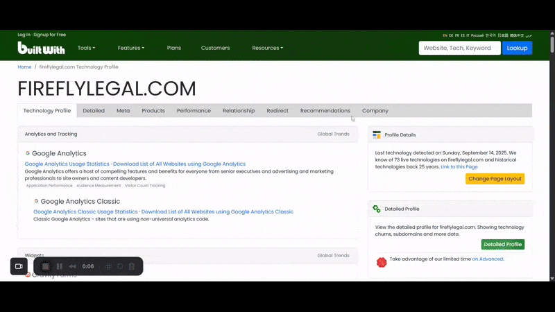
One is that they use WP Rocket. It’s built well, utilizing Elementor, which is evident here, as we use Elementor Pro for WordPress —a lightweight, fast page builder for WordPress. But then on top of that, we’ve got all the case in and all those other little bits and pieces you do to speed it up. But on top of that, they’ve got really good hosting, which is with WP Engine, which we do recommend. We use Google Cloud and WP Engine; they’re both equally good, and there are many good reasons to choose either one. A, they’re fast, but B, they have a lot of security around their hosting, so that it’s very unlikely that you’ll get hacked.
However, they also have a daily backup. If you get hacked or make a mistake, they’ll restore it for you, or you can restore it yourself from the daily backup. So yeah, they’re just the little things that I look for in any website to see if it’s performing well. And if not, why not? What kind of plugins do they have? Are there too many? Are they conflicting? And this is how you can just get a bird’s eye view and build with.
Yep, that’s a great tip. Did you use any other tools to prepare for this? What were some of the other tools that you pulled?
Yeah, just had a look at the XML site map to see how many pages they currently have. Google crawled 100 pages, but one of them’s not live. It might be hidden for iteration, probably a thank-you page. So yeah, it’s indexed in 99 pages. But yeah, I just wanted to see what those pages were. See how many. There are numerous locations, pages, service pages, and insight pages, which is the work that Stephan’s team has been doing for them. That is the majority of the extra pages that have been added. So, yes, all these factors contribute to increased traffic if you simply add pages to your website over time.
The number one takeaway: your website is your #1 asset; treat it like a living, evolving sales machine.
And I don’t think that anywhere near the number of pages that they have now. It’s still only 100 pages, but it’s still, look at the incredible results. But imagine if you had 500 pages or 1000 pages, and that’s the power of just constantly blogging. It’s not just for search engines. It’s like Stephan says, SEO is search engine optimization, including AI, and the more we learn, the more we post on our website at studio1design.com, the easier it is to get found in search engines. Because people are saying, we asked the question, How did you first discover us? Many of them are saying, ‘ChatGPT.’ Indeed, it’s remarkable how investing in content on your website can help you get discovered in AI search engines.
And so the Insight section of the site is just their terminology for the blog. So it doesn’t just sound like a boring blog; it sounds enticing and interesting, calling it ‘insights.’ We have created a lot of content in the blog’s Insights section for SEO purposes, but it’s also there to help users make better buying decisions and understand the breadth and scope of what Firefly Legal offers.
So these posts are evergreen. They’re not just ephemeral. And of the moment, like, here’s an interesting thing that happened last week, because nobody wants to read that two years from now. So, we focus on creating evergreen content for SEO, AI-powered learning management systems, and users when they’re already on the site. You mentioned the tool you used to analyze the XML site map of Firefly legal, or any site on the internet that has the site map, is just XML-sitemaps.com.
Correct? Yeah, exactly. That’s until I know, I think there’s a limit of 500 pages, it’ll still show that it has more. But this is the free version. You get a paid version, and it’ll show every page, essentially over 500 pages.
All right. Well, what would be the biggest takeaway that you want to leave our listeners or viewers with as we close out this episode?
Your website is never finished. Every page is a virtual salesperson, and the more you have, the more opportunities you create.
Yes, I mean, I went through my takeaways before, and you were handling all the technical aspects, but I would say that out of those takeaways, the number one is to consistently invest in your number one asset, which is your website. It can be a Sales Machine if you invest in SEO, traffic, copy, and even updating it regularly with customer testimonials, customer logos, and any other content that evolves as you gather more social proof. Keep adding it back to your website, including impact metrics.
Yeah, I’ll piggyback on that by saying that your website is never finished, and also that every page of your site is like a virtual salesperson. And if you have a 50-page. A website that’s 50 virtual salespeople. Wouldn’t it be better to have 500 virtual salespeople, or even 5000 out there pounding the pavement, getting you leads and sales through AI, LLMs through Google and other channels, that is a secret weapon, make more and better content so that you can be found more places with that SEO, Search Everywhere Optimization.
Well said.
So Greg, how does our listener or viewer work with Studio1? What is their next step to potentially do a redesign with your team?
Thank you. Stephan, yeah, reach out, go over to Studio1design.com, have a look at our folio first. We find that’s what people want to check out first to see if we’ve done something in your industry. And there’s probably a good chance we have an extensive folio, and then, yeah, we’ve got a book a call. We have free resources, but also my book, Next Level Website Design, nextlevelwebsitedesign.com, and you touched on one of the chapters before, Stephan – your website is never finished. That’s the last chapter in the book, because it’s not finished. And that’s yeah, just talking about all the things you can do just to keep improving it over time.
Yeah. Awesome. Thank you, Greg. Thank you. Listener, thank you. Viewer, go out there and make it a better world and contribute in a meaningful way, and we’ll catch you in the next episode. I’m your host. Stephan Spencer, signing off.
Important Links
Connect with Firefly Legal
Connect with Studio1 Design
Connect with Netconcepts
Apps/Tools
Book
People
Previous Marketing Speak Episodes
Dialing In Your Webinar Strategy with Jon Schumacher
Digital Course Website Overhaul: A Case Study with Greg Merrilees
E-commerce Redesign Secrets: A Case Study with Greg Merrilees
High Converting Landing Pages with Greg Merrilees
How to Build a Digital Marketing Agency with Stephan Spencer and Greg Merrilees
Previous Get Yourself Optimized Episode
YouTube Video
Your Checklist of Actions to Take
- Show real people behind my brand throughout my website. Replace generic stock photos with authentic images of my team wearing branded clothing and looking approachable. This builds massive trust, as people buy from people, not faceless corporate entities.
- Create a comprehensive discovery questionnaire before any website redesign. Ask clients about their primary goals, what’s working and not on their current site, target market characteristics, competitor analysis, and the specific problems they solve.
- Build a proper book-a-call funnel instead of sending traffic directly to contact pages. Create a dedicated landing page with no top navigation. Include trust-building video content and embed my scheduling tool on-brand, rather than sending people to third-party URLs like Calendly.
- Implement a strategic ‘thank you’ page video after someone books a call. Use this golden opportunity to answer common objections and FAQ questions prospects typically have. This increases show-up rates and improves conversion because I’ve pre-handled concerns.
- Add impact metrics with subtle animation above the fold on my homepage. Display key numbers, such as years in business, clients served, or success metrics, with light animation on page load to draw attention to social proof without being overly distracting.
- Create location plus service combination pages for local SEO dominance. Create individual landing pages that combine my service with specific locations (such as “process serving Phoenix”) to capture highly targeted search traffic and enhance local rankings.
- Include a careers page even if I’m not actively hiring. This attracts top talent organically and signals to prospects that I’m growing and successful enough to expand my team, which builds additional trust in my brand.
- Embed third-party tools within my branded website pages. Instead of sending users to external scheduling tools or forms, embed these tools on my own branded pages to maintain trust and professional appearance throughout the user experience.
- Invest in speed optimization with proper hosting and caching plugins. Use reliable hosting like WP Engine or Cloudways, implement WP Rocket for caching, and build on lightweight platforms like Elementor Pro to ensure fast loading times that improve both user experience and SEO.
- Connect with Greg Merrilees at Studio1 Design to transform my website into a silent sales machine. Also, grab his free book, Next Level Website Design, where the final chapter covers why my website is never truly finished.

About the Host
STEPHAN SPENCER
Since coming into his own power and having a life-changing spiritual awakening, Stephan is on a mission. He is devoted to curiosity, reason, wonder, and most importantly, a connection with God and the unseen world. He has one agenda: revealing light in everything he does. A self-proclaimed geek who went on to pioneer the world of SEO and make a name for himself in the top echelons of marketing circles, Stephan’s journey has taken him from one of career ambition to soul searching and spiritual awakening.
Stephan has created and sold businesses, gone on spiritual quests, and explored the world with Tony Robbins as a part of Tony’s “Platinum Partnership.” He went through a radical personal transformation – from an introverted outlier to a leader in business and personal development.

About the Guest
GREG MERRILEES
Greg Merrilees is the founder of Studio1 Design. He’s passionate about really good-looking website design that gets results!


Leave a Reply