


Most law firm websites look identical—cookie-cutter templates with carousels and autoplay videos that kill conversions. Greg Merrilees is the founder of Studio1 Design, a conversion-focused web design agency that has been crafting high-performing websites for over a decade. His team specializes in creating designs that prioritize results over eye candy, helping businesses transform their online presence into powerful revenue generators. Greg and I partner on many projects, including this shared client that we’re about to case study.
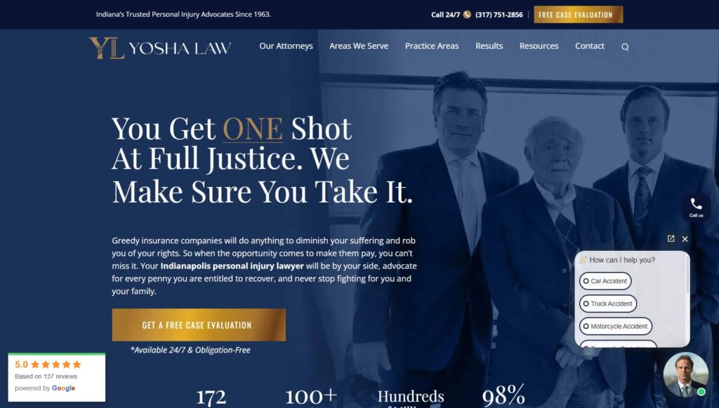
In this episode, Greg and I will break down the total website overhaul of Yosha Law, a well-respected personal injury law firm in Indianapolis. We examine how their website went from generic and unremarkable to sophisticated, conversion optimized, and search optimized. Through the strategies and tactics we are about to delineate, we achieved for the client a 12x increase in conversions and 60 new cases signed in the first three months. And for a law firm that works on contingency, that is a huge result! We discuss the critical elements for not only legal websites, but all websites – including utilizing the Storybrand framework to reposition the brand from self-focused to client-focused.
We go over advanced conversion tactics like sticky navigation, persuasive contact forms, strategic social proof placement, and mobile menu optimization. You’ll get the exact design, copywriting, and strategic decisions that transformed this law firm’s digital presence into a client acquisition machine. And now, on with the show!
In This Episode
- [04:57] – Stephan recounts how he and Greg Merrilees connected with Yosha Law through mutual contact, Jay Abraham.
- [06:45] – Greg critiques the old website’s flaws, like the autoplay video above the fold that slowed Page Speed and hurt user experience.
- [10:53] – Stephan and Greg unpack the power of social proof and case studies in building credibility and trust.
- [18:20] – Greg reveals their approach to generating images with AI from a handful of photos, cutting costs compared to hiring photographers.
- [25:49] – Stephan stresses the need for dedicated pages for each location and practice area to maximize lead generation.
- [36:07] – Greg illustrates how the site’s case studies capture clients’ emotional journeys and Yosha Law’s pivotal role in their outcomes.
- [41:44] – Stephan and Greg discuss how creating a handful of in-depth case studies can be a long-term asset for credibility and conversions. They also break down key blog optimization strategies and reveal mobile-specific optimizations based on user behavior insights from analytics and heatmaps.
- [50:28] – Stephan and Greg showcase the public case studies on their sites, featuring Yosha Law’s record-breaking success. They also discuss the comprehensive strategy behind the success: website revamp, SEO, videos, and social media.
- [54:19] – Greg underscores the value of a brand style guide to solidify positioning and authority.
So Greg, welcome back to the show.
Thank you so much. Stephan, what an intro. I love it. Yeah. I mean, you guys are a game changer when it comes to driving traffic and boosting people’s authority, and that’s one thing we’re going to talk about today: you don’t just do traffic. You do so much more than that. I think it’s kind of underrated. If somebody thinks of you as an SEO expert, that’s just a small part of the equation, so we’ll unpack that. How did you help this client today?
All right, awesome. We’ve done a local services business in the past. We did Ware Landscaping, so if our listener or viewer wants to listen to that before this episode, by all means. However, we’ll recap some of the key concepts in this episode in case they missed the previous one so they’re not discombobulated. We’re going to cover a range of topics at this personal injury law firm website conversion, including SEO, brand positioning for the founding partners, and more. How do you want to frame the next 30, 40, or 50 years?
It’s all of those things, plus it’s about brand positioning. That was probably one of the most effective things you guys did in boosting their authority. Additionally, the brand positioning aspect was a significant factor from a redesign perspective.
First of all, let me give the background on how you. We got this client because it’s relevant. I’ve been conducting four-hour virtual hot seat workshops for Jay Abraham and his clients for years now. And Jay Abraham’s cousin is Brandon Yosha. That’s how we came to know Brandon. He attended several of my workshops over several years, and then, in one of those years — possibly the second or third — he decided to contact me and work with me.
He’s a very savvy individual when it comes to online marketing. He has a Semrush account. He’s in there figuring stuff out and very savvy. He applied some of the things he learned from me in previous workshops, but now he was ready to work directly with me and my team. And this view you’re showing on the screen is of the old website which we started with.
We conducted some SEO optimizations and saw a noticeable impact. It made a significant impact, but this was not a differentiated website in the personal injury space. This was just like cookie-cutter. Everyone else is doing the same sort of site. It wasn’t distinctive, nor was it preeminent, and that’s a key concept for Jay Abraham, and Brandon knows all about it: preeminence.
When we recorded the case study interview with Brandon several years ago on Marketing Speak, we discussed preeminence and its importance. So, with that said, why don’t you chime in with how you got involved and what sort of things were the key issues that needed to be addressed in the redesign?
Yeah, absolutely.Thanks. Stephan, so yeah, basically, if anybody’s on YouTube, we’re actually sharing our screen and showing a little bit of what their website used to look like on the Wayback Machine. The beauty of this is that we take screenshots of websites before we redesign them. However, this is not just a screenshot but also shows how the video is moving in the background.

So, the problem with moving videos in the background of a web page, especially above the fold on the home page, is that there are several issues with it. So, number one, they take a long time to load, depending on the length of your loop. Generally, it’s like an auto-play, auto-loop. It just keeps rotating every 30 seconds through the same footage. So it takes forever. So, the Page Speed takes a long time to load, which negatively affects SEO.
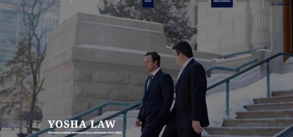
But then, on top of that, it might be fancy for the first-time visitor to think, “Oh, wow, look at this. These guys have a video, and that’s cool.” However, if you’re a repeat visitor to a website and you keep watching their video repeatedly, it’s really annoying for repeat visitors and adds no value. So this is literally just showing their team talking to each other and looking all professional, which is great, but that’s kind of the end of the benefits of it, right? There’s no value. They’re not talking about what they do. It’s all about them. It’s not about their clients; it’s not a case study. It’s just a matter of positioning them as attorneys in this region, looking very professional. So that was just the video above the fold. So that, to me, is a big problem.
Autoplay videos above the fold slow down page speed and hurt SEO — they’re flashy but ineffective for conversions.
Now, for some folks who are listening, they actually have that, and maybe they don’t even have the decision-making power to get that yanked off of the website. Perhaps we should provide them with some recommendations that they can reference if needed or if they require further details before making this decision.
Maybe it’s not enough. What we just said is that we should send them to the Wistia article, which is against auto-playing homepage videos. It goes into a lot of detail about why this approach doesn’t work. The cognitive load adds to, and thus lowers, the decision-making ability of the user. The results obtained from having an autoplay video on the Wistia homepage and why they ditched it, along with numerous details, provide valuable insights into why autoplay homepage videos should be avoided. If you Google ‘Wistia’ against ‘auto-playing homepage videos,’ you’ll find that article.
And there are many examples where, sometimes, it may boost conversions. If you’re a video company, showcasing your work may boost your conversions, right? But most of the time, it is going to be distracting for people like the visitor, and all they really want to know is what’s in it for them when they’re on your homepage; they don’t really care about you initially because they just want to know, can you solve my problem? And if it doesn’t clearly articulate that through a video with no sound, why would it? Because it has no sound, realistically, they’re not going to get an answer to “Can you solve my problem?” That’s probably the main reason why they don’t convert, along with the other reasons we just mentioned.
Your website can’t be about you anymore — it has to be about what’s in it for them.
To me, it’s like an image slider. You know how some websites, particularly many e-commerce sites, do it too, where they have an image with products and some text. Then, it automatically rotates to the next set of images with different text and calls to action. To me, it’s a lazy way of presenting your content. Instead, lead with your most popular content or products, whatever they may be. Ensure that it’s all about what’s in it for them, reiterating what’s unique about your company, how you’re different from your competitors, and how you can help them.
Essentially, we love a clean design, but if you’re a challenger brand, in other words, you have a big brand that everybody knows, then you need to do more convincing above the fold on the homepage and keep it really clean, or just a video with no text and just your brand name. Nobody really cares about that.
There’s no social proof there. There’s no compelling call to action. There’s no clear value proposition that differentiates you in the marketplace. Yeah, it’s all missing because that homepage video is so overpowering and takes up a lot of the screen real estate and attention. Even if you have impact metrics or, as seen on logos overlaid on top of it, you’re still just soaking up a significant portion of the cognitive load and the user’s attention with that autoplay video; just don’t do it.
If your homepage doesn’t answer, “Can you solve my problem?” in seconds, you’re losing leads.
Exactly, exactly. So the other thing we sort of gave him advice on, and he took it, was changing their brand name from Yosha, Cook, and Tisch to just Yosha Law because it’s just easier to remember, and that is their brand domain name, yoshalawfirm.com, so we just thought, again, take away that cognitive load, and literally, put what’s on the jar. You know, put what’s in the jar on the jar, essentially. That’s why you’ll see what we did with the brand in a minute.
I also came up with a beautiful logo. So, that is part of the new site design.
Yes, we kept it very true to what we have here, but we also made a few adjustments to modernize it, such as improving the font pairing and other details. But then, you might notice these little social media icons up here in the top right. They link off to social media. However, we strongly recommend against doing that because it creates a leakage point.
Essentially, as I’ve said many times, you want to bring people to your website from social media, not take them to social media from your website. So, the only reason we would want social media icons on a website is in the footer, not on all pages, but only on the homepage and the blog, etc. It’s just a way to let people know you’re current, so they can check out your following and other things. However, realistically, keep in mind that it is a potential leakage point. So, you don’t necessarily have to put them in the footer either, but avoid placing them on your sales pages and similar areas. It’s just not worth it.
This is just a previous version of the website. We pulled it up with the Wayback Machine, which is web.archive.org. For users or listeners unfamiliar with the Wayback Machine platform, you can remove the selector from the page by clicking the top-right X button. This will display the view of that old version of the website.
Looks all pretty, but with the selector, you can slide to different time frames and say, ‘Well, what did it look like a year before that?’ What did it look like a year after that? Such a handy tool. If you have been featured in magazines, newspapers, or other publications, and those articles have been removed from the site, please let us know. It happens a lot. You link to the old version that’s archived on the Wayback Machine, and now you still have proof that you were featured on those news outlets. So, be sure to include that on your press page or media page.

I love it; it’s cool, and look, these guys have credibility, having been recognized locally in all these different publications. They’ve got some really good cases, as it says here, with a $7.5 million verdict, but to me, there’s not much clarity in that. We’ll talk about what we did instead. But yeah, it’s just showing that they’ve won some decent cases with, you know, various large, multi-million, yeah, exactly, and yeah, very large settlements.
So, they also had a link to case studies. I’m not sure if you provided guidance on this before we reached their website, but this is a good idea. Having all these results and authority boosting where? Yes, we’ve been recognized near the top of the homepage. So that’s quite good. Yeah, did you direct them on that, Stephan? What was that already there?
We directed them on what to do differently regarding their social proof. And I’m not even sure if they had case studies before we started working together. I think they just had. The settlements, and we had to really extract out of it, was hard because they’re going to people who have been injured, who have already gotten the settlement or had the verdict, they’re moving on with their lives, and say, “Hey, can we ask for a favor? Can we obtain more than just the quote you provided or the video? Can we get more details around the results, the situation and everything, and build it into a proper case study,” because the case study has the background, it has the solution, and it has the results.
Bringing users from social media to your site is smart marketing — sending them back to social is just leakage.
Yes, exactly.
It’s not enough to just say,’ Here’s the verdict in terms of dollar value. ‘
Yes, that’s right. And so, as we said, it’s good to have authority-boosting elements near the top of the page. This is obviously beneficial for SEO, as we’re sharing the rest of the page, which has a lot of copy but lacks much design. So, just keep that in mind. Then, buddy, he was the original; he founded the company, and, yeah, he, I think he’s retired now, isn’t he? Stephan,
yeah, he’s not actively representing cases.
Yes, so it was good to show the person behind the brand who started it. I think that’s quite smart. Visually, it looks a bit average, but they’re doing all the right things, just like they’ve in the past. Once again, it’s just a little bit ugly. But you know, that’s obviously why Stephan called us in at some point. However, as Stephan mentioned, he was achieving great results. And there’s a photo gallery of Buddy with various people, as well as Brandon with various people, including famous ones.
Authority elements and case studies near the top of the page boost trust and improve SEO.
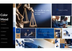
However, the point is they had some really good elements on this webpage. It just didn’t look premium. So that’s when we came in. However, they are truly experts in their field, and we simply needed to elevate their brand profile. So, what we generally do is give it to our brand director to create a mood board. So that’s where the brand director will listen to the call recording, study the questionnaire that the client filled out, and do a lot of competitor research as well, and then figure out, right how do we want this brand to look and feel that represents them in the best light possible, to attract the right type of clients so that they’re more qualified when they come to them. So yeah, this is our brand directors’ mood board.
We start by creating a color palette overall to get a sense of how we want this website to feel. Then, we perform a color breakdown, showing what we want as the call-to-action color and the percentages of colors used throughout the pages. Then, we discuss the fonts and their pairing, as well as how we incorporate them by mixing them with various elements, such as calls to action and other design elements.
Then, we demonstrate how we could potentially utilize background elements and design elements. It mixes the fonts and graphics with photos. By the way, all we do is present ideas to the client, and then the client provides feedback on what they like the most, essentially. So the textures we show are just little background textures that we’re going to use sparingly throughout, and then the photography,
If you’re only listening, you’re not watching the video; you have to see how amazing this mood board looks, so top shelf. It’s so elegant and upscale; it’s truly amazing. I think it’s a great best practice example for you to use if you’re going to do any kind of redesign or revamp of your website.
Thank you. And so what we’re doing a lot these days is for photography direction. We do give photography direction. So, what it means is that if you hire a photographer, this is how we will utilize those photos on the website. We can then give them a lot of color treatment to match the brand after we receive the photos back from the photographer. However, what we’re doing a lot these days is using AI, which is such a powerful tool for us as designers to take, let’s say, 20 photos. They don’t need to be professional, but if a client comes to us and says, ‘I want to do a photo shoot,’ we can help them.
We’ll provide them with directions like this, and they can either go to the photographer or submit 20 photos of themselves from any angle. It doesn’t matter how good the lighting is, nor what they’re wearing. We can also upload this mood board to the custom GPT that we’ve created. And we use a couple of different tools. We use Canva, Midjourney, and ChatGPT to generate various prompts from this type of imagery, and then we produce images based on those prompts. So it’s just another alternative. Instead of spending, say, $5,000 on photo shoots, we can achieve similar results with AI, as we’ve with a few clients now, Stephan. They’re pretty incredible, aren’t they?
They are. It’s really impressive. And you know the old AI adage, but it’s all programmer adage. It’s garbage in, garbage out. Well, gold in, gold out. If you come up with great prompts, inputs, and source material, you’re going to end up with an amazing output. And I’ve seen so many great examples of your handiwork with AI. It’s really impressive. It’s so much better than what you’d normally see with these off-the-shelf tools that create just headshots that are uninspired. They look stiff, and it has to do with the garbage in and garbage out. Problem Exactly?

Yes, we’ve been refining that process, and the reason we use three different tools is to refine it to the exact look and feel, including the color palette and lighting. Yeah, we sort of go into a lot of detail, but yeah,
By the way, a little sneak peek of what’s coming in a future episode. So, we’re going to conduct a case study, or a teardown, or whatever you want to call it, of whatismyipaddress.com. Chris Parker is the founder, and we ended up not using any of the photos from his recent photo shoot. We had nudged him to do so, but in the end, we actually got better images from you using AI than from that photo shoot. And so that’s plastered everywhere on his personal site rebrand, on his privacy crisis site, and the about page on whatIsmyIPaddress.com, really, really beautiful work.
It’s incredible, isn’t it? I’m blown away by how well AI performs when it comes to creating photos, provided you have the right prompts and tools. Yeah, we’ll show you that in the next case study episode. Because, yeah, Chris was just amazed. He said, “It’s so uncanny that he looks exactly like me, but I wasn’t there.” Yeah. So there’s our mood board. As I mentioned, we’re exploring different suggestions for every aspect of the brand, including graphic layouts, icons, and explainers to be used across various page layouts.
If you want conversions, your website needs to shout what’s in it for them, not what’s great about you. Share on XWe send the client a walkthrough video from the brand director, explaining the decisions made, and then receive their feedback before designing the website. However, in this case, the client was very happy with this direction, and we then incorporated it into the website. We’re now looking at the live website. This is the page that we designed. This was their photo shoot before the advent of AI, so we didn’t have the luxury of using AI. But you know, they did a great photo shoot anyway, at one point. Stephan, I think you provided some feedback, and I believe the photos were too heavily edited. Why did you want to discuss that? Why did you say change the photos?
Oh, so this is what they ended up going back to. He put one in that looked overpowering. It was just him, and the photo was too close, not showing other team members. And I just recommended that he switch that back. And he also noticed the impact metrics; they were really impressive. You’re already persuaded before you even start scrolling.
Yes, and I just refreshed the page to show you that when you land on the page, the metrics do animate, as we want to draw attention to them. And that’s the purpose of having large metrics because they do grab your attention. This is a significant credibility boost, with 172 years of combined legal experience. I mean, they started in 1960 or thereabouts, right? That’s when Buddy started the company. Yeah, 100 plus verdicts, hundreds of millions of recovered settlements, and a 98% success rate. That is a key metric that, as a prospect, you want to know that they’re going to win your case. So when you say 98, it’s believable. It’s not 100, but no one’s perfect, and these guys, like most attorneys, won’t charge you unless they win the case.
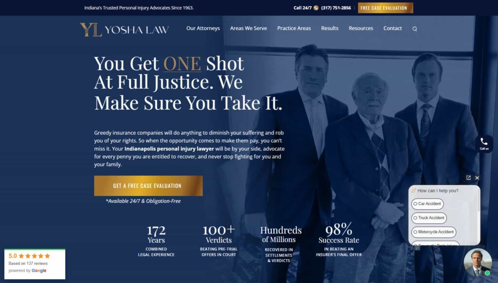
Reviews and ratings are crucial for law firms and many other types of businesses, especially local ones. So, if you have a 5.0-star average and there’s not a single bad review in there, that looks unconvincing, artificial, and manipulated. In contrast, if you have 4.9 stars. You have a couple of cranks that are in there who weren’t even customers or clients, just saying like, “I called these guys on the weekend, and they didn’t even answer the phone. How rude and whatever.” I don’t know. I’m just being hypothetical, but that’s not necessarily bad for you. It’s good for you. You can have these one-star reviews removed multiple times because they’re not from actual customers or clients, or they’re being defamatory, and some companies specialize in removing such reviews. However, if you remove all of them and have only five-star reviews, that may look a little suspicious.
Yeah, yeah, exactly. However, sometimes you can’t help but just get five-star reviews like they have.
Sometimes, you’re just perfect.
Sometimes, this is perfect, exactly, but it’s an absolute fact that if you have, like, a 4.7-star rating, it’s more believable than five stars. All right?
If your site has a 4.7-star rating, it’s more believable than a perfect five — authenticity converts better than perfection.
So, once again, we’ve just discussed what’s above the file. We haven’t even talked about the copywriting, but that’s also super important, and you’ll notice, you know, it’s probably the most obvious thing on the page; we purposely made it kind of tonal blue, so it puts more focus onto the copy and just to give their brand a unique, memorable look and feel, as opposed to it just looking like everybody else’s, but as Stephan alluded to before we did rebrand their logo, so we kept the same sort of feeling that they had in their original logo, like the why, we just manipulated it so that it became the Y and L for Yosha Law.
It’s just so classy. Great job. Great job. The brand elements, including the logo, are subtly incorporated into other areas of the site design as well. So yeah, really, really nice stuff. Nice job.
Thank you. Cool. We’ll show you the rest of the homepage, but we’ll focus on the really important stuff that the SEO experts, Stephan’s statement, and netconcepts.com did because this is what led to the incredible results.
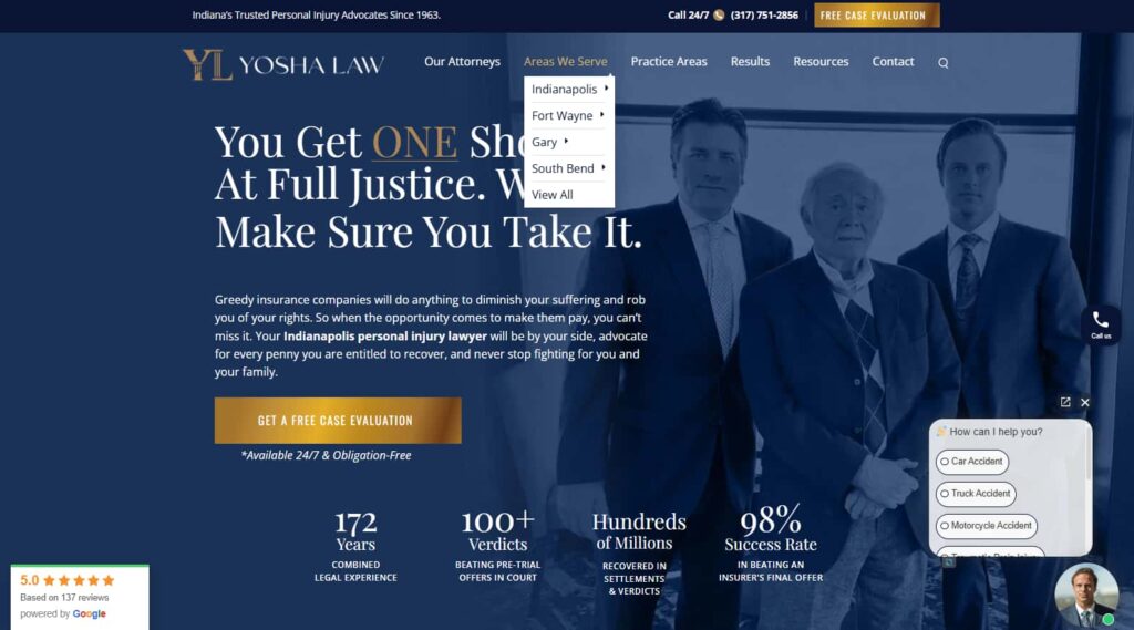
Secret sauce. It’s no longer a secret now that we’re discussing it, but yes, we actually covered this in a previous case study. This was with Ware Landscaping. However, the key point is that when you have different locations and practice areas or services, it’s essential to create a separate page for each major location you serve, even in a general business context. So, Indianapolis gets covered as a separate location from Fort Wayne, Gary, and South Bend, not all on one locations page, but on separate pages. Here’s where the magic comes in when you have a combination of both the practice area and the location.
Authority isn’t just built on logos or numbers; it’s built on stories, human connection, and making prospects see themselves in your successes. Share on XLet’s say we’re discussing Indianapolis car accidents. We are referring to Gary’s truck accidents or those in South Bend. Each of those is a separate page with unique, valuable content that helps persuade and build rapport and comfort with the reader and the visitor. It’s not just SEO copy that contains a lot of repetition of the keyword phrase because that’s not effective, obviously, for conversion. It’s also an old-school SEO tactic that hasn’t worked well over the past decade; you just don’t do that.
And talk through the links within the page.
Yeah. So, the way that you spend your link authority is through your internal linking structure. So, by having these location and practice area pages linked in the top navigation and the drop-down, as you saw if you’re watching the video, and also woven into the copy and the sidebar navigation on each of the relevant pages. So once you’re inside of, let’s say, a location such as South Bend, or you’re inside of a practice area such as a truck accident, then having those related pages that are the combination of the service plus location working that in as well, it further reinforces the importance of those pages. They’re not just there for SEO reasons. They’re there as a helpful guide for the visitor. So, if someone lands on, let’s say, the truck accidents page, they can easily find their location from within the copy. Or, if they land on the location page, they can access the specific type of accent they were involved in.

There you go. Yes, it’s a smart move, and it requires a lot of extra effort, but it’s a game-changer for attracting more leads.
And you see, there are the infographics; there’s a lot of really valuable copy there. There’s a lot of social proof and a lot of elegant design elements. These are not just whipped together, like dumping a bunch of SEO copy on the page. Like, look at all those infographics. This is really elegant stuff, and this is one of those combo pages on Indianapolis truck accidents. This is not one of the top-level practice area pages.
Yeah, that’s right, yeah.
So, I’ve written a ton of essays and created pages like this.
Exactly, exactly.
So yeah, and look how long it is. It’s incredible.
So yeah, there’s a lot of effort that goes into that.

By the way, there’s one other thing you just scrolled past. If you go back for a second, I just want to point out from an SEO perspective that this is a secret weapon. Look at all these Qs and As, such as FAQs at the bottom of your service pages or, in this case, a combination of service and location pages. It is a secret weapon. In the age of AI and LLMs, providing diverse answers beyond those from regular Google searches is crucial. This feature will also enhance Google searches, as it appears in Featured Snippets or AI answers, offering an AI overview from Google.
Additionally, there’s AI mode, which many people will likely switch to in Google over time, providing concise answers. Answer a whole ton of questions that are relevant to that particular service or location, as it’s really critical. Then, use schema markup to mark up these pages so that the LLM and Google are very clear about what’s on the page that’s crucial.
Wow. That’s the future of optimization from a traffic perspective; I wouldn’t call it SEO. Is it called SEO or AIO, or what is it these days?
Yes, there are many acronyms out there: GEO-generative, SEO, AI optimization, and so on. I like this version; SEO equals search everywhere. Optimization.
Search everywhere. Oh, I see, yeah, that’s good. I like that. Okay, trademark stuff.
If you’re a challenger brand, you have to do more work above the fold. Clean design alone won’t convince anyone to choose you. Share on XYou could be searching on TikTok. Many young people are turning to TikTok for answers to their questions. You can use it on ChatGPT. You could be using Siri, Alexa, or whatever. And try to say that quietly because it’ll start chiming in on our episode.
Yes, Greg is awesome. Is that what you asked?
It? That’s the default answer for Alexa.
Now, we’re on the homepage and underneath these incredible impact metrics that boost their credibility and authority. We have video case studies, reiterated five-star reviews, and testimonials. Now, we split-tested this. Originally, I think we had this section next because we wanted to segment people into these three services.
Section, as though this section, you remember, some people are listening.
It’s essentially our services overview, covering truck accidents, car accidents, and slip and fall accidents, for example. So, just on the homepage, under services, we’re listed. Yeah, exactly. So, what we did was move all this social proof, which we had in this section as well, just above the fold through split testing. And they Yeah, we found that they had more people converting by doing this option, right?

So, yeah, split testing is really basic. It’s really just taking an idea and sending traffic 50% to one version of the page and 50% to the other version of the page. You run it for a few weeks, depending on the amount of traffic you have, and then you simply pick the winner. You replace the page with the new version. If the new version wins, you keep the old pages. We’ve done a lot of optimization on this website. And, yeah, this was one of the winners, just bringing that social proof closer to the top of the page. And I think that’s what a lot of businesses could learn from that little split test.
Yeah. And if you want to be more sophisticated about it, you can certainly buy a platform that does not just split testing but multivariate testing, too. However, you need more traffic and conversions to achieve statistically significant sample sizes for informed decision-making. But there’s Visual Website Optimizer VWO. There’s Optimizely. There are several platforms available that you can use for more sophisticated testing.
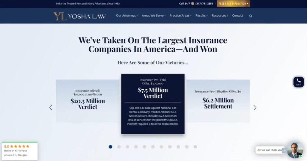
Exactly, exactly. However, we know that when doing conversion optimization, it’s best not to change too many things at once, as you won’t know what works. So, just try and do one split test at a time. So okay, I wanted to show you this. So, if we go back to the previous design and take a look at what they had here: a $7.5 million verdict and a $5 million settlement, that sounds impressive, but what does it actually mean? There’s not much clarity around it; let me explain, right?
So, instead, we informed them of the insurance company’s offer. So, in this case, the insurance company initially offered them $300,000 pre-trial, then they went to trial, and the verdict was $ 7.5 million, right? So, there’s more clarity around what this number actually means. Because if you just say a big metric like 20 million, whatever, it doesn’t mean much. But if you know the insurance company, in this case, only offered $50,000, then you know, ‘Wow, that’s impressive that Yosha Law got them $ 20 million out of a $50,000 offer.’
Additionally, I want to point out one more thing about the copy preceding that section. So here are some of our victories. Now, there’s a little secret weapon here, a little secret to copywriting that’s so effective: putting words that make you feel like you’re winning into the copy. As a result, people are more inclined to make powerful decisions and take action. A study was conducted in which participants completed a questionnaire. I learned about this from Vanessa Van Edwards.
Part of her explanation is that there were two different versions of these instructions given to candidates or test subjects. One version said, ‘Just a regular questionnaire.’ Fill it out, and then complete the other version to win this questionnaire. Here’s what you need to do, and different keywords that evoke the feeling of winning and being successful were incorporated into the copy. Just two or three of those were enough, and it massively improved not only their performance on the questionnaire or the quiz but it also improved their happiness and satisfaction levels while they were doing it. Many things were improved simply by incorporating a few instances of these keywords, such as “winning” and “victory,” and so forth. So it’s no coincidence that we’re discussing this. We’ve taken on the largest insurance companies in America and won. Here are some of our victories: dot, dot, dot. And then, with that framing, here are the verdicts, the settlement numbers and so forth.
Yeah, I love that. It’s similar to the Pre-suasion approach by Robert Cialdini as well. Yeah, very cool. Okay, and so, yeah, that’s how we handle these. And these links lead to actual case studies, which we’ll get to in a minute because one of the biggest changes we made and because these guys worked on the brand script with you, with your company, right, Stephan? What we’re talking about here is the StoryBrand SB7 Framework. It’s called a brand script, but it essentially walks the customer through why their offer is important to them, in a nutshell, right?
And so, the big change in this website, from a copy and branding perspective, was switching it. Brandon said this himself in the awesome interview you did with him that this whole website was about him, and now it’s all about what’s in it for them. That was the massive brand shift, encompassing the copy, look, and feel.
By the way, just to give some additional resources for our listeners if they’re interested in learning more about how to do a brand script. Of course, read the book by Donald Miller, Building a StoryBrand, or listen to the audiobook if you prefer that.
However, here is an actual, legitimate, and real brand script. We can’t give you the one for Yosha Law. We didn’t get permission to share that. It’s confidential, but I did obtain permission from another shared client to mention that we did a redesign for BorderBuddy, which is featured in episode number 427, where I interviewed the founder of Border Buddy, Graham Robbins. He permitted us to share the brand script that we created for him that was used in the redesign that Studio1 did. That’s at marketingspeak.com/427, so definitely check that out because you need a great example of a brand script to do this, right?

Yeah, very cool. And so, in that brand script, it’s really saying that you have two choices for your prospects. So, one, they can go with a competitor, and they’re not going to get an awesome outcome. Or, two reasons why they should come to you: the outcome they’ll get will be significantly better. You kind of have to unpack that in the brand script, and that’s what this little section on the page is all about. There are two types of personal injury lawyers. Option one is your personal injury lawyer; sorry, an attorney is competent enough to get the job done, but what it’s saying, pretty much, is you’re just another number, and they’ll just try and get rid of you and get to the next case study as soon as possible.
They’re just happy to get a settlement if it’s going to save them a ton of time.
Exactly. If you go with Yosha, then we’re going to fight for you. We’re going to take care of you, your family, and your life, and you’ll have a wonderful life if you choose us because we care about you a whole lot more. In a nutshell, right? It’s not that articulate, but that’s what we’re trying to do.
I like the term advocate. They’ve got that in the copy. We’re an advocate for justice. For you.
Exactly. The other part of this brand repositioning for Yosha Law is to demonstrate how, through case studies of their clients, they connect and highlight their unique differences. So what we’ll do is show you one of the case studies. We’ll go to that, yeah, and the rest of the page would. It’s got a really cool video here. It’s a SPIN Selling video, which is an acronym for a best-selling book by Neil Rackham called SPIN Selling, which is really just letting people know that you understand.
S, the situation they’re in.
P, the problems they face because of their situation,
I, the implications if they don’t address the cause of the problem or if they choose the wrong solution, and then
N is the need, which is essentially what’s unique about your solution and how you can help them.

So, if you watch this video on the homepage, that’s what the brand script was. So, it’s pretty powerful, but I wanted to highlight this case study in particular. There are a few, but I chose this one to show you. I won’t watch or play the video in its entirety, but it really just shows the story of the client they helped. And then you’ll see Brandon comes over to the house, and he’s just talking to her on a deep level. Is that out in the backyard, on the swing with her, talking through it? It’s just really powerful. And all of these are just showing the emotion and emotional side of the prospect. And then, when a prospect to this website is watching the video and reading their story, they can see themselves in it.
And, yeah, it’s just super powerful. This was the whole brand positioning piece, where we shifted the focus from Yosha to what’s in it for them and how he helped others and got that emotional hook. So yeah, and there’s a whole case study page for each one of these videos as well, showing how much they are offered and how much they were rewarded, et cetera. But they’re pretty incredible pages because then, with these case study pages for individual case studies, you can put it into your email marketing and your social media and wherever else you’re driving traffic to your website. Pretty powerful.
Authority doesn’t come from traffic alone — it’s built through proof, clarity, and consistent design.
This is such an expansive approach; it’s like really gets you into their world, that client, and what their situation was, what they were facing. In many cases, the odds were really stacked against them, and then they got a great outcome. It didn’t make them whole, so to speak, but it really made it a lot easier for them to cope with the new normal.
And if you’re a business thinking about creating a case study, it could be a lot of work. It is compared to just putting up a testimonial. But you don’t need that many. You could get by with even, say, three to six case studies, and you can use them for years to come because they are so powerful. So yeah, that was the way we approached flipping the switch, the script, I should say, from focusing on them to, Yeah, it’s all about the customer.
So, we talked about the pages and the SEO side of it. Let’s take a look at the blog, as I think this is something we’ve put a lot of effort into. Stephan, it was your idea to categorize blog posts by their individual services, such as car accidents and motorcycle accidents. This way, when you enter each category, it’s easier for people to find relevant topics. But then you go into the individual blog posts, and what we did here, from a conversion optimization perspective, was put in a sticky form. I know we’re on a desktop, but we’re currently showing that. We’ve also optimized the mobile version, which you’ll see shortly. As you scroll through the form, the call to action to review my case remains sticky, even when you’re scrolling through the rest of the blog posts. So yeah, that was a huge conversion booster. So that’s an idea.
Preeminence isn’t just about ranking — it’s about being remembered and preferred.
On the left side, two sticky elements form a section. The article and table of contents are positioned on the right side, and they don’t scroll away. So they can easily jump to different sections of the article without a lot of effort, and also just another little nuance that makes a difference from an SEO standpoint. If you go to the top of the article, it doesn’t say when the article was written. It says when it was last updated.
Yeah, explain that. Why is that?
Well, because it was written in 2017, but it was updated two months ago with a lot of new information, new stats, more contemporary examples and so forth. That’s what really matters to the user, and that’s actually what matters more to Google. So, a 2017 article that hasn’t been touched on is obsolete. In many cases, it’s dated information. It’s not going to rank as well. However, if you continually update it, and that’s what’s featured as the last updated date instead of the original published date, you’ll appear more relevant and timely. ,
There are a lot of little tricks you do for SEO on the blog, like the breadcrumbs and this little knowledge panel section at the bottom. It all boosts SEO conversions, doesn’t it? Why does this help?

So the bylines at the bottom there for Brandon, if you think about this concept of E, E, A, T, expertise, experience, authoritativeness and trustworthiness, that’s an acronym that comes from Google that the quality raters at Google had to rate websites on that they were visiting, and then that went in as training data for the machine learning algorithms so if you demonstrate more of that EEAT or experience and expertise and all that in the content of the website, including on blog posts Brandon as well. On awards, that’s all he’s got, with all these recognitions, and that’s featured at the bottom of the page to help set the tone of this page. It is not just an AI-generated piece of content that was just spun out in two minutes. Now, this was written by Brandon, and it’s high quality, and here’s his reputation to go along with it.
Understood, yeah, very cool. Speaking of his reputation, you introduced him to the idea of writing a book, which he took on.
Yes, I didn’t just give him the idea. I really pushed him to do it. This was not even on his radar at all, but now he’s one of the very few attorneys in the country who has the book, and it’s like a part memoir, part really great examples of cases and lessons learned and so forth. So it’s a great book. He didn’t have to write it. I connected him with the ghostwriter I’ve used for past books, and she did a great job.
They also have an audiobook, in addition to the actual print book, which you can purchase on Amazon. It’s not just a free download e-book. This is like a really legit book, and he’s got a history behind him that’s really interesting beyond before he was an attorney; he was a running back in college football, and he was very successful. He had a lot of promise, possibly even to go to the NFL or something.
So there’s a whole story here, which is expanded on in the book a bit, and it’s in the about page and the timeline and all this sort of stuff. But he has a book that really positions him differently from most attorneys and really puts him in another tier. This is the landing page for that book. He was giving it away to prospects and clients, and that was really helpful, as it helped set his preeminence positioning before signing a new client. Oh, yeah, it’s really good.

Yeah, check out the landing page as well. It’s got a lot of authority-boosting things on there. So yeah, it converts well. But also, yeah, he’s even got his case study, just one of the examples of how it helps a client, which is the same case study that we showed you earlier. So, when creating a book landing page, consider what’s in it for the reader and why they’ll find value in what they’ll get out of it. Then, support this with a lot of proof elements. So that’s what we do for book landing pages. But yeah, that’s what I mean. Stephan, like you, gives clients so many ideas. It’s more than just boosting their traffic; it’s more about boosting their authority as well. So yeah, it’s just very unique.
Let’s take a look at the mobile’s actual design, and then we’ll go to the results. So, what we did on their mobile for the hamburger menu, we realized they were getting a lot of traffic on their mobile views. So for the hamburger menu, we played around with this home page section, a lot of the call to action at the top and making all that sticky, but the hamburger menu itself, normally, clients will just have, like, a standard list of whatever’s on the top nav of their main desktop website, however, from doing split tests and looking at user behavior on Microsoft Clarity and having a look at the Google Analytics data and the pathways of where people go. We realized that people were primarily interested in car accidents, truck accidents, case studies, and other related topics. So you’ll notice the navigation order on here is different from on their actual desktop view. We’ve highlighted the key points first, and you can scroll through all the cases they handle, including their practice areas and case studies. So yeah, it’s pretty powerful, but this really boosted their conversions.
Why don’t you explain what this tool is? Because it’s so handy, you don’t have to whip out different kinds of phones. Probably, you only have one phone, so it’s an Android or an iPhone or whatever, and a certain screen size, but you can see, if you’re watching the video, you can see multiple screen sizes. You can see different kinds of devices emulated here, all on one page on one screen that you can navigate between. And this uses a particular tool that you found. What’s the name of the tool, and how do you get it responsive?
It’s just a Chrome extension. It has all different types of phones and tablets pre-loaded, and you can just select which ones you want to display for your testing. So, generally, we know most people have iPhones. We have different sizes of iPhones. There’s a Pixel Pro in there as well, and an iPad Air, and I mean, they’ve got everything in here, but we just focus on the most popular devices. Thanks, Stephan.
If you’re using multiple creatives, a brand style guide ensures you’re represented consistently across every touchpoint.
It’s pretty powerful, and you can just scroll through every page at once, so you can see how it looks on all different screen sizes. So yeah, obviously, the website needs to be yeah responsive for every screen size. Because yeah, you just don’t know what size people are going to be viewing your website. So that’s how we handled the hamburger menu, and this was a game changer. As we do on many websites and during conversion optimization, we’ve never seen a negative result. We also do this on e-commerce, displaying the best and most popular products, such as the highest-selling ones, first and showing images of them. Social proof is a must. But yeah, it’s pretty powerful doing that with a hamburger menu. So, the results, Stephan, do you want to run through this?
Let’s review the public case studies on both your site and mine. Also, I think we should play that little clip that you found from the interview where I interviewed Brandon. Let’s play that, yeah.
The KPI for success in your industry is the number of signed cases per month. You’re, like, at just about at all-time records, right?
B: Yeah, just this month, we are at 16 signed cases, still at about nine days.
That’s outstanding. That’s a big, big deal.
B: Yeah, and every case has to meet certain criteria, and they’re all good quality cases where people need our help. So before I came into the firm and realized that we needed an entire revamp, I think the year our firm signed 12 motor vehicle accident cases, on the whole year, just this month, we’ve signed 12 motor vehicle accident cases. The other four are premise liability cases, and that’s just in one month. So, we have essentially outperformed an entire year of case intake in one month. This is long-term success.
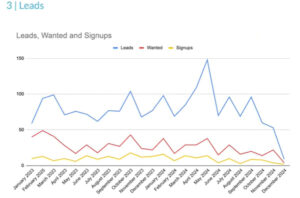
Cool, yeah, so that’s pretty incredible, the results that just came out of Brandon’s mouth. So, basically, it’s saying that traffic and conversions have been through the roof compared to the previous website.
Now, one other thing that is not in that recording but was added to the intro. So that was recorded in late-ish December, about two-thirds into the month of December; at the end of the month, they actually signed a bunch of additional cases, and they got up to 23, which was a massive record-breaking month for them.
Wow
Not just 16, because the 16 was fantastic, as you heard, but to get up to 23 at the end of the month, that was phenomenal.
Amazing, yeah. And that’s the case study on your website, but you also did a lot more for them, including social media and other things, right?
Yeah. So what we’re looking at right now, if you’re listening, is a case study page, a public case study on the new Stephanspencer.com designed by Studio1, of course, and a lot of great results, as you can see, and improvements and percentages and up into the right graphs and all that sort of stuff. We delivered a lot of tangible evidence for Yosha Law. Additionally, the case study episode we did, where I interviewed Brandon, provides some context about the book and its origins. That’s all part of this case study. And then, you did a case study page on your site as well. Do you want to show that?
Sure, yeah, and so we’re really just highlighting the fact that this was a result of Brandon investing in the website, the videos, the copyright, and the SEO. So yeah, the results,
yeah. Why don’t you read the quote from Brandon,
“I invested heavily in my new website, videos, copyrighted and SEO, and I’m thrilled with the result. Our traffic and inquiries are at all-time highs month after month, yeah. So, 12x increasing conversions overall. So, 60 new leads in the first three months, and yet, over 200% daily traffic increases. That’s from Stephan’s team.”
A well-executed brand style guide ensures visual consistency across every marketing touchpoint.
Yeah. I think it was actually 60 new cases signed, which is that’s the success, not just inquiries. They receive a lot of inquiries, but since they’re not the right fit, they pass them on. So, the sign cases were the real difference maker for them, and for most law firms, that’s the needle they’re judging success on. There are a number of sign cases per month.
Which is incredible. Yeah. Then, we created a full brand style guide for his brand, based on the new look and feel, so he could use it across all their marketing. I do have it here, so it’s important for most companies; if you are using multiple creatives, then put a brand style guide together so you have all the do’s and don’ts for your logo and your color palette, and however you want to be represented, you’ll just make sure you have a consistent look and feel. The color breakdowns include hex codes.
If you have print material, you can include the CMYK breakdown and photography direction, which is essentially everything we included in the mood board at the start. We then incorporate this into the final brand style guide. Final elements. So yeah, all credits, from blog posts to podcast images, everybody can see how you want the brand to be represented in the real world. So that’s a brand style guide. Yeah, pretty important. Yeah, that’s beautiful. Thank you. So, do you wanna go over these results as well? Or is that all in the case study on your page?
Yeah? So, these are just updated results from more recent data. If you look at the organic traffic and organic keywords, most of the time, they’re up and to the right, right? So there’s definitely a correlation between several keywords that you if you scroll down to the keywords that they’re ranking for, and the organic traffic that they get because of it, and the lead volume, like if you’re tracking your calls with call rail or call tracking metrics, something that allows you to associate your marketing initiatives to the calls that are coming in. That’s really important.

So anyways, this is all compelling stuff up into the right graphs and things, and if you have tracking in place, we want to extract out the sort of stuff to get you a good overview of what’s working and when it’s working when it’s not working, because the old adage, what gets measured gets managed. That’s not just about looking in your Google Analytics.

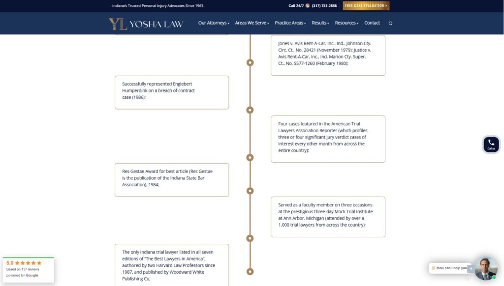
Yeah, exactly. So, yeah, incredible results, and yeah, I think they deserve it like they’re incredible lawyers. They really care. They’re passionate about their clients. And now that we’ve showcased all that passion, and they’re human, we reveal the human side. One last thing, let’s show these about Stephan, if we have time, because obviously, Buddy has a lot of history. This was Stephan’s idea. Normally, we just do a timeline for a brand, right? But Stephan said this guy has an incredible history, and so if you have looked at all the elements on this page, what did you call it before Stephan?

Yeah, it’s a tribute wall. I mean, that’s what I was envisioning when Brandon had so much love and respect for his dad, who was just an incredible force for good in the world and a huge inspiration to so many people. Brandon, of course, being one of those people that it was a great, I think, tribute to him to make a virtual tribute wall on the website.
So, it’s not just an about page with a timeline, but really a tribute to Buddy. This is how much I respect and love and care about you, Dad. I’m making sure that you have the most incredible page here or section of your site. It spills over. It’s not just on the Buddy Yosha page under the About section but also on the main timeline and the main About page. So there are multiple places where you really get the sense for this guy’s stature and how much love there is in the Indianapolis and Indiana area for him, and he’s really an inspiration to a lot of lawyers, including competitors.
Yeah, what a history. Milestones are just amazing. So yeah, a lot of achievements. And yeah, very well respected. So yeah, he’s a super lawyer. Not many people get that title. So that’s the human side that we’ve injected into this website. And yeah, the results are pretty damn good.

Yeah, that’s definitely a huge extreme makeover before and after that. I believe our listeners and viewers can apply many lessons to their own businesses, regardless of whether they’re in the services industry; there are numerous takeaways they can gain. What would be some of the key takeaways that you want to reiterate as we wrap up this episode?
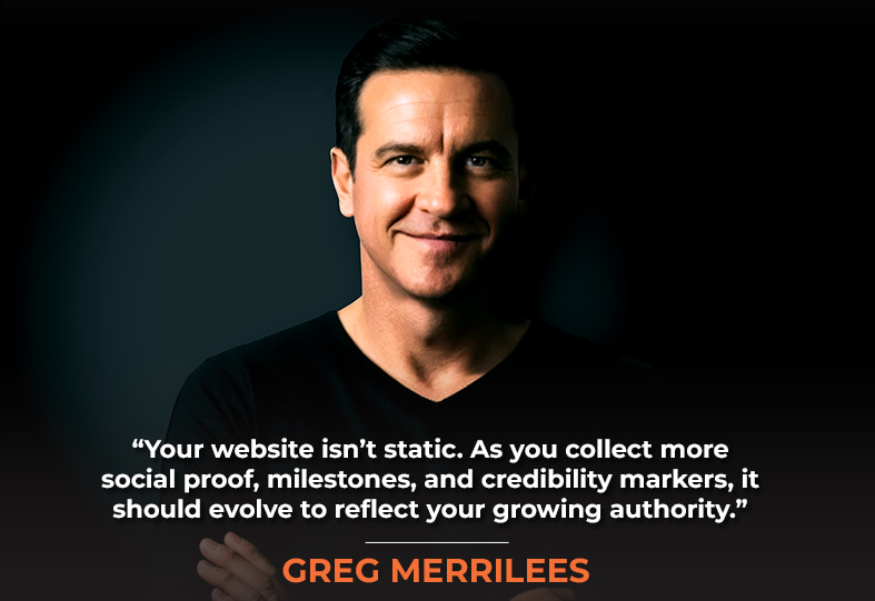
Absolutely. Just look at your brand positioning and your price point, and are you represented in the light that is in the best light possible for your offer? And over time, you’ll accumulate more case studies, social proof, credibility, and milestones on your journey. Just keep adding them to your website, and you’ll always stay relevant, continually building your authority. So yeah, then you’ll just keep attracting better clients as a result of that.
If you’re looking for a world-class web design or SEO firm, consider Studio1 Design for web design development and conversion optimization. There’s Netconcepts for SEO, my company. So, why don’t you also give a link or mention the website for your book, which might already be out, depending on the air date of this episode?
Yeah. So Next Level Website Design. Thank you so much, Stephan, for mentioning that. And there’s a case study in there for Yosha Law. There’s also a case study for Stephan Spencer for personal brand. So yeah, check that out. I’d love that Nextlevelwebsitedesign.com, and yeah, the studio1design.com is our agency website. And yeah, what about you, Stephan? Where can people go to check your team out?
So netconcepts.com is our agency website. Stephanspencer.com is my brand website. If you are interested in checking out the websites for either of the two podcasts, you can do so here. There’s this show, Marketing Speak, and then Get Yourself Optimized, which is a personal development podcast. All Studio1-designed websites. Well. Thank you. Listener, thank you, viewer. Do something with this. This isn’t just edutainment. This is meant to be actionable advice and actionable insights that you can apply to your business and personal site, as well as to any online initiatives enabling you to make a bigger difference in the world. So get out there and make it a better world. I’m your host. Stephan Spencer, signing off.
Important Links
Connect with Yosha Law
Connect with Studio1 Design
Connect with Netconcepts
Apps/Tools
Article
Books
Businesses/Organizations
People
Previous Marketing Speak Episodes
A Case Study in Preeminence, Prominence, and Positioning with Brandon Yosha
Build Your Business With The Strength Of The Parthenon with Jay Abraham
Digital Course Website Overhaul: A Case Study with Greg Merrilees
E-commerce Redesign Secrets: A Case Study with Greg Merrilees
From Hands-On to Visionary with Graham Robins
High Converting Landing Pages with Greg Merrilees
How to Build a Digital Marketing Agency with Stephan Spencer and Greg Merrilees
How to Grow a Site from 0 to 6 Million Visitors with Chris Parker
How to Read People with Vanessa Van Edwards
Local Services Website Teardown: A Case Study with Greg Merrilees
Mastering the Art of Persuasion with Dr. Robert Cialdini
The Enlightened Marketer with Jay Abraham
Scaling to 12 Million Monthly Visits with Chris Parker
Secrets to a Persuasive Website with Greg Merrilees
Using SEO to Its Full Potential with Stephan Spencer (Interviewed by Jay Abraham)
Wisdom That Transcends Marketing with the Legendary Jay Abraham
Previous Get Yourself Optimized Episodes
YouTube Videos
Your Checklist of Actions to Take
- Remove autoplay videos from my homepage immediately because they slow page load times, hurt SEO, annoy repeat visitors, and fail to communicate what’s in it for my prospects without sound. Instead, replace them with static hero images and clear value propositions.
- Create location + service combination pages for local businesses. Create separate pages for each major location I serve, incorporating each service I offer, and include unique, valuable content that enhances both SEO and user experience.
- Move social proof closer to the top of my homepage through split testing. Test different arrangements of testimonials, reviews, and case studies. Moving social proof elements just below the fold significantly increased conversions compared to burying them further down the page.
- Replace generic settlement numbers with context that shows my value. Instead of just stating “$7.5 million verdict,” explain that “the insurance company offered $300,000 but we secured a $7.5 million verdict at trial” – this clarity demonstrates my actual impact and negotiation skills.
- Analyze my Google Analytics pathways and use tools like Microsoft Clarity to see what visitors want to access, then prioritize those items first in my mobile navigation rather than just copying my desktop menu structure.
- Implement sticky contact forms and a table of contents on long-form content. Add a “Review My Case” form that stays visible while users scroll through blog posts, and include a sticky table of contents so visitors can easily jump between sections without losing the conversion opportunity.
- Create comprehensive FAQ sections at the bottom of service pages. Build extensive Q&A sections for each service page to capture featured snippets, help with AI-powered search results, and provide immediate answers to prospect concerns.
- Develop video case studies that show an emotional connection with clients. Go beyond written testimonials by creating video case studies that show me interacting with clients in their environment, demonstrating the human side of my business and allowing prospects to see themselves in similar situations.
- Use “winning” language throughout my copy to prime visitors for action. Incorporate words like “victories,” “won,” and “success” into my messaging – research shows that priming people with winning language improves their decision-making ability and satisfaction levels.
- Connect with Studio1 Design for conversion-focused web design that prioritizes results over aesthetics. Visit studionedesign.com to discuss my website redesign needs, or check out Greg Merrilees’ book Next Level Website Design at nextlevelwebsitedesign.com, which includes detailed case studies like the Yosha Law transformation.

About the Host
STEPHAN SPENCER
Since coming into his own power and having a life-changing spiritual awakening, Stephan is on a mission. He is devoted to curiosity, reason, wonder, and most importantly, a connection with God and the unseen world. He has one agenda: revealing light in everything he does. A self-proclaimed geek who went on to pioneer the world of SEO and make a name for himself in the top echelons of marketing circles, Stephan’s journey has taken him from one of career ambition to soul searching and spiritual awakening.
Stephan has created and sold businesses, gone on spiritual quests, and explored the world with Tony Robbins as a part of Tony’s “Platinum Partnership.” He went through a radical personal transformation – from an introverted outlier to a leader in business and personal development.

About the Guest
GREG MERRILEES
Greg Merrilees is the founder of Studio1 Design. He’s passionate about really good-looking website design that gets results!


Leave a Reply