


It’s wonderful to have Greg Merrilees back with us on the show. He’s been a guest multiple times. He is the founder and managing director of Studio1Design, an incredible design firm. It’s my go-to. It’s my secret weapon for not just all my websites and my wife’s websites, but my clients as well. And we’ve been working together for over a decade. It’s just been an incredible partnership.
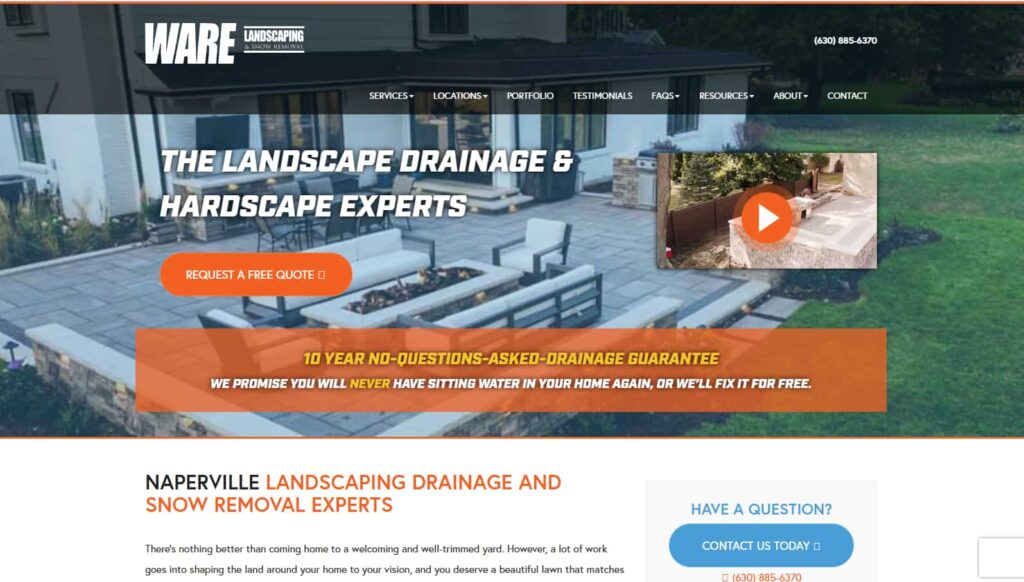
In this episode, we are going to go over how across many years, we’ve collaborated on many, many clients. But in this particular episode, we are going to zoom in on one particular client, Ware Landscaping, and how we were able to take this local services business from a pretty not great place, in terms of the quality of their SEO and their web design, their conversion to really stellar and outstanding in many ways.
You’re going to learn some great stuff in this episode about how you can apply these same principles to your own website. And there’s stuff in here that I’m gonna guarantee you have not heard of before, strategies and tactics that will be outside the box and you’ll wanna implement on your own site as well.
In This Episode
- [02:11] – Stephan reflects on his long-standing partnership and friendship with Greg Merrilees, underscoring the mutual value and growth they’ve experienced through collaboration.
- [04:10] – Greg showcases the Wayback Machine to reveal a client’s outdated website and illustrates the importance of redesigning with conversions in mind.
- [09:47] – Greg stresses the strategic use of brand colors and the necessity of a strong, visible call to action.
- [11:26] – Stephan outlines why building location-specific service pages boosts SEO performance and helps capture localized traffic.
- [14:42] – Stephan delves into leveraging blog posts for SEO, focusing on creating authentic content that resonates with human readers and passes the “sniff test.”
- [18:10] – Greg and Stephan explore how the StoryBrand framework helps resonate with ideal clients by positioning the brand as the solution to their pain points.
- [22:49] – Stephan breaks down a YouTube strategy upgrade, highlighting the value of consistent video editing and optimization resources.
- [28:46] – Greg introduces mood boards as a visual tool to align the website’s design direction with the client’s new brand identity.
- [34:11] – Stephan and Greg emphasize using emotional copy, trust signals, and impact statistics on the homepage to increase credibility and engagement.
- [39:59] – Together, they address the structure of service and location pages, spotlighting the need for compelling headlines, supportive subheadlines, and measurable proof points.
- [58:36] – Stephan reveals how well-crafted FAQs can preempt objections and provide clarity for prospective clients.
- [69:34] – They highlight the importance of user journey tracking tools like Microsoft Clarity to gain insights into visitor behavior and improve website effectiveness.
Greg, welcome to the show.
Thank you so much for having me. Stephan, 10 years. Hey, wow, it’s been a long time.
Yeah, it’s been, I think, over 10 years. I think probably 2014 or so. When we met through Taki Moore, The BlackBelt Mastermind, he was running. And wow. You know, out of many 1000s of dollars I spent with Taki for that mastermind, multiple years, the best thing I got out of that was you. Was that intro and the recommendation to work with you? I’m so grateful.
Amazing. I was gonna say, like, 10 years of working together, but we’ve got a friendship. It goes a lot deeper than just working together. We hang out together when we train.
I consider us a soul family. I think that we must have worked together in past lives. We do get along. Collaborating with you on so many projects seemed like the most natural thing, and we help each other in life and business. Our lives are richer because each other is in it.
You bet. Now the list is probably thinking, get on with the guys. So what have we got?
Yes? So, let’s talk a bit about the background of Ware Landscaping and why they needed the up-leveling. So why don’t you start from a design and conversion standpoint? You’re going to use a secret tool that many people know about but not everybody. So why don’t you explain this tool that will help our listeners? You’re actually sharing your screen right now, too.
So, if your listeners are only listening without video, you might want to watch this later with the video so that you can see everything before and after work. Yeah, it’ll give you a lot more tangible experience. So, Greg, you’re sharing your screen no and showing us a Wayback Machine tool. Why don’t you?
Yeah, you introduced me to this tool, and I use it to show a lot of clients what websites looked like back in the day. And this goes back to 1990 something, Stephan, this machine.
Yeah, I think ‘95; not every website from ‘95 was captured. So, I actually started my agency, believe it or not, in 1995, and the first iteration of Netconcepts.com and the Wayback Machine was captured. It was from 1997, so you can see my site and look at my agency website from 1997 in the Wayback Machine. So, yeah, continue.
All right. And so we’re showing here what warelandscaping.com looked like before we designed it. And to get that, we’ve gone to the Wayback Machine. It just hovers over one of the dates, and you can click on it to show what it actually looked like. And here it is. So this is what it used to look like before.
And the URL for the Wayback Machine? What is it? web.archive.org
There you go. I have no idea. I just typed in.
Or you can Google.
All right. So, where did the landscaping used to look like this? So, I think it’s just a bit of a background, like Michael Ware, who started this business in the early 2000s. And you know, since he was a teenager, he just loved landscaping and turned it into a business. He did quite well. He’s doing really well in the Napier area. What’s the state?
Yeah, Napier is in New Zealand. No, Naperville is a suburb of Chicago. Yeah, he’s Chicago-based.
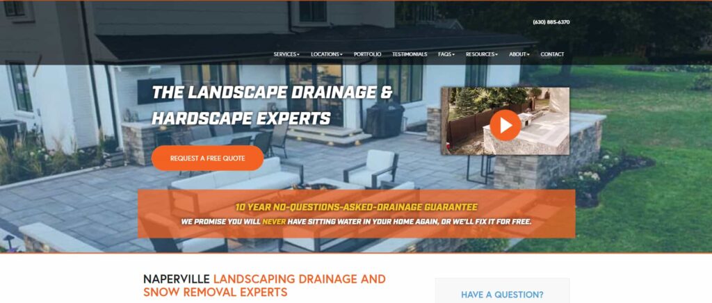
Your website is your most powerful positioning tool, and it’s never truly done. Continuous testing, measuring, and refining is what keeps you competitive and converting. Share on XBeing an Australian, I have no idea where that is, but he has a good reputation and does incredible work. He’s really good at what he does. A lot of his work comes from people having a problem with their drainage, essentially, and that’ll turn into a full drainage landscaping, hardscape, or whatever they need. He’ll just turn it into a full project because clients love working with him. He’s very down-to-earth, yet people stick around for years with him because he does such incredible work. This is what his homepage used to look like, right?
So, it is probably not terrible for something that’s probably created in 2020, or whatever it is, but from our perspective, it’s definitely not a conversion focus. There are a lot of issues with it. From an SEO perspective, the reason Stephan reached out to us is that for Stephan’s team to do amazing work like they do, they need a website that will convert better. And yeah, that’s why we team up.
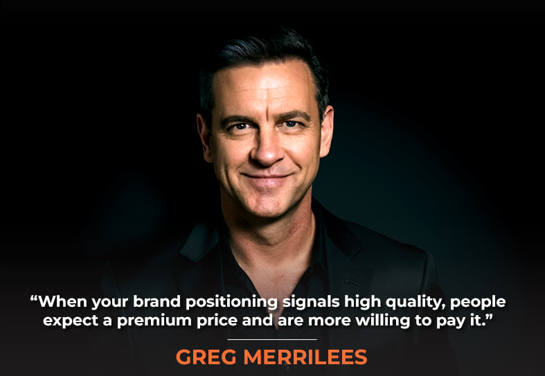
It has a better brand look and feel and has a positioning of quality and a high-touch upper echelon. And when people are spending 10s of 1000s of dollars for hardscaping or drainage fixes, they want to know that this is not a fly-by-night, this is not a guy in a garage operation, that this is legit, and that they stand behind their guarantee and that they’re here for the long haul.

So, this website design did not reflect that. And so when we worked really hard to get SEO results for Michael Ware, we would end up driving them to a website that looked not so credible, and some of the traffic didn’t convert that probably should have,
Yeah, understood. And so realistically, the other thing is, because he’s charging 10s of $1,000 if his brand position is poor, he generally attracts lower quality leads. And that was one of the problems he said to us on one of the initial calls:” People, they may reach out, but they don’t convert,” because when he tells them the price, they’re scared. They’re just not prepared to pay that much and didn’t expect it. But when your brand positioning is high quality, people expect it, and that’s one of the results we’ll discuss later. But yeah, it’s changed with the brand positioning compared to what it was. What it is now is to attract and convert better quality leads. So this is what it was.
One of the things you suggested that was really great was to do a pricing juxtaposition and provide several tiers of services, like a subscription service for landscaping, mowing lawns, cleaning up the yard, and all that sort of stuff. There were three options that I thought were really clever, and I’d say it would send away many tire kickers and the people who tend to lowball because it’s on the pricing page. Now, a drainage job can be much more complicated. It requires an on-site kind of inspection analysis and estimation, but for the more straightforward jobs of landscaping and stuff, you can do snow removal. Depending on the situation, you can give pricing checks to positions of three different options.
Yeah. And so yeah, we’ll show those pages and how that’s all displayed, but it helps with clarity and attracts the right person. However, one thing that he really did well was that he had this 10-year guarantee, with no questions asked.
For drainage. So, a drainage project, one of the most expensive types of landscaping projects, with no questions asked and a money-back guarantee if it didn’t work or stopped working years later, was a great guarantee. Really exactly differentiated,
That’s exactly right, so he’ll fix it for free forever, for 10 years. It’s an incredible guarantee, but it’s kind of hidden here, and, like, obviously, we’re very conversion-focused, so it’s the brand positioning piece. Also, just the look and feel, where you want the eye drawn to the call to action. And we’ve got three orange things right next to each other that really compete. Obviously, the top nav is orange; the logo is orange. Everything’s orange, right? So, even this text is orange. So it’s okay to use your brand color on your web page but use it sparingly so it doesn’t compete with everything else around it. So you want it clear.
What do you call that? Is that the accent color?
It could be the accent colors, for instance, for this palette. For example, he has blues and navy, but you can’t quite see it; it’s hidden when you scroll down. It’s just a simple color logo. But he has a navy blue and an orange in his logo, which is all over his signage, on his vehicles and everywhere.
So we were going to change the logo, but he decided not to change it. But we kept the palette because it’s actually known in the neighborhood for his existing branding. So that’s one thing we must be wary of if we are doing a brand positioning change: we have to consider the existing clientele.
It’s okay to use your brand color on your webpage but use it sparingly so it doesn’t compete with other elements.
If it’s too jarringly different, they may think it’s a totally new business, and they may not associate it with the existing business, which they may have previously dealt with. So yeah, it’s just something to consider if you are rebranding; yeah, think about whether your existing customers still recognize the brand when you upgrade it. But yeah, okay. So then all this text here, Stephan, just talk to this. Is this kind of there for SEO purposes?
Yeah. So, we had been working for months with this client before you got involved, and we created a lot of additional content for their site. We created separate services pages that hadn’t existed before they had services pages before. But there is a big difference, and this is really crucial for any local services business, if you create a combination of the service and the town or village or suburb, and now you’re targeting these location plus service pages of that particular market with that particular service.
For example, Naperville landscaping, Naperville drainage, and Naperville snow removal. Those are really crucial pages to have. And if you’re a law firm, or you are a plumber or electrician or any other kind of local business, and you serve multiple suburbs, multiple towns in the area, you really need to do this because that will help you to rank for those combinations of keywords, and not just like trying to be everything to everybody with the general drainage page.
The general drainage page may rank for your main city town or suburb, but it probably won’t rank for all 10 or 15 other suburbs that you’re trying to target as well. And that, indeed, was the case. And then, by rolling out all these additional pages, which had valuable, unique content for each of these location and service pages, we were able to really up the rankings and the organic traffic, and that was even before the redesign happened.
Got it. There you go, and yeah, so you can see on these pages that you’ve got a lot of internal linking as well for low other locations or services within each location, right?
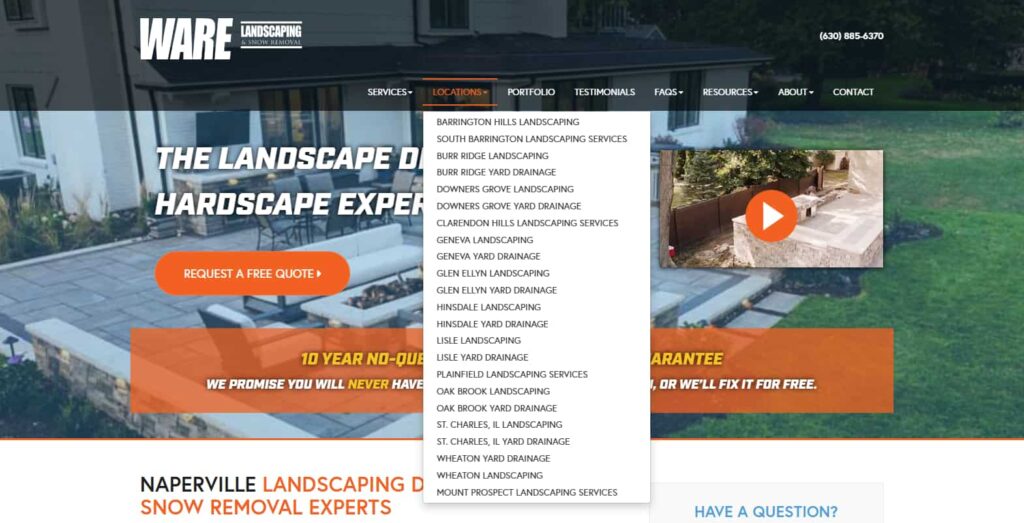
Yeah. So if you think about it, if somebody’s on a services page like drainage, and they’re in Brookfield or Oak Brook or whatever, and they’re not in your main town, Naperville, for him, for Michael, then yeah, we should have secondary navigation or in context links that drive the person to those more relevant suburbs, and then vice versa. If you’re on a location page, let’s say you’re on the Oak Brook page. Well, what are the services that you offer for Oak Brook that should link to other combination pages? So yeah, this is an internal linking strategy.
Regardless of what kind of site you have and what kind of business you’re in, you really need to hone in on an internal linking strategy that helps reinforce the importance of the pages that you think are important by linking to them in a strategic way internally with your own site, because you’re not spending or sending more trust to those internal pages by linking to them from more pages on your own site, but you are sending more importance signals to Google.
If you’re writing primarily for SEO and not for user experience, Google’s AI is far too sophisticated—its algorithms will easily detect that the content is geared more toward SEO than providing real value.
So that’s a crucial distinction. Get trust from other sites linking to you, and that’s why you want to get deep links to internal pages and not just to your homepage. Then, you spend that link equity internally once you receive it through your internal linking structure.
Got it. Is part of that strategy writing blog posts as well for each of the services?
It can be but. But if you’re writing it primarily for SEO and not for user experience, the AI at Google is way too sophisticated; those algorithms will pick up that this is primarily SEO copy and it’s not meant for human consumption. So it really needs to be a super valuable piece of content and pass that sniff test because if a human user is not really interested in reading it, then the algorithm, for sure, is gonna be able to pick that up.
There you go. Okay, good to know, yeah. And so if we look at all of the pages, like all of the individual service pages or location pages, they just use, like, a standard blog layout, which is kind of boring.
Yeah, and you’re still showing the old version of the site before the redesign. So yeah, for a listener who’s listening, we haven’t shown off the new site yet, which is amazing and really does some really clever things. So yeah, we’ll get to this. It is just SEO applied to the old structure of the site, which was really constraining for us as an SEO company, Netconcepts.
Cool, awesome. All right. So he even had a careers page as well, which just looked like this. Will show you the new version of that later and why that careers page is so important that this was his about page. So, generally speaking, people will visit your About page. Would you say it’s one of the most visited pages on most websites? Stephan the About page?
Yeah. People want to work with those that they know, like and trust, and your methodology for about pages was such a game changer for me and for all my clients of having the whole storytelling with a timeline, with a hero’s journey and everything, and not just a big block of text about the company. It’s a big difference-maker. And, of course, most people are going to want to know about you before they give you money.
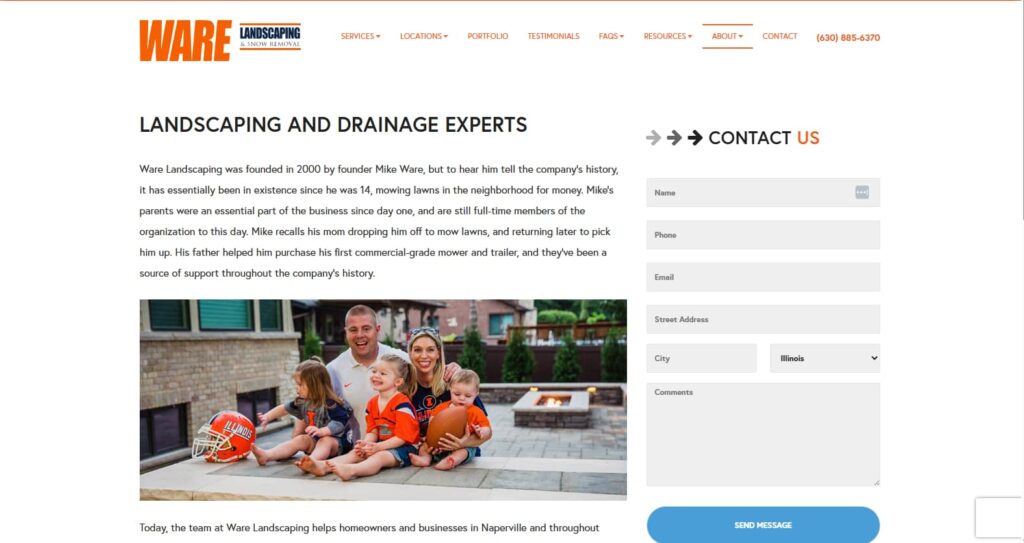
Exactly, and it’s, yeah, it’s your story. But it also needs to relay what’s in it for them. So we’ll get to that when we’ll show you the examples of what we’ve come up with. Then, the service index page looked pretty average on mobile. It was quite terrible as well, with these leakage points, especially the social media icons in the top nav. Well, the purpose of your website is to bring people from social media to your website. We don’t want to take them back again. So, if anything, we’ll just put social media icons in the footer but not in the top nav.
Those were so prominent that those social chiclets took up as much space as the logo for the business at the top. That’s crazy true. Like, who are you promoting? Are you promoting Facebook? Do you want Mark Zuckerberg to get more business? Or are you trying to get more business for yourself?

So we know that’s what we started with. That was the problem. It was getting an increase in traffic, but it wasn’t converting well or attracting quality leads. It was hosted on slow hosting. So, we recommended Google Cloudways or WP Engine. He moved to WP Engine for this one. So yeah, just everything about it’s been rebuilt. Stephan’s team then does a conversion audit. So there was a whole bunch of tips that they
30 pages, yeah, just a few ideas.
Then, what we do as well is I have a deep dive call with the client to review his existing website, and we dive deeper into his competitors and his target market. We get deep into what makes his target market tick. When we think about what to put on the website, as far as copy is concerned, it needs to talk to the target market.
So, Stephan’s team uses the actual StoryBrand, Donald Miller‘s StoryBrand framework, to draw out how the clients answer this questionnaire. And then obviously, Stephan’s team interviews a client as well to really find out what our clients, like Michael Ware’s clients, think, how they think why they would choose him, why they wouldn’t choose him, what their challenges are and all that. Then, you put that copy into the story brand framework on the web pages, and it really attracts the target market because they feel like you have a solution to their problem as well.

So, an action for our listeners or viewers might be for their own up-leveling of their brand. Either listen to the audiobook or read the book by Donald Miller called Building a StoryBrand. Yeah, it’s a second edition now. It was recently updated. It’s phenomenal. And yeah, I love the StoryBrand, SB Seven Framework.
I love applying it to my clients and helping them get to the internal, unspoken problem and not just the obvious external problem to speak the language of the customer that’s inside their head that they’re not even willing to speak out loud. It’s really, really powerful, and when you have that kind of storytelling that gets inside the head of the visitor and articulates the problem in ways they’ve never articulated, calculated before or aren’t willing to speak out loud to even their friends now. You have a rapport and relatedness that no other competitor has, and that just really takes your brand to another level. So Building a StoryBrand, a great book by Donald Miller, is on my Dream 100 wish list. So, if any listener has a connection to Donald that can help me get him on my show, that would be amazing. But, yeah, go ahead.
Awesome. Another thing that we do is look at the competitor analysis. Now, Michael knows this competitor and said he likes this website. He said, “If we did a website like this, he’d be quite happy.” But the problem with that is, if we do it too similar, then obviously when somebody like a prospect comes to this website, comes to your website, they’re not going to remember the difference.
So, we need to make sure we review all of your competitors. This was another one, and we need to make sure that the brand positioning is from every standpoint, from the look and feel to the messaging to the funnels to absolutely every page. And every aspect of the page is different from what your competitors are doing, right? And we don’t even know if this works for them. So why copy them? And that’s probably one of the biggest dangers of copying your competitors. You really don’t know what’s working on their website and what’s not, so don’t do that.
Yeah, you know, there’s a funny thing about it because I could. I knew the inside baseball on some of these really big client accounts like Zappos. So many people were copying exactly what Zappos was doing, but they were doing some really silly things that they just never got around to implementing something better. And so you’d see these poor strategies implemented across many other websites just because Zappos did it.
When you address the unspoken problem, your customer won’t even mention it out loud; you have a rapport and relatedness that no other competitor can match.
Still, you don’t know which of the things Zappos is doing are best practice and actually work and which things they just haven’t gotten to fix or don’t know what they don’t know. One example of that is on the homepage. For years and years, they featured random testimonial product reviews for products that weren’t even relevant to the visitor. So, toddler sandals or something, some random latest review would get featured for a toddler sandal. Maybe you’re a teenager or 50 years old, and your kids are all grown and have left the house, but you don’t have grandkids yet.
So, these random testimonials or product reviews. Customer Reviews were featured on the homepage, seemingly as content SEO fodder for Google, but it wasn’t relevant, and it wasn’t strategic, and you’d see that get copied all over the place, like, why are you doing that? That’s silly. Just because Zappos doesn’t doesn’t mean that you should do it.
Exactly. And I guess that’s a lesson for sure. So yeah, don’t cover your competitors. But then also, another thing that you guys helped him with was the strategy on YouTube, right? Once again, he was getting what I call tire kickers of leads; leads weren’t very serious and were not converting. So, what was your strategy here? How did you help Michael?
Yeah. So, first of all, you didn’t really have a resource for doing a lot of video editing and YouTube optimization. So he got lucky a few times with some videos that had 1000s of views, but for the most part, very few views. And it wasn’t regular, it wasn’t strategic, it wasn’t optimized. So we came in and helped really improve the YouTube presence. We took all the raw video content and spiffed it up for not just long-form videos but also for shorts. So we’ve really hit it with some great shorts, longer videos, or landscape mode videos.
Here’s a really crucial tip or strategy that I don’t see many people implementing, and I think this will be worth the price of admission, which was $0 for listening to this episode. But this is so brilliant, and I’m really happy we implemented it on the Wear Landscaping YouTube channel. And that’s this. You’ll see some of the highest performing, most viewed, most watch time. Videos for Ware Landscaping are not short but are regular videos, and yet, they are only a minute or minute and a half or two or three minutes long. You can have a short up to three minutes long. It used to be a minute; now it’s three minutes.
Why would we upload a short video, like a minute and a half, as a regular video instead of a short one? This is what’s crucial about this. When people are scrolling in that dopamine addiction mode of short after short, or reel after reel after reel and Instagram, they are not in buying and researching mode. They are in entertain me mode. Give me another dopamine hit. So if we only do shorts for these shorter, compelling, educational videos that help people really understand what the problem is or what the solution is for, let’s say, drainage, we’ve missed a huge opportunity.
So some of these best-performing videos, as far as if you can sort by most popular and see the highest view count videos there for any channel, and you’ll see the highest performers for where landscaping are a minute and a half and two minutes and one minute and so forth, with 10s of 1000s of views, which is really good for a very small local business, you know, a small landscaping business in the Chicago area, to have multiple videos with 10s of 1000s of views and some with like 70 or 80,000 views, that’s outstanding. So Michael told me on multiple occasions that he loves getting leads that come in through YouTube because they are so qualified, they are so persuaded to use Dr. Cialdini‘s terminology to buy that he hardly has to sell them. They’re ready to get the contract and sign the dotted line. It’s really cool.
And good on him. Not many local businesses would even want to put themselves on camera and do this. He is really smart, and it’s just showing problems, and he’s doing case studies of before and during and after, of how he solves these problems, and it’s just super helpful for prospects to see that.
And he’s been doing this for years. So many of those videos were just sitting on his Google Cloud and not going anywhere, not serving the public, not helping him sell, except when he was on-site, you know, he’d be giving an estimate. He’d pull up some of the past similar projects on his iPad and show short videos of that or short clips from his video library, but it was not really leveraged for YouTube until now.
Yeah. And then the other thing we did was put all of his content onto his website as blog posts, essentially, right? And we’ll get to that. But yeah, again, that is really helpful for the users to keep people if they come to your website, you want to keep them on your website. And if you embed a YouTube video, we only do this on the blog post where we embed a YouTube video. That way, you still get the video count for YouTube, but you keep people on your website. So that’s amazing.
One thing we don’t do for all of the sales videos is the 10-year guarantee, and there’s a whole bunch of other videos like that on any type of sales or service page, so we upload the video to Vimeo. You could use Wistia or another platform other than YouTube because if somebody clicks on that, let’s go to one of these. For instance, they go to a video on your web page, and it’s a YouTube video, and they click through. Then what happens? They go through YouTube, and they never come back.
Another thing that happens I’m sure the listener has seen this, is when you play the video at the very end, there are related videos that are recommended, and they can be on other channels. They could be competitors. You can turn off pinning something to the embed URL so that it’s only related to videos on your channel. But most people don’t even know how to do that. They’re advertising. Essentially competitors. Are competing channels and their videos embedded at the end of the video on your site?
Don’t copy your competitors. You have no idea what’s working for them.
Yeah, got it.
And that won’t happen with Vimeo or Wistia when you embed it there.
Exactly, exactly, so there’s no leakage point whatsoever. Yeah. Okay, so then you’ve seen what the website looked like, and then our process to redesign is to have our brand director create a mood board. And so the mood board is a series of, in this case, a multiple-page PDF, a series of elements. For instance, we start with the color mood, so we just want to capture a new look and feel with the color.
Obviously, we started with his palette, but we just enhanced the color to make it feel a little more modern than the orange he had. So we jus show an overview mood board. We show the color breakdown and how we want to use the color. We gave him some logo concept updates, but he decided not to go ahead with that; how we want to use the fonts, how the fonts are mixed with different scales of the fonts like the large headlines are small paragraphs, and how it mixes with the images as well. And so it’s just a whole screen, a whole mood board to show that and how we want to treat some of the photos to keep them on brand.
So just take a generic photo and then, you know, colorize it to suit the brand, and we just push these into the background at various stages on the web page. Just, yeah, manipulating photos in general to have them recolored slightly to match the brand. We’re just going to recolor photos, just little bits and pieces of them, and then, yeah, just various textures and background images. We don’t overuse these, but we just use them sparingly throughout the pages, and then some custom illustrations and icons to represent the brand in a unique way as well. So we just go to that effort to give it that brand personality.
If our listener or viewer has not seen a high-quality mood board before, this is something that, if you’re just listening, go back and watch this part of the recording. Wow, the mood boards that come out of Studio1 design are at the next level. They are amazing. They’re so high-end, and they get the customer, the ideal client avatar, what appeals to them, and what helps them feel comfortable and connected. And it’s just so well done. I love your mood boards, and I can’t imagine not having one for a big, important redesign project because this is the map for what you’ll create. Otherwise, it’s just kind of building the plane while you’re flying it, which can be done, but it’s still dangerous,

Yeah. And it’s really helpful for the client as well. We will send this mood board before we start designing the actual web page. A lot of it is just some custom ideas we’ve put together and brand directors put together. It might be getting some ideas from here and there but then customizing it to make it unique for this brand. Everything is custom, right? From here, we send a walk-through video of each one of these slides to explain why the brand director did what she did.
And it’s super helpful for the client because they confidently know it. This is how we intend the website to look and feel before designing it. And they give us feedback on this. We ask them specifically what they like and don’t like, and then we just take that on board as well, which helps direct the designer.
So when we get to design the homepage, it’s got a solid starting point that the client will feel confident that we will deliver a homepage that they like the look of. Luckily for us, he loved a lot of this and just said what he didn’t like, so we just took what he liked and didn’t use what he didn’t like.
A mood board is a map. Without one, you’re building the plane while flying it.
And when you have this kind of map for what elements should look like, then you can create things like trust badges a lot easier, and they don’t stick out like a sore thumb like they don’t match what the rest of the design is like. So, I came up with a 10-year guarantee trust badge that was really beautiful and high-end looking and just really blended in well but was still noticeable in the design. It wasn’t garish, glaring, body, or ugly, like most trust badges; it just stuck out and looked awful and not part of the design.
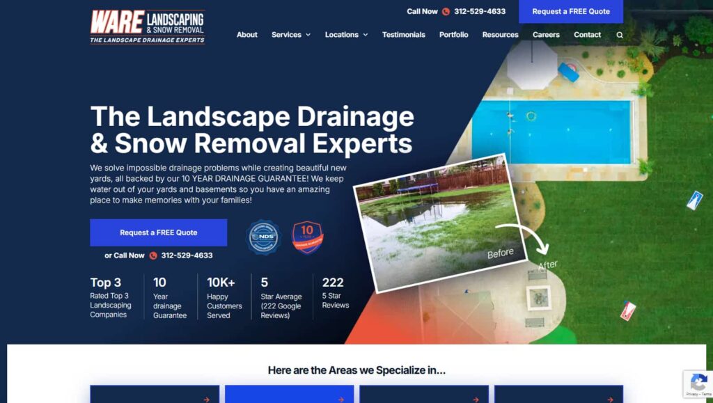
So yeah, and that’s right, and so you’ll notice as well, we’re looking at the homepage. The new homepage that we created now has a lot of influence on the mood board, but it also has all of the trust elements. And you know, Stephan just alluded to one. So, if you have something unique, create a custom graphic to make it more unique, and you don’t need to use a stock image. Essentially, give it your custom look and feel for anything that represents your uniqueness.
So now we also have to keep in mind that we’re trying to get across a couple of things above the fold. Some might say, “Oh, it’s got a lot of information.” And yes, it does, right? But it’s actually intentional, and it converts. So, let’s just explain what we have above the fold here on the homepage. Now, your homepage is probably the most visited page on your website. It lets you send a lot of paid traffic to other pages, and it is also the page; even if people hear from you from another resource, they’ll go to your homepage to check you out. You can guarantee that. So I guess Stephan, in every analytics report you look at, would you say the homepage is generally always the most visited page?
Yeah. I mean, it’s not always, but unless somebody has done some really great SEO or created some sort of campaign that was very successful, like a viral report or study, something that got a lot of links, usually it’ll be the homepage that is the highest trafficked and the most linked to page.
Your homepage is the director of traffic. Its job is to guide visitors to the right place based on their intent, not to seal the deal on the spot. Share on XGot it, so above the file, you’ll notice no moving elements and no video background. That’s all intentional because the most important thing is the messaging. And obviously, we need to mix a little bit of SEO to have it appeal to search engines with conversions, right? So, I mean, Stephan can talk to the copy more, but basically, this here says exactly what you know, has a lot of clarity, and is also good for SEO. Then, this sub-headline underneath the main headline clearly explains what’s unique about them, that he’s got this 10-year guarantee within there, and just says exactly what they do and who it’s for.
Essentially, it’s really good. It’s got an emotional copy. I’ll just read it because it’s pretty important. We solve impossible drainage problems while creating beautiful new yards, all backed by a 10-year drainage guarantee. We keep water out of your yards and basements, so you have an amazing place to make memories with your families. How cool is that it’s got the emotion, it’s got the guarantee, it’s got what’s unique about them and exactly what they do with clarity. So that’s pretty powerful. We haven’t even started scrolling, so people say, I don’t want too much copy above that.
I just want to chime in with something else here: a framework for people to think about when they’re writing a copy for their website, or they’re using ChatGPT or Claude to or whatever LLM to help them write that copy. I learned this from Taki Moore, who we mentioned earlier, is why we met or how we met. So Taki Moore teaches this thing called the four forces, and there are four quadrants. Suppose you take a piece of paper and draw a line down the center of the page vertically and horizontally. So now you have four quadrants.

One of those quadrants will be moving towards the immediate, moving towards the immediate, and wanting to move towards a future or imagined. That quadrant is aspirations, so it is moving towards its imagined future. That’s aspirations. On the left side of the page, or the top quadrant, there are frustrations because you’re moving away from, and those are immediate, and then the fears that’s the bottom left quadrant, the fears you’re moving away from, and their imagined or future.
So by creating copy that addresses all four of those forces, the frustrations, fears, wants and aspirations, you will build rapport and relatedness and really tug at the heartstrings of the person that you’re talking to or you’re writing for on your website or in your videos, because you get their world. It’s not just telling me about the features and the benefits and what it does for you and the wants, wants, wants.
Well, what about my fears? What if things go horribly wrong with my drainage project? What goes well is basic, good stuff that you would expect, kind of table stakes. But what would be my aspirations? Right? So, creating wonderful memories for years to come for my kids, my grandkids and so forth because the yard is finally usable.
The imagery needs to give the copy wings—it should truly enhance the message, as a picture is worth a thousand words.
Every time it rains, it becomes like a little pond, very frustrating, and we can’t enjoy the yard for days. That affects my quality of life, not just me but my family. And then, when I grow older and have grandkids over, that’s still going to be a problem. Well, touch on that with aspirations and fears, and not just address the wants and the frustrations immediately. So that model of, I don’t know if it’s Takis or you got it from somewhere else, but that’s so cool, and it really helps hone in on great copy.
Yeah, nice framework, cool. And then, obviously, the imagery needs to give the copy wings. It really needs to enhance the copy because the pictures tell 1000 words. On the right-hand side of the above-the-fold section on the homepage, we have a before and after state, a little inset picture, and a much larger after picture. There’s an incredible difference because there’s a flood in the before picture, and the after is just beautiful green grass around a beautiful pool and landscaping. So it’s a big difference. And you can see, if you look closely, there are actually little drainage dots throughout it.
So, that picture tells the story again and reinforces the copy. Then we have a call to action; they can either Request a free quote or call. So obviously, a local business, you want to have your phone number in there, and then also in the top nav, above the sticky top navigation, we have the same thing, the call now and the request free quote, because then they can see that on every single page, right? So it’s sticky,
By the way, some businesses, local businesses that rely on calls coming in as much, if not more than the form fill outs, need to be using a tool like a CallRail to track their calls and where they’re coming from, so which pages, which campaigns, which marketing channels, are driving the leads, because some are poor performers and some are over performers. And the over-performers you want to invest more in, and the poor performers you want to either optimize or cut them out and stop spending money on those channels. And how will you know if everything coming in is just one main number?
Yeah, exactly. It’s a really good tip, yeah. And then, underneath the call to action, we just reiterate what we call impact metrics. So we’ve got the top three rated landscaping companies, which is an award day one, reiterating the 10-year guarantee. So it’s just in plain English text. And then 10k plus happy customers, five-star, average Google reviews. There are 222 of them, and then, yeah, I guess he’s written it twice here, which is probably a bit overkill. We’re trying to get people’s attention with the metrics.
So we’ve got a large five for five stars and then 222 for the actual number of five-star reviews. But I also want to mention that this is all just above the fold. The top nav is obviously super important as well. We know from offering conversion optimization that the top nav gets clicked more than anything, people. A lot of people don’t scroll right, but the top nav is super important. And there’s a bit of logic to the top nav order of things, and just making sure there are not too many elements. But we believe Stephan and I both believe that the about should be the first item in the top nav, as opposed to anything else, because that’s generally one of the most visited pages, as we mentioned before. And then you want to go into your services. We’re talking about service business here. And then the locations, and then some social proof, and then some free stuff after that. And in this case, we have careers at the very end and then contact.
So, it is really important for our listeners or viewers that they should not break the paradigm of the web. Most people expect the top nav to have about or about us, contact us, and lead with the about and end with the contact because most websites do that, and that won’t break the web paradigm. Nobody wants to rent a rental car that has everything in the wrong place or is all different from what they’re used to. So, make it easy and intuitive. Don’t make them think too hard.
That made me think of Steve Krug. I think you’ve had him on.

Yes. He was a guest on this podcast. Great episode. A fantastic book, like a classic, for anybody who wants to build anything intuitive, whether it’s a website or an app or anything, doesn’t make me think of a classic book. Another thing you always do about the top nav is make it sticky. Do you want to elaborate on that?
Yeah, just as you scroll down the page, you don’t want the top nav to disappear up the top. You always want it to be in view, so it essentially sticks to the very top pixel of the web page. And that’ll be on every page of the website, yeah. Yeah. So that’s everything above the fold. We unpacked a lot; then, we had to unpack the rest.
So also, since we’re on the topic of sticky navs, what about a nav on the side, like a sidebar? I would never want to make that sticky because you’ve also made a sticky sidebar nav, not on the homepage but on other pages.
Ah, I see what you mean. Oh, yeah. So, for instance, if you have a table of contents or navigation within another page, yes, like your podcast, I don’t think we’ve done that on this website. Still, I think you’re saying yes, there might be secondary navigation or categories or whatever it is that helps segment and what we generally do; I wonder if you could bring me a link quickly. Stephan, but generally, when people scroll to that section, we would have that section sticky at the top of the page so that you can keep scrolling the rest, but that little sticky segmented area would be static, and it wouldn’t it would always be in view as you’re scrolling through the rest of the page. That’s what we’re trying to say, Right?
So, Well, let’s keep this on the topic of Ware Landscaping is. Still, yeah, this is an overall strategy that makes it easier for someone to convert to take that next action that you want them to take because it’s always in view, whether it’s a call out to an ad to something like on my podcast, Get Yourself Optimized on that website, we have sticky sidebar navs for things like view the course or download the checklist as like a right-hand sidebar internal ad essentially on show notes. Pages on the left side, we have the table of contents to the main sections of the show notes, and so that is a really cool way to keep people going down the quote, unquote funnel, although it’s kind of more like a pinball machine these days. Some people are saying, hey, internet marketing is getting turned on its head with AI. But anyway, you know, you want to keep people going down a path that will get them to convert, yeah, you help steer them in that way with the sticky nails.
That’s right, exactly. Then, really think of your homepage as the director of traffic. You’re never going to close people on a homepage. You just want to direct them off to whatever’s right for them based on their intent. Right? So you. They may be ready to get a free quote immediately because they may have heard of you through an ad or something else. Author radio, for instance, the advertisers on radio, or you want to direct them to a page that’s right for them for one of your services so they can learn more about it. Then, obviously, we’ve got the impact metrics. They want to have a testimonial close to the top of the page so that, you know, and a killer testimonial, don’t have a lot, just have one, so that people can see an incredible result, and then all from here down. It’s really just trying to boost credibility and using trust elements.

So, there is one other thing I want to point out before you scroll away. I thought he had a radio ad that was really kind of endearing and cool, and it made him very personal and personable. And that ad we put on the website, so you can see that’s featured there underneath the testimonial. So, this is just another example that you might think I don’t do radio ads. Well, I did a podcast ad on Dave Asprey‘s podcast, which used to be called Bulletproof Radio and was now called The Human Upgrade.
He does these customized ads where he’s the one reading them, and he’s saying stuff about what the company’s like because he’s had experience with it. So he was saying wonderful things about Netconcepts and our SEO and working with Stephan and me directly, and that was in Dave’s voice. It was being exposed to many, many, many 1000s of listeners on Bulletproof Radio.
And finally, after many months, it occurred to me, like, wait for a second, why Am I just letting that sit over on Dave’s side? Why don’t I pull that over and put it on my own website, along with all my other testimonials, and so we now feature that on Netconcepts and on stephanspencer.com if you have something like that where you have somebody saying something nice about you on their show, whether it’s an ad or it’s kind of a call out, a hat tip or whatever. Feel free to ask for permission. Use it on your own website, use it on your own YouTube channel, or on your own podcast.
Every aspect of your brand — from visual design to messaging to funnel flow — must boldly differentiate you from your competitors. Blending in is the fastest way to be forgotten. Share on XLove it. Great tip. Yeah, certainly have a before and after video or explain the whole process like a real case study. And you’ll notice the brand elements as well. It’s quite memorable and unique, especially for a landscaping business. It’s very different from what everybody else does. And yeah, so this is all part of that brand positioning piece and elements that give it a bit of brand person personality.
But then, yeah, this is a little bit of problem-solution text. So, you think about the story brand framework. It’s really just letting people know you understand their problem. We have a unique solution to them, and that’s what the rest of this is. Then, we just segmented off to the various solutions that they offer. And then he talks about what depends on the time of year, but if he’s doing no removal, it’s not all year round. So, he has a section for that. But really, just like I said, think of it as a gateway to get to everything else on your website. And, yeah, this here shows the stages of, you know, how his drainage magic unfolds, and it’s just got all the different stages.
Michael loves that; by the way, that was a brilliant innovation on your guys’ part, make it so visual and so clear and unambiguous, how the multi 10s of 1000s of dollar project that is a big considered purchase for somebody but a big pain point for somebody who has standing water in their yard, This just makes it so simple and straightforward and an easy yes, and he loves that.
That’s good to know. Thank you. I didn’t know he loved that bit, but yeah, awesome. So then, as well, having decent photos, real photos. There’s no stock on this website anywhere. It’s really important to have real testimonials; yeah, just everything is real. There’s no fakeness with this.
These aren’t just testimonials that you normally get. We pulled some of the five-star reviews from his Google views and put those up with the star rating and the person’s name that was publicly available on the website. I mean, on the Google business profile, that means that you’re not just reliant on the testimonials, where you have somebody to make a video for you. You’ve got hundreds of reviews over many years that you can pull from your Google business profile, Yelp profile, etc., and leverage that feature on your website.
Exactly. And just, yeah, pick them all. We don’t want to load too many onto the homepage because it would just take forever to load the page. So we’ll just pick a handful. And then you have a call to action to go to the individual Testimonials page, where they can scroll through tons of them, basically. “Okay, so, and then, yeah.” We generally, often have, like, a section for education. This really helps showcase your authority when you share your expertise. So, we just have a few snippets of his most recent articles. It could be videos, or it could be podcasts.
Expert articles, not blogs, position you as the go-to authority, not just a content creator.
I love the title or the head headline, right? So it doesn’t say a blog or latest blogs; it says expert articles. Yeah, it’s not just the latest articles or latest blog posts. It’s an expert article because nobody cares that it was two weeks ago that the article was released, or two months ago or six years ago. These are expert articles about the things they care about, like how to do a drainage project and make sure that it actually works. What’s the difference between a French drain and some of the other kinds of drains that the competitors do? Those expert articles are so helpful, positioning Michael as the go-to guy. The expert who has the YouTube following all the great videos and has all the expertise and knowledge base he shares on his website got it nice.
Then, we just have a little location map for each of his main locations, which is interactive, so people can see roughly where they are in relation to each of the main locations. And then there’s the footer. And so we just list all the main pages in the footer, and then that’s kind of it.
There are hundreds of pages on this website. This is a pretty big website. Yeah, it wasn’t nearly as big before they came on board to work with my company, but we’ve built out hundreds of high-value books that are really worth people’s time to read. It’s not just SEO copy for Google; the most important pages are bubbled up to the top with the internal linking structure and the different kinds of nav, sidebar nav, top nav, footer nav, et cetera, and content links.
And yeah, we’ll show the results at the end of their boost. It’s incredible. So, it takes a lot of work. As you can tell, it’s not just us; it’s the client providing whatever we need in videos, photos, et cetera. And yeah, Mike was super helpful along the way. So, by the way, this is his About page. We turn the About page into this with the help of Stephan’s team writing the copy.
Can you go back to the previous About page so we can contrast?
Let’s do it. Which is, here we go. That’s before.
That’s a cute family photo of him with his wife and kids. But his kids are gorgeous. All this block of copy above it and this wall of copy below it doesn’t really inspire a person to read it, to read it. There are no sections with sub-headlines or visuals to help break out and tell the hero’s journey because he has a great story. And people who are into football love that he’s not just a football fan, but he was a college football player and a pretty successful one. Then, he was at the University of Illinois. He was a walk-on like he is, a self-made man, not just from his business but from his football career. And all the great storytelling that my team pulled out of him to utilize your team to display visually in such a beautiful, engaging format. It’s amazing.
Every ‘About’ page should shift the focus from “all about you” to your commitment to them.
Thank you. Yeah, it’s a good team effort. And so this is the after. This is the About page, so it’s a little overview at the top. And then we do have a call to action there. Why not a beautiful photo of him with his family? Again, good testimonial. And then there’s a video, a testimonial. And then he’s got a commitment to you. So he’s making all about them.
You know, if you look at the other previous about page, it’s all about him, but this is all about his commitment to them, what it means, like their core values, what that means to the customer. Essentially, we are customer-centric. We believe in transparency, blah, blah, and then the culture, which I think is important, his mission, and then his journey so far. So this is what Stephan tapped on before.
If somebody’s got this far down the about page and they understand all this stuff and what’s in it for them, then they may be interested in what led you to this. Why should I trust you? Who is behind this brand, and what were the milestones on your journey that sort of, you know, position you as the authority? And that’s what we’re trying to unpack so that people can get to know the person or, you know, the people behind the brand. And just think about, even if it is a brand, and it’s not so many people, what are the milestones on your journey? What customers did you help at that time? What challenges did you overcome? You know, who helped you along the way? And yeah, so you can tell a personal story and a business story, but doing it in a visual timeline like we’re showing here is just super easy and impactful for somebody to read. Read that and really get to know you. So that’s that’s what Stephan was saying earlier, that we do on every website,
Because we want people to root for you like you’re the underdog who is self-made, created something out of nothing, bootstrapped, whatever your story is, and overcame some adversity. People want to root for you, and they want to work with people they root for.
Because he’s helping families, and I love the fact that he’s just displaying his family all throughout his journey as well because he’s very much a family man. And you know, that’s his target market. They’re going to value that as well. So don’t be afraid to put yourself and your story into your timeline. Cool. And then, yeah, we just end with another beautiful call to action with a during and after this time instead of a before and after, but either way, and then social proof, and that’s kind of it. So that is the About page.
And I know we’ve been going for a while, but it says we wanted to unpack a few more pages. So yeah, let’s do it. There’s still okay, so this would just be one of the service pages, just the first drainage page. So now, obviously, it’s got a lot of different locations. So I get that right. What we’re doing here for this, which is the main location, is we’re putting Naperville. You know Stephan as the headline. This little sub-headline is all about what that’s all about. We still have all of the impact metrics and credibility icons in there, so it’s a nice picture representing this location. Then, we have the usual trust-building because we have to think that people may come directly to this page and not go to the home page.
Risk reversal—pairing clear pricing with a strong guarantee—is a powerful way to build trust and attract committed clients.
So don’t worry about duplicating authority, boost in things and social proof on multiple pages, because people need to see it. And what I really love about what he does is he displays his prices on these pages, which does, as we said before, attract a better clientele because the people who are prepared to pay this won’t even bother contacting him. So I think it’s good that he displays his pricing, and then straight underneath the pricing, that’s where he has his guarantee, which I think is really smart because it’s right, okay, here’s a pricing, but don’t worry, we’ve got your back, you know, we’ve got a guarantee. So this is well worth it. We’ll just fix it for free, forever, and then we will go into his process for this particular service.
So what do they call that? Risk reversal, right? So you’re taking the risk and putting it on yourself, saying, “Hey, if anything goes wrong, it’s on me.”
Exactly, exactly, risk reversal. That’s spot on. It’s definitely a strategy that, yeah, we definitely encourage all clients to think about, Yep, cool. So then, yeah, it’s a fairly long page, but this is a high-ranking SEO page.
A lot of these service and location pages rank high. Now, this is because it’s the main service page. We’ve made it specific to the Naperville location, but we also have other locations plus service pages, which look pretty similar in style. However, they have different copies, different images, and different videos.
In fact, it’s intentional that the styling across all the service pages is pretty much identical in look and feel because we don’t want it to be jarringly different. And we think about what you’re saying before. Don’t make me think that if they go to different services, we want the same structure, look, and feel across all of them. But as Stephan said, it needs to have a different copy so that each page ranks individually for each service or location or service within a location. But talk about these FAQs. Why are these here Stephan?
Yeah, so. FAQs are great for multiple uses. One is on service pages, sales pages, and landing pages to obliterate objections that the potential buyer might have. These can also be used on separate FAQ pages. They can also be used as fodder for videos, each about one or several of the questions with answers. There’s so much value to be gained from creating FAQs and then the answers to them.
One of the easiest things you can do is have Google help you answer those questions. And so there’s a free tool called alsoasked.com, which will scrape Google’s results for the frequently asked questions you see as a box on many search results. That’s called what people also ask. When you expand those questions in the Google search results, you’ll see that Google is starting to populate even more questions. So it’s like an infinite rabbit hole you can go down of FAQs. Google’s providing you the fodder for that, so you can use that as inspiration for creating your own FAQ section on a crucial page, like a sales page or a landing page, as well as a separate FAQ section for your site.
Cool. Yeah, love it. So, yeah, very powerful in many ways, and make it specific per service, or even better, service location, yeah, very powerful. Some businesses may need a site-wide, sorry, single FAQ page that answers many questions, but it’s more powerful for SEO and super helpful for people if you answer questions about a specific service.
So there are so many nuances and little details that you make sure that the first question is expanded to show its answer yes because content that is hidden by default gets discounted by Google. So if you hide all of the answers, then Google’s not counting the answers so much because they’re all hidden under the plus sign or the down arrow.
Got it, yep. So, we just displayed the first one because we wanted to get the balance right. You don’t want to be all expanded because it’s overwhelming for the user. You just want them to read one at a time. So when one closes, the next one opens, cool. All right, so then that becomes a template for the other pages. And so this here is a locations page, and the other one was a services page, so you’ll find it’s very similar, but it’s more related to that location and the service. But then we link to the various other services on this page. So keep that in mind as well.
So it’s, you know, if you look at the old version of this, there were just little links within. And yeah, what we want to do instead of having little links within, which is probably not the best example, is show interactive graphics, and you can get to that individual service page for that location. So yeah, it’s pretty smart next level, basically, yeah, and then we have just a form on that page, so you know where that lead came from. But okay, so then we do a different version for paid traffic, and this has all of the unnecessary SEO-related copy stripped out of it. We leave all of the authority boost elements there. We’ll come back to the top in a minute, and we just make it extremely focused on mobile traffic because a lot of paid traffic comes from mobile, but we just give them the right amount of information without overdoing it.
People want to do business with those they know, like, and trust—and your contact page needs to convey that clearly.
So it’s we give them enough so they don’t have to pogo stick across the whole website, but we don’t have as much content, which is really to try and attract organic traffic that we have on the individual service location pages that aren’t for paid traffic. So this is just for paid traffic and so above the fold. The other thing we know that converts well for paid traffic is having a form above the fold. It converts better on, let’s say, a paid traffic page versus a non-paid traffic page because we know their intent. If the targeting is done right through the advertising, they intend that they’ve got a problem with drainage, so they, you know, already know they have a problem, and they are looking for a solution straight away.
So they’ve clicked on an ad, so they’re just going to get a free quote. So it’s low risk. This converts really well when you have a form above the fold on a paid traffic page. Still, if you’re on an individual service page, you don’t necessarily need a big form here because A, they’re ugly, and B, if they press a free quote, which is always above the fold, will go to that form anyway. But realistically, I would prefer, and this still converts well. Still, people are more in research mode on this page, so they don’t necessarily convert above a fold anyway if you did have an ugly form up here on an individual services page.
Back to the paid traffic page there for a second. So you strip away all of the nav and just have the logo on top.
Yes, good point. Yeah. Once again, we don’t want people to stick around and go to another page because that defeats the purpose of sending paid traffic to a page. Then, you don’t know your ad spend’s effectiveness and point. Earlier. Stephan, this phone number is different on this landing page than it was on the rest of the website because, once again, they want to measure the paid traffic result.
So, this phone app is unique to this landing page, which is through that service call rail that you mentioned earlier. Cool, but yeah, there is no top navigation or footer navigation. And then another thing we do to prevent leakage, we’ll just test this. Hopefully, they’ve done it. The privacy policy should be in a pop-up, and we’ll get that fixed. But yeah, what we do, instead of taking people off, see how we went off to an actual individual privacy policy page, generally speaking, on a paid traffic page. You want that to open in a pop-up to keep people on the page. So we’re going to get that fixed, Stephan, because that shouldn’t have happened.
What gets measured gets managed. If you’re not tracking things, how can you tell what’s working and what isn’t?
Also, one thing that you do that I like is on all pop-ups where you have the privacy policy, the old messaging that we’re protecting, your email, IES, or whatever. When the pop-up comes up, the privacy policies are mentioned on that pop-up; if you click on that, it shows a pop-up underneath the main pop-up instead of going to another page so that we keep them in the flow of completing the pop-up instead of clicking away. Yeah, that’s smart. Exactly.
I was just trying to find the lead magnet, but yeah. Okay, so then this is also smart. This is from your team. We have all of the testimonials on the testimonials page, so you can just see a big wall of them. But then we also have them separated into their service, so people just looking for testimonials about drainage can go to the drainage tab and read those. So, it’s just a much better user experience for people looking for that. And then just take it to the next level. We’ve got the same categorization on the portfolio page for all of their past projects; once again, it’s super helpful just to get to drainage or landscaping, et cetera.
By the way, this was something that they didn’t do before. They did not even have a portfolio of past projects. They just had some testimonials and some videos. But it was a little mishmash, and there wasn’t a section of essentially social proof, showing the before and afters with video, pictures, and a description of the project and its location. This is really good.
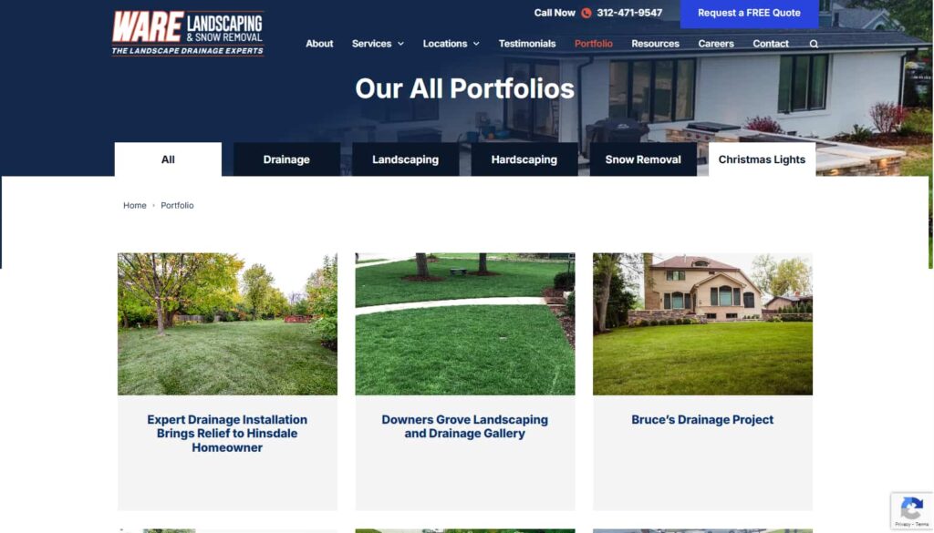
Exactly. And I think this is one of the clients who added himself recently, but most of them looked a little bit better than that. They have a full before and after state and a little bit of a story about the portfolio. Yeah,
Not all of them had that because that was more extensive, more work for our client,
So, yeah, it’s fair enough. But the same with the learning center as well. All the blog content, etc, is categorized.
Expert articles.
Yep, there you go. Yeah. So, yeah, it’s just next level, the whole website. And then, finally, they gotta request a quote page. It has a nice video here, which is really good. Actually, it makes these fields, phone numbers, and street addresses mandatory because they also attract better-quality leads. Okay, so, yeah, keep that in mind. If you’re a service business, you want better leads.
A website is never truly finished. You should always be testing and measuring. There will always be opportunities to improve.
But you can test it, right? You can turn off the required field and see its effect on the quality and quantity of the leads coming in, and you can add more questions. You can remove questions. You can make them not required. You know, be experimental. This shouldn’t be just like setting it and forgetting it. Can you show an example of the version from before when the previous site was live? Yes, it was. They only had a contact page, so that’s important, as they didn’t have a separate request-to-quote page and the contact page. Go back to that contact page for a second. Sure, that was not sophisticated, and that didn’t make me feel like I was working with a person or a company of people. Yeah, it just felt so generic.
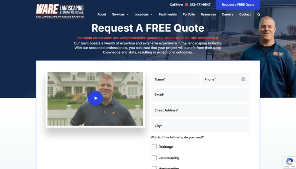
Exactly. But this, yeah, especially with the video of Mike, you got a picture of Mike as well. Yeah, it certainly converts really well.
People want to do business with people they know, like, and trust, and you have to convey that on the contact page, which is another request-to-quote page.
Exactly, exactly. And so he has a contact page as well, but yeah, then he has a careers page, which we’ve put a lot more effort into. This page is your team with a copy, and yeah, it’s really just showing you what people will get out of work here. But this has a great double benefit: one, you attract the best people, but then also, for prospects that are thinking or considering hiring you, they look at your careers page, and they go, “Oh, wow, these guys really put in a lot of effort to attract the best people,” which is another reason for them to choose you. So that’s what I like about this level of career page, careers page.
You care about the user’s journey. So, you install it for your client’s Microsoft Clarity. Then you can watch the user sessions where they’re clicking to what their session looks like, what they’re clicking on, that doesn’t work, that isn’t clickable, but maybe they’re expecting it to be how they’re interacting with forms. Programs and other interactive elements. This is really, really smart. And, like, what gets measured gets managed, and if you’re not tracking the stuff, how do you know that some things are working and some things aren’t? That does work otherwise.
Yeah, and that’s why we say, even though we use all the best conversion elements and strategies and layouts and copy and images and design and everything, a website’s never finished, so you always have to test and measure. You’ll always find opportunities to improve things. Your audience also changes over time, and you may have new competitors come into the market. So for all these reasons, you just have to constantly put effort into improving your website, and you won’t know that unless you check all of your heat maps and user insights and all of your Google Analytics and how it’s actually converting as well how many leads and sales you’re generating from it. So a website is never finished cool. So here are some of the results. I mean, just the calls, like from just explain this was this before the redesign May 2349 calls.
So, there are several kinds of milestones. One is when they hired us Netconcepts, my SEO agency, and then when they hired you and Studio1 month later, maybe it was a year later, or something like that, and then today, or most recently. So, in those time frames, we saw some really nice results in terms of increased call volume, clicks and form fillouts, and the number of keywords we rank for this client.
All this has grown, and I don’t know how much detail we want to get into in terms of each of these numbers. But the idea is that we’re getting into the right graphs and charts here.
We can completely say it’s tripled without saying a metric, right? It’s tripled the number of inbound calls, which is incredible. And so that’s just the calls. And yeah, there’s a whole bunch of metrics on this page, but we probably don’t need to go into all of them but all we can say is the traffic’s gone up significantly, and the conversions have gone up significantly, and they’re better quality leads as well. So that’s the result, which, yeah, let’s not give specifics, but we can say,
I mean, you can show that there are screenshots, such as Semrush and Ahrefs, which are tools for paid subscribers. You can give information on any website that you want. So this is basically public information, so you can see it’s really looking good up into the right here, with improvements in the number of keywords we’re ranking for, the amount of organic traffic, and anecdotally from our client. Michael, yeah, better quality of those leads that are coming in as well.
Yeah, you bet. So that’s kind of a wrap. Stephan, unless there’s anything else you want to add,
No, no. I think this was above and beyond. You did a great job walking through some of these best practices, some innovations that may not even be known as best practices but should be. This is like table stakes, I think, in the era of AI, where everybody who survives this AI apocalypse of jobs and businesses going out of business is going to be AI first. They will be looking for opportunities to scale and multiply themselves and their team in ways that none of their competitors are doing and reduce costs. So you need to really up your game in order to survive these next few years. So, these are best practices for any website, especially if you have a local services business. But much of the stuff we discussed applies to any website, regardless of what you offer.

Exactly, and even if you do use AI to create a website, which you know you can do, these are timeless. You can use these principles, regardless of whether you know if you use AI or not, which is what I’m trying to say. So good luck. I hope your website is successful.
It was really awesome. Thank you for kind of peeling back the curtain and showing some of your thought processes and standard operating procedures for creating a really outstanding website. So, if somebody wanted to work with you and your team, where should they go?
Yeah, well, go to studio1design.com, just have a look at our folio. And if you see what you like, if you like what you see, I should say, yeah. Then, by all means, reach out, and we can chat and see if we can help you with your website. But also, I’ve got a new book about to be released, so go to nextlevelwebsitedesign.com.
Definitely get that amazing free book. And, of course, if you want SEO services from my company, please feel free to go to netconcepts.com or stephanspencer.com, which will potentially take you to work with us. We would love to have a chat.
Perfect. They’re the best in the world, guys.
Thank you, Greg. All right. Well, thank you so much, listener. This was a longer episode than usual. We’re gonna, I think, do some more of these. So, if you liked this format, we’ll keep them to the usual hour or less in future episodes, but give us some feedback on what you liked and didn’t like about this case study episode, and we’ll apply that to future episodes.
Important Links
Connect with Greg Merrilees
Apps/Tools
Books
Businesses/Organizations
People
Previous Marketing Speak Episodes
YouTube Videos
Your Checklist of Actions to Take
- Use the Wayback Machine to audit competitor websites and my own site history. Visit archive.org to analyze what competitors’ websites looked like in the past and identify the design elements to avoid copying, as I don’t know what actually converts for them.
- Create location + service combination pages for every suburb I serve. Build separate pages rather than generic service pages, as these rank better for local search queries and target specific market segments.
- Implement sticky navigation that stays visible while scrolling. Make my top navigation bar stick to the top of every page so visitors can always access my main menu items, keeping the user journey smooth and reducing friction to conversion.
- Remove social media icons from prominent header locations. Place social media links only in the footer since my goal is bringing people FROM social media TO my website, not sending them back to Facebook or Instagram where they’ll get distracted.
- Create detailed mood boards before starting any website design project. Develop a multi-page PDF showing color palettes, font combinations, image treatments, and custom illustrations to establish the brand personality and get client approval before design begins.
- Apply the StoryBrand framework to my website copy. Read Donald Miller’s Building a Story Brand and structure my messaging to address the customer’s external problem, internal frustration, and philosophical aspirations while positioning my business as the guide with a clear plan.
- Display my pricing openly to attract higher-quality leads. Include pricing tiers or ranges on service pages to filter out tire-kickers who aren’t prepared for my investment level, allowing me to focus on qualified prospects who expect quality pricing.
- Design custom graphics for my unique selling propositions. Create branded trust badges and visual elements for guarantees, certifications, or unique offerings rather than using generic stock images that don’t reinforce my brand positioning.
- Install Microsoft Clarity to track user behavior on my website. Use this free tool to watch actual user sessions, see where people click (including non-clickable elements), and identify friction points in my conversion process through heat maps and recordings.
- Connect with Greg Merrilees for professional website design services. Visit studio1design.com to view their portfolio and reach out if I want their team’s help with my website redesign. Get his new free book at nextlevelwebsitedesign.com for additional strategies and insights.

About the Host
STEPHAN SPENCER
Since coming into his own power and having a life-changing spiritual awakening, Stephan is on a mission. He is devoted to curiosity, reason, wonder, and most importantly, a connection with God and the unseen world. He has one agenda: revealing light in everything he does. A self-proclaimed geek who went on to pioneer the world of SEO and make a name for himself in the top echelons of marketing circles, Stephan’s journey has taken him from one of career ambition to soul searching and spiritual awakening.
Stephan has created and sold businesses, gone on spiritual quests, and explored the world with Tony Robbins as a part of Tony’s “Platinum Partnership.” He went through a radical personal transformation – from an introverted outlier to a leader in business and personal development.

About the Guest
GREG MERRILEES
Greg Merrilees is the founder of Studio 1 Design. He’s passionate about really good-looking website design that gets results!


Leave a Reply