


Your website isn’t just a digital brochure—it’s a trust-building tool. And if your audience is navigating trauma, chronic illness, or nervous system dysregulation, that trust needs to be felt instantly.
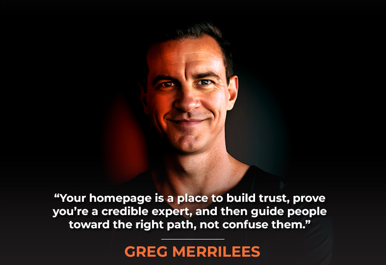
My guest on today’s show, Greg Merrilees, is the founder of Studio1 Design and a longtime collaborator of mine. His agency specializes in crafting websites that don’t just look good—they educate, inspire, resonate with, and persuade the target audience on a deep emotional level.
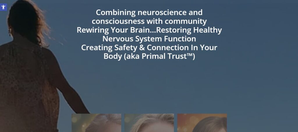
In this episode, we break down the redesign journey of Primal Trust, a powerful healing community and membership platform led by Dr. Cathleen King. When we first looked at the site, it was cluttered, slow, hard to navigate, and failing to rank even for branded terms. That’s a big problem for a business with a mission to help thousands—especially when it’s not reaching those who need it most.
In this case study, Greg and I walk through the Primal Trust transformation. We rewrote the messaging to offer empathy and empowerment, clarified the member journey, and created conversion-focused pathways like lead magnets and quizzes. At the same time, we wove in SEO best practices with a calming, intuitive design.
Whether you’re in wellness, coaching, or any purpose-driven space, this case study offers key takeaways to make your website more powerful, more aligned, and more profitable. So, without any further ado, on with the show!
In This Episode
- [03:33] – Stephan reflects on his long-standing collaboration with Greg Merrilees, while Greg outlines his client onboarding process before diving into a detailed website review.
- [10:21] – Greg explores the importance of simplifying a website to foster a calming, trust-driven user experience and shares insights on the mood board created for Primal Trust
- [15:55] – Stephan and Greg explore tasteful ways to integrate Google reviews and ratings that enhance credibility without overwhelming the design.
- [23:01] – Greg evaluates Primal Trust’s membership sales and social proof pages, offering key recommendations for improvement.
- [35:55] – Greg breaks down the “Book a Call” page, explaining how it serves both the client and the service provider effectively.
- [39:12] – Stephan highlights the value of a strategic, long-term SEO approach and how it contributes to sustained growth.
- [41:50] – Greg recaps key takeaways, reinforcing the importance of clear messaging, minimizing cognitive load, and avoiding distractions like video backgrounds and parallax effects.
Greg, thanks for coming back on.
Thank you, Stephan. And, just so you know, all of these joint projects are thanks to Stephan sending them to us. I appreciate you, Stephan. And yeah, we do have a lot of fun. We are good friends. We catch up every week, discussing both work and personal lives. So it’s cool.
Yeah, it’s been great. I really treasure our friendship. And, of course, business collaboration is great, too, but friendships are number one, right?
Yeah, awesome.
In this episode, we will conduct an analysis and deep dive into primaltrust.org, an online course and program-based website. In the previous episodes, where we conducted case studies, we explored a local services business and another, an e-commerce business that sold books. Those were both pretty fascinating. If you haven’t listened to or watched either of those, please, I recommend doing that. They’re fascinating, and there’s a lot of great advice in there.
So, in this particular teardown or analysis, we are going to examine what makes for an effective content site where some of the content is publicly available, as we need to attract people from Google searches, LLMs, word of mouth, and other sources. They need to come in from not just the homepage but also other pages. Additionally, we need to have enough compelling content on the inside that people want to stay and continue with a subscription month after month.
Every detail, from fonts to textures to icons, needs to evoke the feelings your audience needs most. Share on XGreg, why don’t you share some additional insights on Primal Trust and the background? Because, of course, you have your onboarding process with each client, and you take screenshots of the before. You take notes. You do all sorts of prep work before an engagement or at the beginning of the engagement. So, why don’t you walk us through that?
Yeah, sure. So, with this client in particular, they are a well-established brand in the industry of helping people with trauma recovery and nervous system healing, offering a mix of self-paced courses and a community-focused group, right? So, she’s created an awesome community here, which means there’s also a challenge in that when we redesign a client’s website, we’ve to think about that existing community and not be too jarringly different because they can get annoyed, which some of them did with the redesign. We’ll talk about that later.
But essentially, what we’re talking about here is that we started with a website that looked like this initially. This is a screenshot we took during onboarding when we conducted a deep dive discovery call with a client before onboarding them. And this is a screenshot. It’s not showing all the parallax effects, but it does give you a rough idea of what it was.

But we also popped it into the Wayback Machine, and you can see it had a video background, which is kind of pointless. I say that because, although it looks nice and creates a bit of a captivating feeling, it takes forever to load, which negatively affects your organic rankings, and it’s quite annoying for the visitor as well. They’re trying to read copy and all these things flying around.
If your site has three calls to action above the fold that don’t align, that’s confusing. All roads should lead to the same next step.
Yes, and it also adds a significant cognitive load, so people are less inclined to make a buying decision, right? It adds decision fatigue before they even have a chance to make a decision due to the cognitive load from the busyness of things happening behind the scenes or in the background.
What I also say about video backgrounds is they might be great and exciting for first-time visitors. But imagine your repeat visitors who have to watch this repeatedly. They just get bored of it, right? It’s quite annoying, and it’s on a loop, so it’s kind of pointless. There’s a better way to display the above-the-fold section.
Now, you might also notice that if you’re watching this video on YouTube, there’s a small video here with a Play icon in the middle, but it’s following my cursor around the screen. So it’s quite funny, amusing and gimmicky, but that’s where it ends. It’s gimmicky, and it doesn’t help boost conversions, which is what we’re all about. So yeah, just don’t use any gimmicks like this. Now, as we scroll, it does have a lot of parallax effects, where elements scroll at different rates and speeds compared to other elements, right? So that can be quite annoying as well. They also did it in the horse section, which is quite effective because it doesn’t take up a lot of vertical space. So, I think in that case, it’s good to use a little bit of parallax effects.
Then, at the very footer, there are some missing things because it’s the Wayback Machine. Still, yeah, in the footer, they had a subscription to our email newsletter, which we say is generally a bad idea unless you are a bit of an authority out there. You probably have millions of fans, so it’s probably not a bad idea because they’ll opt-in. However, realistically, if you have a smaller business and are offering a digital product, a membership, or even a service, the key is to deliver something of value in return for an email address rather than just a newsletter. So, we helped her with a new strategy for this.
So basically, when we first met Kathleen, the owner of this business. She’s super nice, and, as I said, she’s built a very loyal community; she does a great job of helping people. However, when we reviewed this website, she mentioned to us that it didn’t rank for anything, not even her brand name, let alone other keywords that Stephan will unpack. And she said it’s very confusing for visitors like, above the fold, there are actually three calls to action, which don’t really make much sense because they should all lead to the same thing.
Additionally, they lacked a strategy to warm up cold visitors despite having various lead magnets. That’s why, as we did and said, we’ll get to that, was just to help with the whole strategy piece. So that’s kind of the background and the situation before we did the redesign.
Yeah, and she helps people so much. Dr. Kathleen King is a real leader in the field of helping people who have trauma and chronic pain and chronic illness who are really suffering and help them to get through that suffering and ameliorate it, work through stuff like Lyme disease and other issues that have really wreaked havoc on their lives. And so they’re not in a very resourceful state.
When they come to her, they’re really in a tough place. And so we have to have some elements that are easy for them to grasp and make sense of, without a lot of complexity, and need to be straightforward. Kathleen made that very clear: that’s something that has to be maintained through the site redesign and all the work we did from an SEO perspective, as my team at Netconcepts.
Yes, and just on that, because she had that community, they obviously have a membership platform as well that already has a lot of content with a certain look and feel. So we didn’t want a new website to be jarringly different from that. Initially, the client sent us this mood board. And so, this is how we want the new website to feel, as it aligns with their existing content, which is all the content they deliver to their members via their membership site, essentially.
We want people to come to the website and breathe out — to feel calm and know they’ve found a solution to their problem.
So this is what they sent to us, and then we showed it to our brand director. She said, “Look, we understand where the client’s coming from. However, it does feel a little bit dated and a little bit too busy, too much going on,” and we kind of like for the reasons that Stephan just said, we needed to sort of simplify it and not stress people out. We want them to come to the website and breathe out. They feel like they’re at a place where it’s calm, and they’re going to find a solution to their problem.
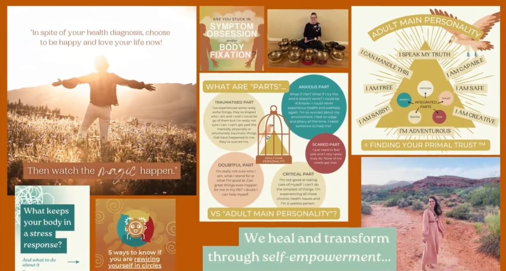
So we send it to our brand director. This is after conducting a deep dive call with the client, during which they complete a questionnaire. We talk about everything from what’s working, what’s not working, who their competitors are, who their target audience is, what their pain points are, how they solve those pain points, what their marketing strategy is, look and feel, the colors the pages, the page structures and pretty much everything right that goes into a website brief. And so, based on that, our brand director reviews everything and puts together a beautiful mood board, which is shown here.
And so, we begin with the words that are most important and are drawn out of the briefing process for the client. The most important words to the client were healing, welcoming, natural, warm, calm, grounded, safe, authentic and mindful. So, everything we create needs to represent that mood, those words that will create the mood we’re after with this brand. This screen for YouTube watching is essentially trying to capture that mood.
And then, the color palette, as I mentioned, we didn’t want to be jarringly different from her existing palette because she has members who are familiar with this brand, and she has many incredible existing resources. We needed to match those. So, there’s the color palette, and then we break down the amount of this sort of dark Jade color we want to use versus the other colors. And there’s always a contrasting Call to Action that stands apart from everything else.
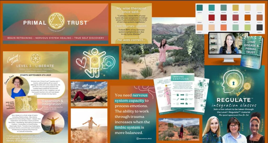
So, yeah, that’s the color palette breakdown. And then, obviously, she’s got her existing programs in these colors. So what we tried to do was keep the color palette, but just give it some percentages of those colors to really. We had some gradients and elements like that to modernize the palette and tie it in more closely with the rest of the palette around it, which is our addition, including the font used. Once again, we’re thinking about how we want people to feel. We’re trying to create a different font pairing that represents a non-stressful look, essentially to evoke a calm feeling.
And there’s a lot on the screen right now, so obviously, you wouldn’t see all this in one screen or one fold on a website. It’s simply providing the client with various ideas. And when we send this to the client, they provide us with feedback. We roll with their preferences. However, there are also some gradient backgrounds. Again, it has that nice, soft, flowy feel, which we incorporated throughout the designs to create a sense of calm.
Same with some textures. They’re not busy; they’re very soft and muted. And then photo effects as well. This guides the type of photos we want to use in the website design, as well as the photography direction for Kathleen with her photos. She already had some beautiful photos, and we just directed her on how to take some new ones. I think she had some new photos taken after that. And B, even with her existing photos, we can simply select ones that suit this look and feel and even adjust the colors to match the brand, essentially.
Social proof isn’t just about sprinkling in a few reviews — it’s about curating trust and displaying it strategically across the site to overcome objections. Share on XAdditionally, we create a range of icons and illustrations to explain various sections of the brand. We then present various layouts for each page. This can also be applied to social media. So that’s the mood board. Do you have any questions about that, Stephan?
No, but that’s beautiful. You guys are true artists.
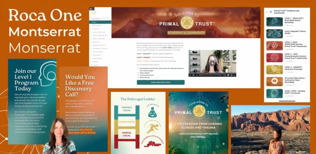
Thank you, very good brand Director. Thank you. And now, on the screen, we’re sharing the after-results. So, this is the actual homepage.
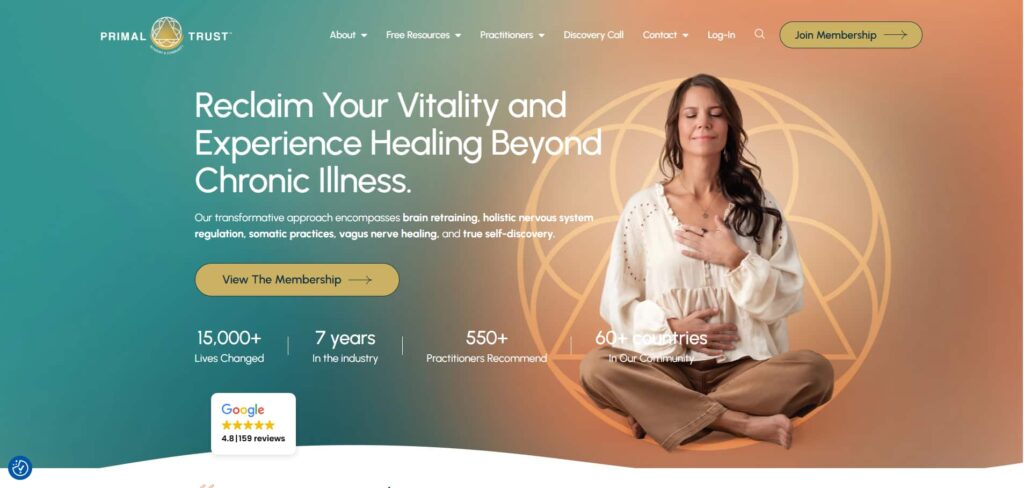
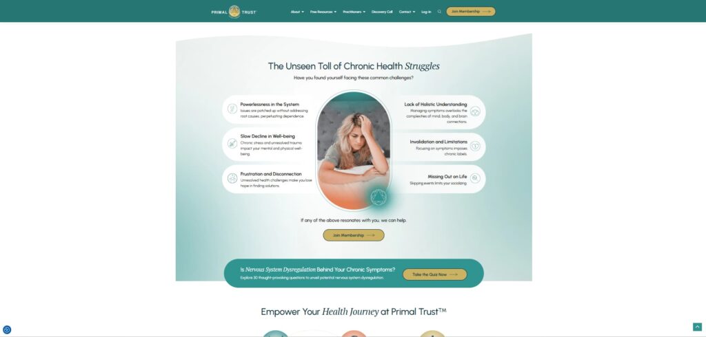
I’ll just refresh so you can see. You’ll notice a little animation on what we call these impact metrics, which animates for about a second to get your attention, as these things are really important. Important. What we’re trying to do with these little impact metrics is to determine whether someone lands on this page for the first time. They’re going to read the headline. We want them to focus on that so we don’t have any moving backgrounds.
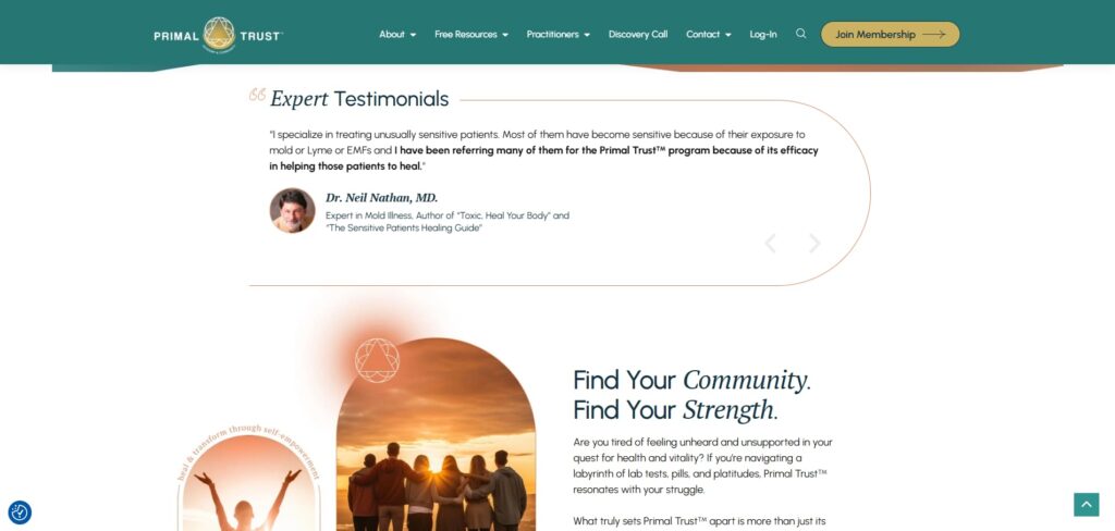
We have a beautiful image of Kathleen looking relaxed and calm, which is what we want to represent. And it also enhances the copy. Reclaim your vitality and experience healing beyond chronic illness. Then, there’s a little supporting tagline that supports how she helps people. Then, call to action to view the membership. And then, which are these impact metrics that give her credibility, letting people know how many lives she’s changed and the countries she’s in? She’s very global, having worked in the industry for seven years. Then, we lead with some testimonials.
We have sticky top navigation, of course, but I just wanted to explain how we want people to feel when they land on the page. It is a sense of calm.
Highlighting a single powerful sentence within a long testimonial makes the social proof more readable and impactful.
Would you like to comment on the Google reviews and ratings? Because that’s, yeah, I think, done quite cleverly, it can be tacky in the way that it’s implemented, in many cases, adding the star ratings and the number of reviews, but I think it’s quite elegant here. It’s somewhat set apart in a way that doesn’t detract from its professional appearance, and there’s just an ambiance to the site. It’s not garish, and the way that it’s implemented.
Exactly. I mean, we wanted to get attention, so it’s a bit jarring compared to the rest of the design. However, this is clickable as well.
Let us put it in a separate box, kind of like a little sticky note, a post-it note,
That’s true. So it does get your attention because it is important. They’re all five-star, well, 4.8 on average, which is more believable than five-star, right? Because, yeah, you can’t expect everyone to be 100% happy. If it was all, let’s say, a thousand 5-star reviews, people don’t believe that. It’s proven that people will prefer a 4.7 or a 4.8 over a five-star rating simply because of human nature; can’t please everybody.
By the way, I’d like to mention something about Google reviews. People can write Google reviews who are your competitors, haters, those who have never been customers or clients, and random trolls. So, if that happens to you, I hope it doesn’t, but if it does, There are recourses that you can take. You can file an appeal with Google, and you can get a company to help you with that if you don’t know how to do it, and you can get those crummy troll-ish reviews removed from your Google Business Profile or business listing.
Wow, is that easy?
It can be easy. It depends on how obvious it is. I’m not a customer, and I never will be. I hate these guys. I tried calling them on the phone, and they didn’t pick up, and now I hate them forever. That’s pretty obvious. They weren’t customers. So, how can you possibly give a rating?
Adding credibility early is key. Google reviews plus expert testimonials create a strong one-two punch.
Yeah, and a review. Got it? Okay, cool. And you notice as well as you can scroll through the actual reviews that we’ve purposely picked out without this scrolling by itself. Many people use a rotating banner of reviews, which does grab your attention but can be quite annoying because it takes control away from the user. We simply added a left and right arrow that people can use to scroll through when they’re ready. The other thing is that when someone is reading one, if it’s too long and it scrolls to the next one, then they get a chance to read it. That’s annoying as well.
Again, that adds to the cognitive load because now they’re partially finished with one, and they haven’t received a resolution to that. Now they’re under the next one because it auto-rotated.
One other thing I want to point out, too, is that this is a box of expert testimonials. These are not customer or client reviews. These are people who are industry experts, like Dr. Will Cole. He’s been on my personal development, health, and biohacking spirituality podcast. He’s a super smart guy and well-respected in the industry. He speaks at conferences and the like, and thus, providing an expert testimonial adds a lot of credibility. There’s Dr. John Bergman, a highly respected individual with a large following and a substantial subscriber base on YouTube. He’s also been a guest on Get Yourself Optimized, my other show, and having those, in addition to being able to click through to see all the Google reviews and ratings, is a one-two punch.
Good point. Yeah, so the more credibility we can add closer to the top of the page, the better. So yeah, Google reviews, plus expert reviews. Very cool. I forgot to mention that. So thank you, Stephan. The next section then focuses on what’s in it for them, reiterating how the community can help. So find your community, find your strength, and you’ll see the font pairing as well. It primarily focuses on the two words’ community’ and ‘strength’ and then discusses the situation and the problems they face.
And then I’d like to mention something here about the headlines, which I find particularly compelling regarding Primal Trust. So, find your community and discover your strengths. So somebody who is in a dark place because they’re in a lot of pain and they’re dealing with chronic illness and have been for some time. They need a community. They need strength, and it’s all about them.

One thing I learned from Clay Hebert who was a past guest on the show discussing marketing speak and someone who has spoken multiple times at Genius Network, is that he has a formula for headlines, especially those that are the main headline for the homepage, to bring the person in. It’s “verb-your-noun”, so the word you’re in the middle, but then a verb at the beginning and then a noun at the end.
So, find your community, find your strength, or fund your dream if you’re a mortgage broker; those are examples of verb-your-noun headlines that draw the visitor in and promise a compelling transformation, not just information.
Another thing I learned from one of the copywriting legends, as I read from a book called Breakthrough Advertising by Eugene Schwartz, is that the headline’s only job is to get the reader to keep reading

Find your community, find your strength. There’s an open loop there. It didn’t give the punch line away. It makes me want to keep reading to find out. How do I find the community and the strength that I need? It doesn’t just say the thing, and then it’s all done. I want to keep reading. So, that’s the most important thing to remember when you’re crafting headlines for your website.
Exactly. And so, yeah, it’s just talking a little bit about their situation. Are you tired of feeling unheard and unsupported in your quest for health and vitality? If you’re navigating blah, blah, blah. We’ve got a solution, basically, so we’re just trying to frame it initially so that they feel heard and understood, and then you present the solution.
And that’s a big problem for people who are suffering from things like Lyme disease and chronic fatigue syndrome. Many people don’t understand it. They don’t understand the world of chronic illness, which is often unspecified or difficult, or sometimes impossible, for allopathic practitioners to diagnose. They say, “No, that’s not a thing. Chronic fatigue, there’s no such thing.”
No, there’s for those who are suffering. They don’t feel understood by the allopathic medical community or the establishment, right? They want understanding, empathy, and relatedness, not just with the person running the community but also with the other people in the community. You get my world. I want to be in a world where we support each other and get through this together.
Exactly, Exactly; yep, well said. Then, you want to present your solution succinctly, using as few words as possible, which I think is really good because there is an actual landing page for people to join the membership as well. We aim to provide a brief overview to people. The purpose of your homepage is to establish trust in your brand, demonstrate your credibility and expertise, and then offer your solutions while providing a tailored pathway for each individual.
The most powerful headlines follow the verb-your-noun formula. They promise transformation, not just information.
So, if you recall what we were saying earlier, don’t just have a newsletter. So, she has a newsletter because she has a decent community. She actually has thousands of followers on YouTube, Instagram, and other platforms. However, she also has an exit pop that you can’t see now, which is the lead magnet that I mentioned before that offers more value. And we’ll talk about that in a minute because that’s the main strategy. However, she still receives sign-ups for her newsletter as well.
If you have a brand with a decent following, you can do that, but it’s not the best way to build a new following of leaders and gather email addresses, as you’re not providing a lot of value compared to a PDF or a quiz.
You’ll see that there’s a quiz section, which is also the exit pop. We’ll show you that in a minute. She also has some really good videos. She puts a lot of effort into her videos. If you’re on the primaltrust.org website, take a look at some of her videos, as they’re quite engaging.
And then just an overview of the different levels within her membership. And then, we end with PDF. So, it’s various pathways. If people aren’t ready to check out the membership, they can take the quiz, download the PDF, or do whatever is relevant for them. Okay, so that’s the homepage, and then just a really nice message and image at the very end of the page, essentially, well almost the end, just to reiterate what her main sort of purpose is: together we rise together, we fly. So it’s really reiterating that community aspect.
And then there’s a little bit about Dr Kathleen’s section there. And. And then we have, yeah, just a little bit more about who Primal Trust is, essentially, because they’re not a one-man band but rather a one-woman band. I should say she has a team of around 25 people. Obviously, we need to represent this as a full brand, not just a one-person brand. Essentially, yeah. So, yeah, that is the homepage. Is there anything else you wanted to mention there? Stephan?
Okay, so this is a really cool pop-up. I think it’s really attractive, really elegant, really compelling. It offers a great free download, which is a wonderful guide. This ebook, available for free, then invites you to take the quiz. So, there’s actually a double whammy. You’re getting two things at once. You’re getting the quiz and its results; then you’ll also receive this eBook, which explains how healing occurs, and it’s well-researched and well-organized. It’s over 100 pages. It’s really compelling. You’ll receive a great free gift simply by taking a short quiz. The headline here is, is nervous system dysregulation behind your chronic symptoms? Anything you want to add here? Greg,
You must first make people feel heard and understood. Only then are they open to your solution.
No, I just think from this point, maybe just press take the quiz now, and let’s just sort of show how this looks because a lot of people use software for quizzes, third-party software; you don’t really need to. I mean, you can; if it involves a lot of logic and technicalities, you can use Typeform. A lot of people use that. However, if you have a WordPress site, you can generally use the page.
So, yeah, this type of thing is just built right in. You can still use logic, but you can then customize it to match the look and feel of your brand rather than relying on third-party software. Even though you can embed it on your page, such as using an iframe, there’s still a disconnect. This is a better way to have it look exactly as you want it to look. The beauty of asking so many questions is that it lets people know you’ve really thought about all of these questions, and it makes them feel like if they answer them, you will understand them better. So that’s the purpose of it. So, even though it’s a lot of work, in this case, the people coming to her do have a problem. So, this type of quiz would work really well. So yeah, just depends on your target market and your business model as to whether or not you would go to this type of effort to do, you know, a proper quiz with, Yeah, probably 50 questions.
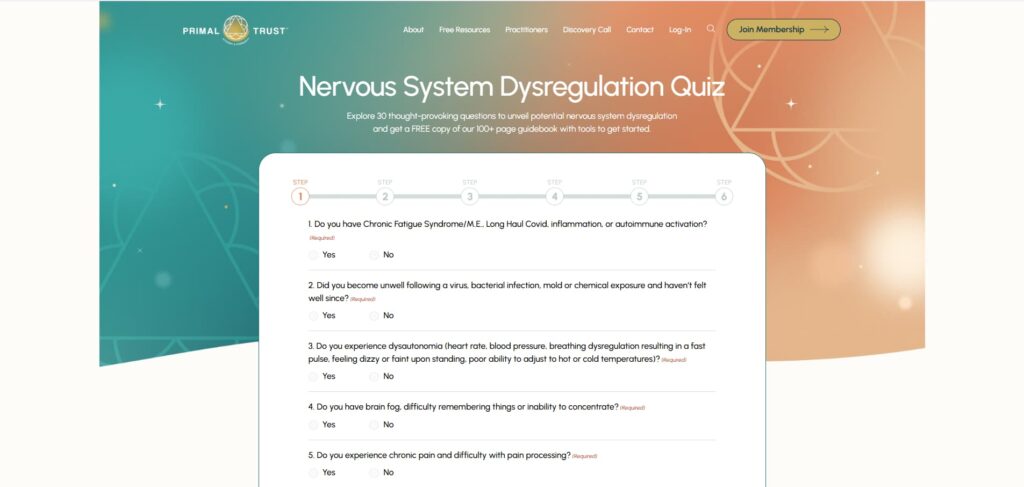
Yeah. In this case, there are 30 questions. There are other sites that we’ve worked on together, which typically involve five to 10 questions, depending on the outcome of the quiz, the client’s needs, and what you’re trying to deliver to them.

Yeah, so now you’re getting a score overall rewards results of four out of 30. If you want the guidebook, you need to provide your first name and last name, as well as your email address. But yeah, it’s not like you’re going to just bail at this point because you didn’t. You invested the time in filling out the questionnaire, but you haven’t supplied your email address yet, and you feel like you haven’t received all the details. You’ve just received a score, but you haven’t received the detailed results yet. You didn’t get the guidebook. So it’s a no-brainer. You’ve already invested X amount of time filling this out. You might as well do the last little step here and give your email address.
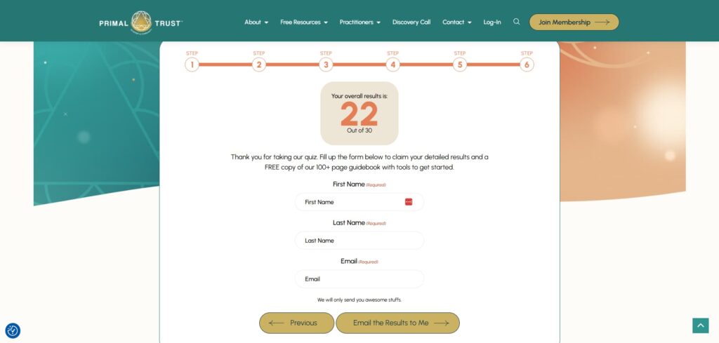
That’s right, exactly. We’ve also tested multiple-step quiz forms, such as this one, where you either ask for the opt-in at the start or the end. The conversion rate is quite similar, but I feel like you’ll probably get a more dedicated person if they go through all those questions first. Then you can see she’s asking for last name, which usually doesn’t convert that well, but yeah, if it’s after asking them 30 questions, then they probably won’t mind giving their last name as well.
Yeah, they’re more inclined.
Yeah, yeah, exactly. Cool. Well, yeah, thanks for sharing that. Yeah.
So, let’s move on to the internal pages of the site.
Asking thoughtful questions in a quiz shows you understand the user’s struggle and builds instant trust.
So then we have a membership sales page, essentially, right? So, what we’re doing above the fold, you’ve to remember, people may come to this page initially without seeing the homepage because they could get to it directly from her social media or other ways. So she’s just trying to let people know what’s in this course. Generally speaking, if she does a lot of warming up of her leads, then they will really be warmer, so she’s just trying to let them know straight away what’s in the course, such as level 123, regulate, integrate, liberate. And I love those words because it’s kind of very much, you know, benefit-driven as a one-word summary of each of the levels, which is pretty cool.
And so, we have the headline in this membership, which is really clear that it’s a membership; you will reconnect with your natural ability to heal. Then, we have the three levels, which explain what they are, followed by a call to action to join. And then, we’ve reiterated the impact metrics below. Then we move on to some social proof, and then there’s a good video to watch, but then it breaks down in more detail what the program is all about and what they get in each of the levels.
Then, she has the actual Google Plugin for the reviews. Then, she has a video that showcases many of her customers and their success stories, essentially a collage of all the clients in one video, which is a pretty smart idea. And then, yes, she reiterates what the benefits are and what’s unique. And then there’s a nice image of a community, such as an online community, showing that it’s part of how she delivers her membership, where members can access exclusive group support, including one-to-one calls, for instance.
But yeah, so, and that’s it. The landing page, I mean, has a little bit more to it, but you can go to the page and check it out. It’s definitely on brand. Yeah, it’s good value. It’s an incredible offer. And, yeah, it converts well, so yeah, and then, oh, FAQs explain the FAQs at the bottom of this page seven because these are probably super important for rankings.
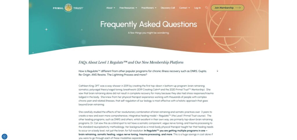
Yeah. For some of these questions, a couple were expanded to prevent them from being hidden content. All questions are displayed with a plus sign and a down arrow; whatever your method is to convey, you can expand the question to display the answer underneath it, but it’s hidden by default for most questions and answers. The ones that are displayed by default receive the most weight from Google and are partially discounted if they’re hidden by default.
Google’s AI knows when content is genuinely helpful. Organize your FAQs to serve real user needs, not just SEO.
This is beneficial from an SEO perspective, as it contains numerous relevant keywords and valuable content. Google can distinguish between SEO content that’s merely there for SEO purposes and content that genuinely helps the user as well. You know, Google’s AI is very sophisticated in that regard. This is really helpful content, providing a wealth of answers for those with questions and a desire to delve into the details of various aspects of the membership and its workings. It’s basically an objection. Obliterator before they sign up,
Exactly, very powerful, and she’s got a lot of questions, which I imagine she’s been asked questions over time, so she probably just keeps adding to the list based on frequently asked questions. So, it’s pretty smart, but yeah, and then the first batch is related to level one, the second batch is related to level two, and so on. So, it’s really organized from a user’s perspective. So I think that’s pretty cool.
Now, I’m just pressing the little arrow that appears in the bottom right corner to get to the top of the page. Many designers and developers overlook this step, which can be quite annoying for users who have to manually scroll up, especially on lengthy landing pages. So, just by adding that little helpful arrow to get to the top, it disappears when you get to the top. But it’s quite helpful as you’re halfway through a page or near the end of a page.
Now, somebody might say, “Well, that’s not necessarily intuitive. I haven’t seen that on that many websites,” or whatever. Well, if you think about how you use, let’s say, WhatsApp, and you’re in a group that’s very active on WhatsApp, and you haven’t caught up on all the latest threads in there, there is that arrow that points the other direction that jumps you down to the very last message. We’re trained to use it because billions of people are on WhatsApp, and so they’re already familiar with that paradigm. So, it’s not that much of a leap to have an arrow pointing in the other direction to jump back up to the top.

There you go. I love it. Cool. Now, one of the most important pages on your website is your social proof page. So, the more social proof you have, the better, in my opinion. But you don’t want to plaster it all over every single page. You just want to scatter it appropriately over every single page.
However, if you have a dedicated page for social proof as well, people can visit this page to see the volume of social proof. She has her Google reviews listed, and then she has segments for the different types of social proof she has, including doctors, members, videos, stories, data, research, level two, programs, etc. So there’s a lot in there, and some of them are not fully expanded.
So, there’s a little more for each section. And, yes, the ones we really want to highlight, we’ve included photos. We’ve created a unique design for it, as opposed to just a Google review. Yeah. So, there are a lot on this page, and so a couple doesn’t have photos. It doesn’t look very good, but yeah, video testimonials, and then this section down here, stories of triumph based on condition, like, look at this.
The more strategic social proof you share through videos, reviews, and categorized stories, the more believable your brand becomes.
These are all categorized based on whether you have one of these conditions. Not all of them are loaded, by the looks of it. Then, you can simply click on it to view relevant testimonials. So I think that’s pretty cool. And then, yeah, some testimonials from level two. You know, quite boring, but to us, it might be boring to look at, but somebody might get a lot of value out of this. We’ve highlighted the part that the client thinks might be most beneficial for the reader to read. So yeah, testimonials can be boring to look at if there’s a lot of text with one testimonial. So, if you highlight the part you really want people to focus on, it’s just a good way to present it.
I think you told us that. Stephan, yeah, I don’t remember where I learned that from, but that was years ago. Yeah, a great little tip.
Yeah, cool. And so, just as you can see, you just keep learning more and more and more. So, the more social proof you can display on a single page, the better. So yeah, it just becomes more believable, which, yeah, in this case, I think people would be skeptical. So, yeah, it’s just another reason for people to say yes, okay, and then yeah.
Essentially, the more calls this client books, the more sales she makes. And I think that’s probably because people need to be convinced that she has a solution that’s specifically tailored to help solve this particular condition. And so, yeah, we have a book-a-call page. This video is actually quite good, so it’s probably worth watching if you’re considering creating a page for booking a call rather than just having your calendar open. Go to the extra effort of doing a video letting people know who you’re a good fit for, who you’re not a good fit for, and what the specific benefits are of your program in a video; it can just help really build trust when you put the face to the brand, basically telling specifically how people are going to benefit.
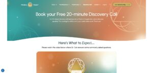
Because, yeah, if she is on all those calls with the community, then that’s what people are going to see once they’re a member. So yeah, building trust from the outset and having a video from her is going to be super powerful for attracting people. So then she has a calendar in bed. That doesn’t look the best, but the point is, before people book a time, she’s trying to give them an overview in this video of why it’s important to book a call. And then she’s got throughout the page, you know, what you received during your call, and she just talks about the benefits, essentially.
And then, she finishes the page with social proof. So, it’s a pretty basic page. But compare that to just having a calendar in bed; this page generally converts a lot better. Then, following that, there will be a thank-you page with a video thanking them and ensuring they show up, and an email nurture sequence will follow.
A thank you page is a golden opportunity. Don’t waste it by just telling them to check their inbox.
Yes, and I don’t recall if I’ve shared this before in one of the past case study episodes, but whenever you have a thank-you page, you’ve 100% of their attention. And the worst thing to do on any kind of thank you page is to just say, “Check your email. Your free thing is over in your inbox.”
Well, they’re flooded with so many distractions in their inbox. You’re going to get just a sliver of their attention if you send them there, so instead, you’ll have 100% attention on the thank-you page. Deliver more value and keep them engaged, upselling and cross-selling them to further move them down your funnel or buyer journey before they check their email. You could even say, ‘Hey, in a few minutes or in 10 minutes, your email will arrive.’ In the meantime, please walk through this, whatever thing you value, the really compelling thing that will help them move down the buyer journey and solve their problem.
Exactly. You know, she did all the copy. We helped with the design. We worked together; Stephan told the SEO that she got more traffic, so all those things contributed to more sales. That’s really the reason she reached out to all of us, and yes, we helped achieve that result.
Okay, I’d like to walk through some statistics and graphs. This is publicly available information. If you have an Semrush subscription, I’m not sharing anything confidential here. I just pulled up primaltrust.org in Semrush, and you can see it in the right graph: organic traffic.
We started working with the client in October 2023 and continued through to late summer 2024, after which the engagements paused. She hasn’t worked with another SEO company, but for budget reasons, pausing our work together, you can still receive SEO benefits after implementing your changes, including foundational infrastructure updates. Is the content changes, optimizations, link building and so forth. That kicks in potentially many months later. After you’ve done the work.
Don’t just offer a newsletter unless you’re a massive authority. Instead, deliver immediate value — like a quiz, a PDF, something they actually want. Share on XIt’s not immediate, usually, so it’s not uncommon for stuff that was done, let’s say, in the spring, to start showing up and showing benefit in the form of increased rankings and traffic six months, 12 months later,
Incredible. Yeah, exactly. That’s a benefit of SEO, right? If it’s done well, yeah, it lasts.
Yeah. And let me also show another thing. So, she was not ranking, as you said, Greg, for even her own brand name, but now she’s ranking and has been for a while for ‘brain retraining’ as an example keyword that she really wanted to rank for. She’s currently number four for that wow, as you can see here, and that’s important, not just for getting leads coming in, but also for positioning.

As for brand positioning, if you’re a leading option for brain retraining, information, and programs, and you’re nowhere to be found on page one while your competitors are there. Well, if you’re trying to get speaking gigs or trying to get partnerships, or JVs and things like that, and you aren’t positioned with those other leaders in the field, they’re going to question whether you’re a leader too.
Yep. Love it. Fantastic. Stephan, so yeah, that’s great. Is there anything else you want to add? Or should we just wrap up with the key takeaways?
Let’s wrap up. This was all good stuff. I think we built a strong foundation for our listeners or viewers to apply some of these principles to their own websites. So, let’s recap what those principles are.

Yes, I think messaging is a big one, so having clarity in your message is crucial, making sure it’s all about what’s in it for them rather than it being all about your offer. It’s more about how your offer can help them and reduce cognitive load in the process, exactly, which leads me to video backgrounds. Don’t use them unless you split test and realize it’s getting good results. However, most of the time, it will likely negatively impact your organic rankings and conversions.
So, yeah, just be careful with video backgrounds and parallax effects as well. You can use it to put the focus on social proof, but try not to overdo it, as it can be quite confusing. And then also think of your other lesson from this: if you do have an existing brand and existing members, in this case, because it’s a membership, then think about how a redesign might affect them and how they’ll feel about it. So, yeah, just be compassionate to them. Alright, that’s the wrap and lead magnet. Try not to use a newsletter. Try to offer something of value in return for an email address, such as a PDF or a quiz.
Yeah, all good stuff, and from an SEO perspective, things that worked for this client and will work for you to do the strategy before you do the implementation. In the case of Primal Trust, we employed a link-building strategy. We conducted audits of their content and technology, encompassing everything. So we were able to really hit the ground running once we had the plan in place and figured out what the priorities were and the biggest needle movers.
So my favorite quote from The Art of War, by Sun Tzu is tactics without strategy. It is the noise before defeat. Don’t short-shrift the strategy just by asking ChatGPT and some half-hearted prompt for strategy, and then start beavering away at tactics that may not get you to your intended destination.

Love it. So check out nedconcepts.com Stephan’s team.
And studio1design.com. Thank you. So, Greg, do you want to share your social media and all your various websites, your book, and all that?
I think the book website is a good choice because there’s a whole chapter in the nextlevelwebsitedesign.com, a book website that focuses just on online businesses. Various chapters focus on various business types; we’ve got a whole chapter on E-commerce, a whole chapter on service businesses, a whole chapter on online businesses, a whole chapter on personal brands, as well as all the principles that go into understanding what converts. So yeah, check it out.
Yes, and your personal site is Gregmerrilles.com, and your agency website is studio1design.com.
Thank you, and thank you to Stephanspencer.com and about 10 other podcast websites that you have.
Yes, marketingspeak.com, getyourselfoptimized.com, and, yeah, we could go on and on and all studio1-designed, beautiful, amazing websites.
Thank you. Appreciate it,
All right? And thank you, listener. We appreciate you. Go out there and make the world a better place. Do better marketing. Make the world better by being better and enjoying life; we’ll catch you in the next episode. I’m your host. Stephan Spencer, signing off.
Important Links
Connect with Primal Trust
Connect with Greg Merilees
Apps/Tools
Books
Businesses/Organizations
People
Previous Marketing Speak Episodes
Previous Get Yourself Optimized Episodes
YouTube Videos
Your Checklist of Actions to Take
- Remove video backgrounds from my website’s hero section as they significantly slow loading times, negatively impact SEO rankings, and create cognitive overload for visitors.
- Audit my homepage hero section and eliminate multiple competing call-to-action buttons that confuse visitors. Focus on one primary action that aligns with my main conversion goal, ensuring visitors have a clear next step rather than decision paralysis.
- Develop a detailed mood board that captures key emotional words along with color palettes, typography, and photo direction. This ensures every design element supports the psychological state I want visitors to feel when they arrive at my site.
- Stop asking for email addresses in exchange for a generic newsletter unless I have millions of followers. Instead, offer specific value, such as PDFs, quizzes, or guides, that solve immediate problems for my target audience and demonstrate my expertise.
- Create comprehensive quizzes that show prospects I truly understand their specific challenges and situations. This investment of their time creates psychological commitment and positions me as someone who “gets” their unique problems.
- Structure my quiz to ask for contact information after users complete all questions, rather than upfront. This approach converts similarly to front-loaded opt-ins but attracts more committed prospects who have already invested significant time in the process.
- Create a dedicated testimonials page organized by customer type (experts, members, condition-specific results) and scatter appropriate social proof throughout other pages. Include Google reviews, expert testimonials, and video success stories to build comprehensive credibility.
- Design FAQ sections with expandable questions where 1-2 high-priority questions remain open by default for SEO value. Organize questions by program levels or customer journey stages to help both users and search engines understand my content structure.
- Build dedicated landing pages for consultation bookings that include videos explaining who I’m a good fit for, who I’m not, and specific program benefits. This approach converts significantly better than embedding a bare calendar and helps attract more qualified prospects.
- Connect with Greg Merrilees for website design and conversion optimization through his agency, Studio1 Design. Visit his book website at nextlevelwebsitedesign.com to access detailed chapters on optimizing different business types, including e-commerce, service businesses, and online programs.

About the Host
STEPHAN SPENCER
Since coming into his own power and having a life-changing spiritual awakening, Stephan is on a mission. He is devoted to curiosity, reason, wonder, and most importantly, a connection with God and the unseen world. He has one agenda: revealing light in everything he does. A self-proclaimed geek who went on to pioneer the world of SEO and make a name for himself in the top echelons of marketing circles, Stephan’s journey has taken him from one of career ambition to soul searching and spiritual awakening.
Stephan has created and sold businesses, gone on spiritual quests, and explored the world with Tony Robbins as a part of Tony’s “Platinum Partnership.” He went through a radical personal transformation – from an introverted outlier to a leader in business and personal development.

About the Guest
GREG MERRILEES
Greg Merrilees is the founder of Studio1 Design. He’s passionate about really good-looking website design that gets results!


Leave a Reply